Case Study: Unceasing Footprints – 70 Years CCE

THE INITIAL CHALLENGE

Printed architecture: editorial design as a legacy and historical memory.


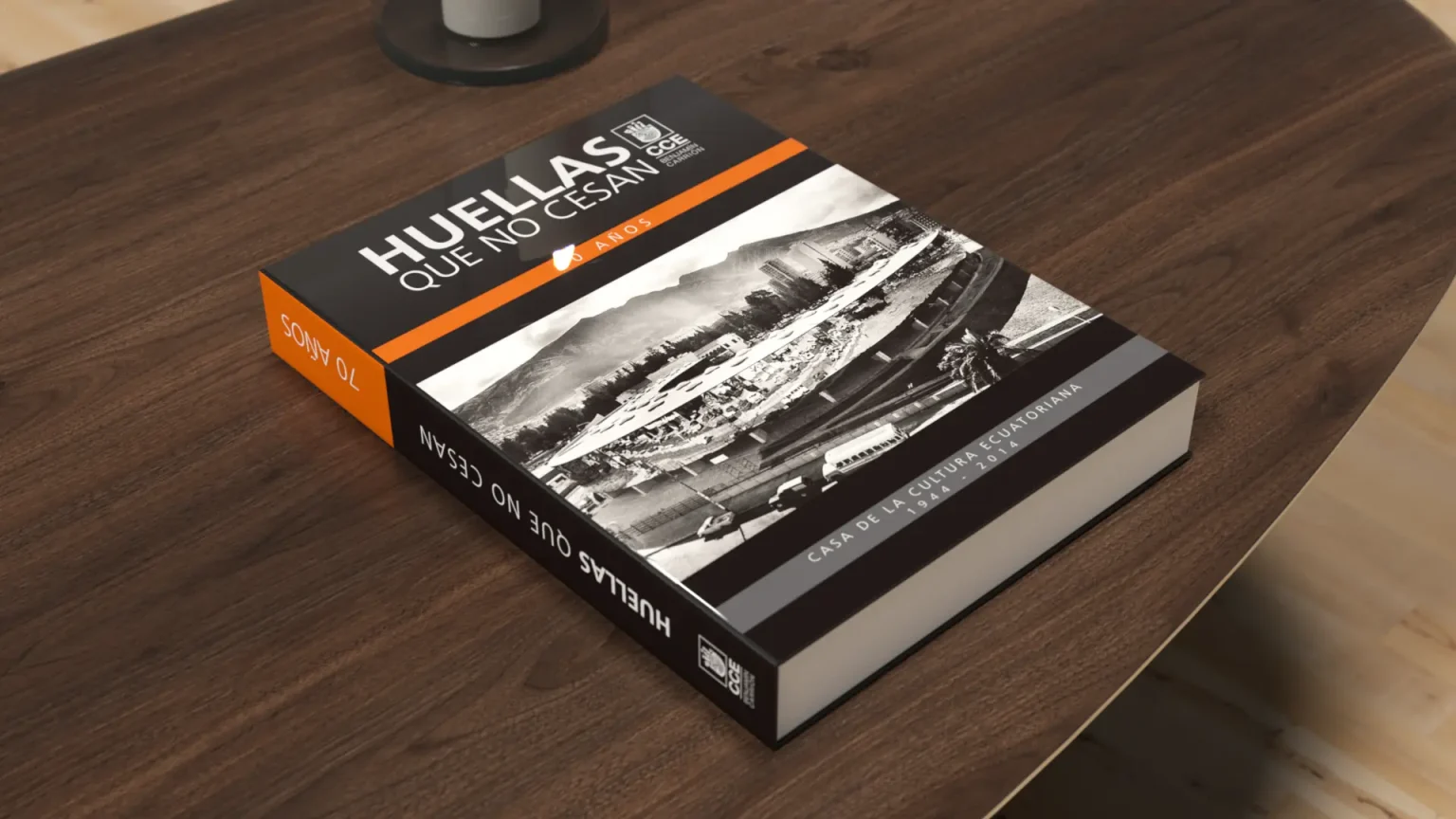
The main challenge consisted of uniquely designing and laying out the commemorative editorial work for the 70th anniversary of the Casa de the Cultura Ecuatoriana. As a high-volume historical book, the design challenge was not purely aesthetic, but of pure information architecture and technical art direction.

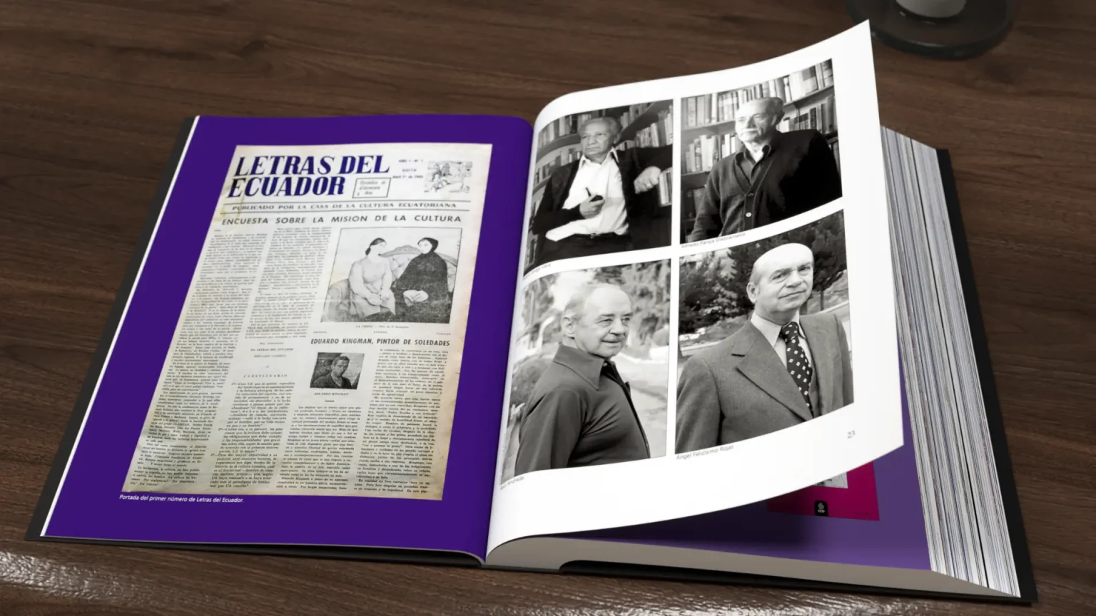
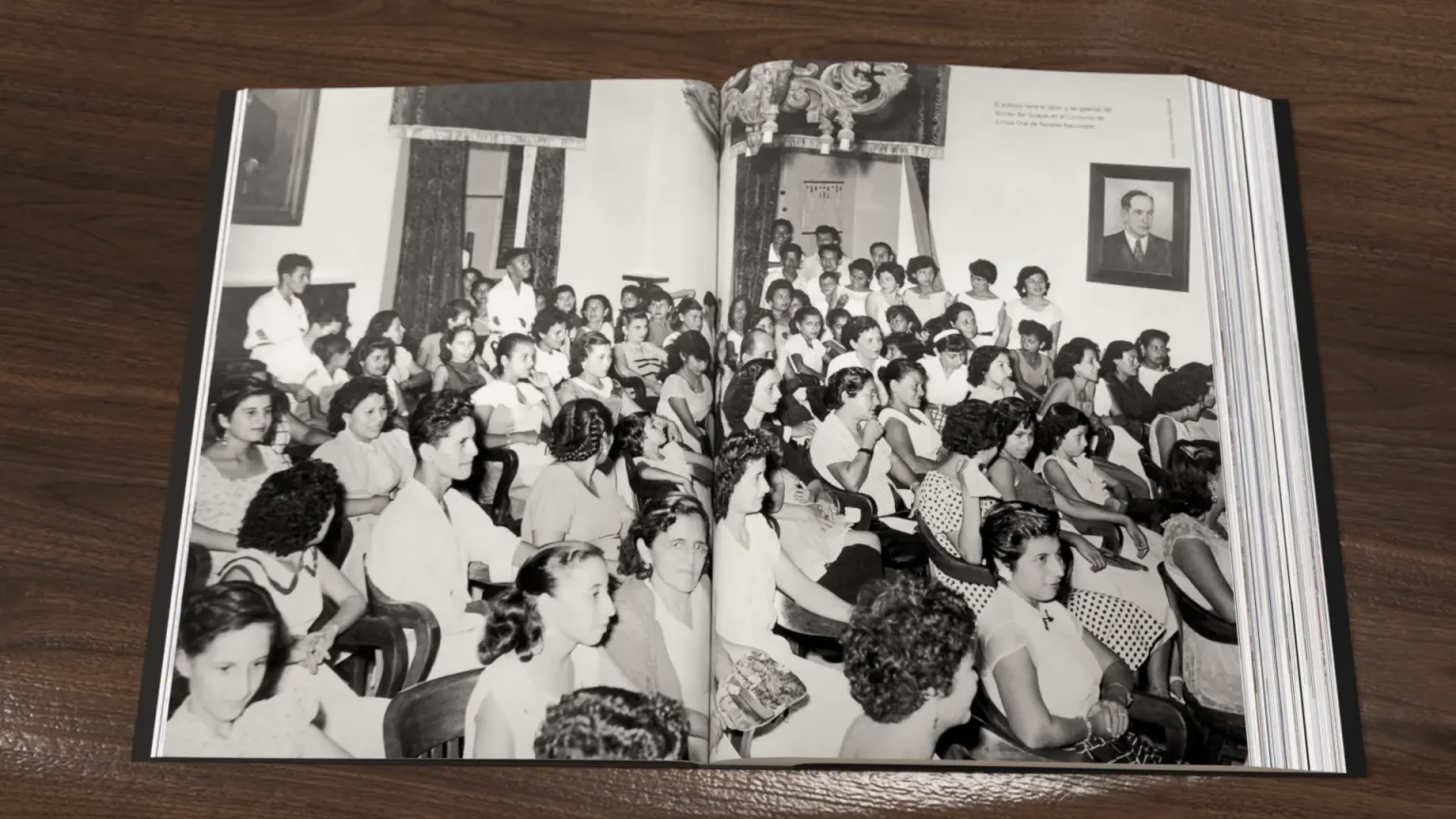
The archive material presented critical complexities: an immense amount of institutional texts and an archive of historical photographs collected over decades which, in their majority, were in low resolution and poor quality. The graphic challenge consisted of visually unifying totally different eras (from 1944 to 2014) and structuring an imposing physical format that could support the density of the content without losing dynamism, elegance, or legibility.

“The design of a book is not a matter of personal choice, but the result of logical thinking and mathematical discipline that seeks the perfect legibility of the content.”
— Jan Tschichold.

THE SOLUTION

Visual engineering: from iconographic restoration to grid dynamics

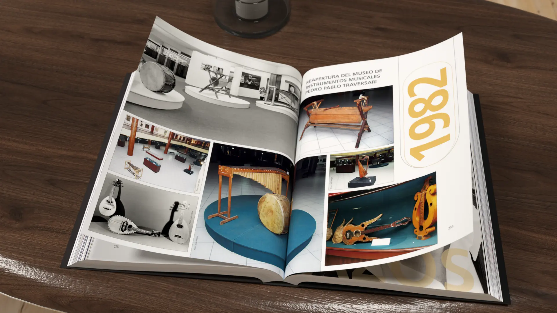
To solve the photographic archive issue, I performed a meticulous high-end prepress and digital retouching technical intervention, scaling, restoring, and improving the contrast of historical images to guarantee optimal and sharp reproduction in physical printing systems.

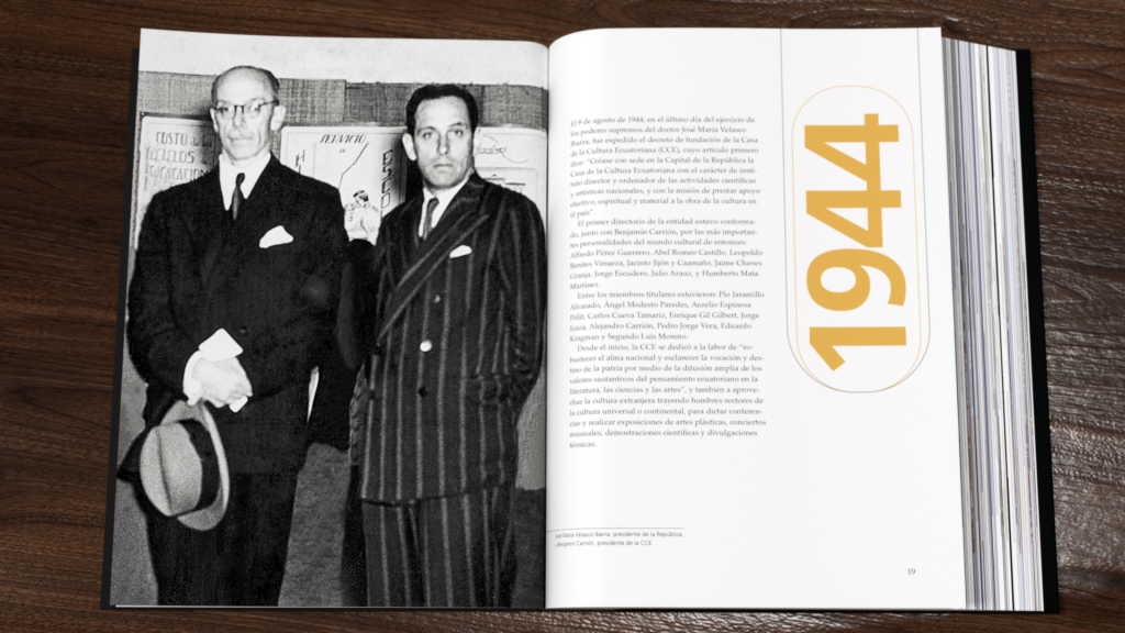
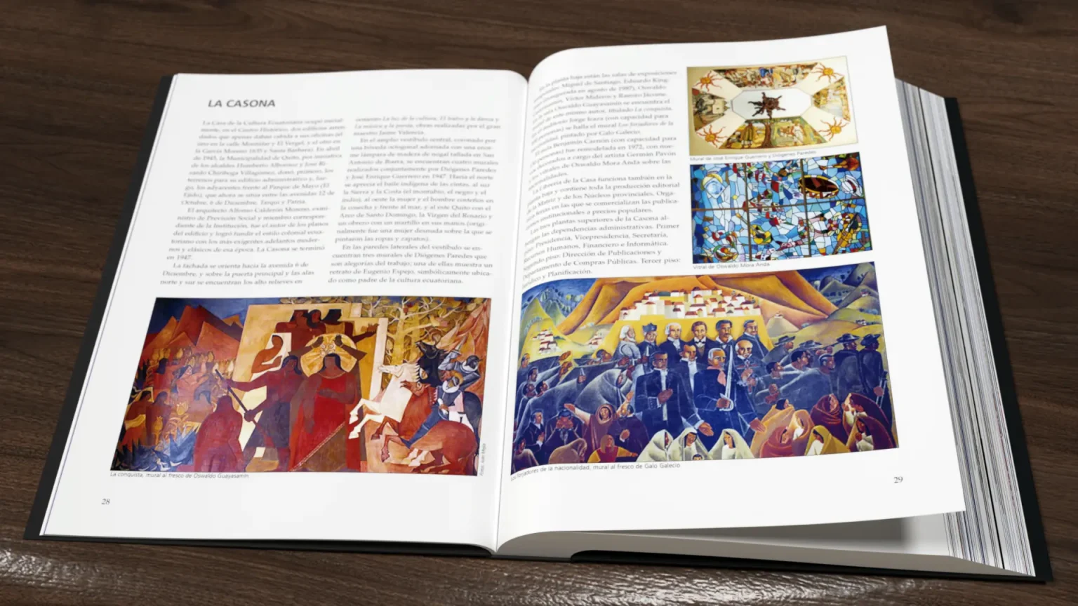
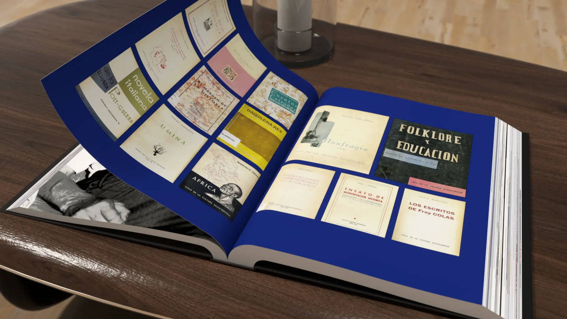
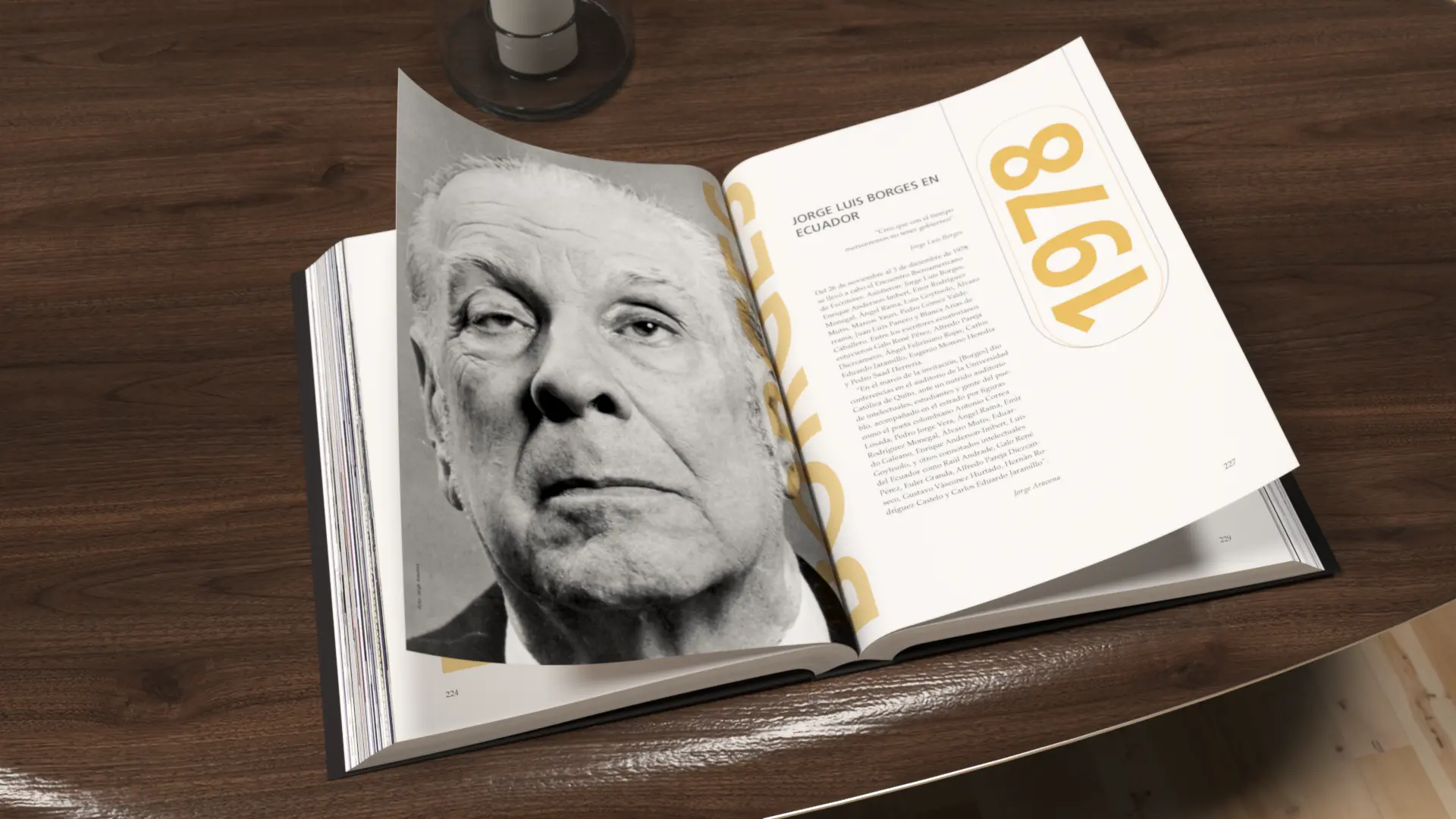
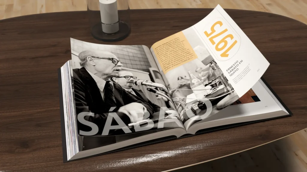
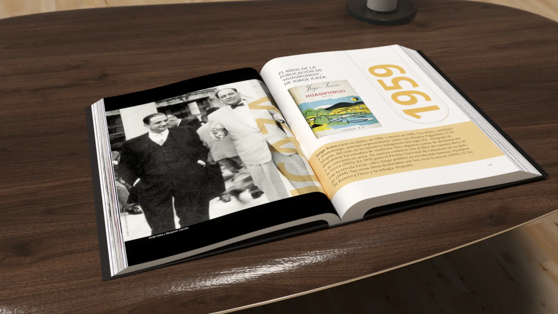
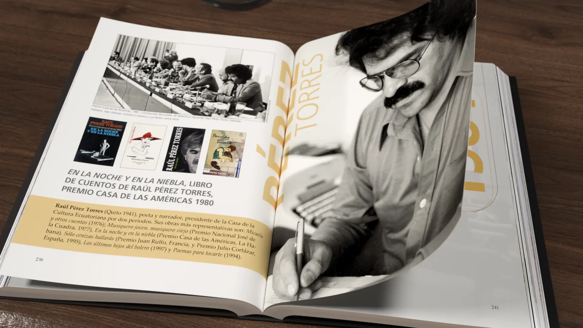
At the layout level, I designed a system of dynamic constructive grids adapted to the different chronological sections of the work. As shown in the interior sample, I used color blocking through a historical ocre/golden tone to highlight annual milestones enclosed in geometric typographic structures, breaking text density and generating a fluid and stimulating visual rhythm for the reader.

The selection of materials and production engineering was planned to convey solemnity and sophistication:

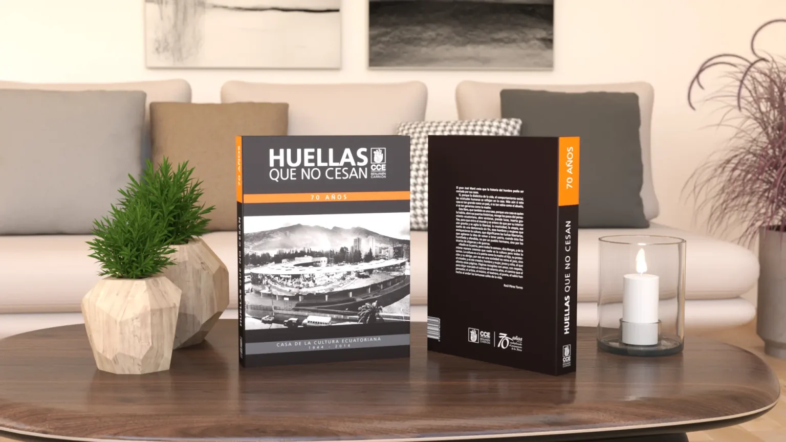
  • Format and Binding: A voluminous hardcover edition was chosen to ensure the book’s durability and heritage presence.
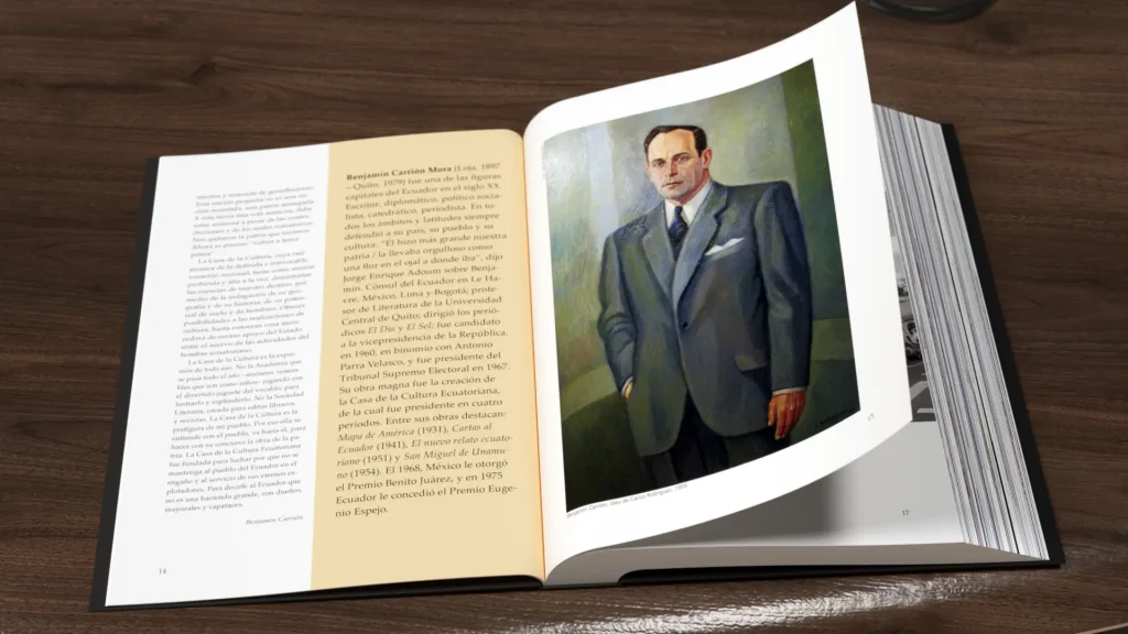
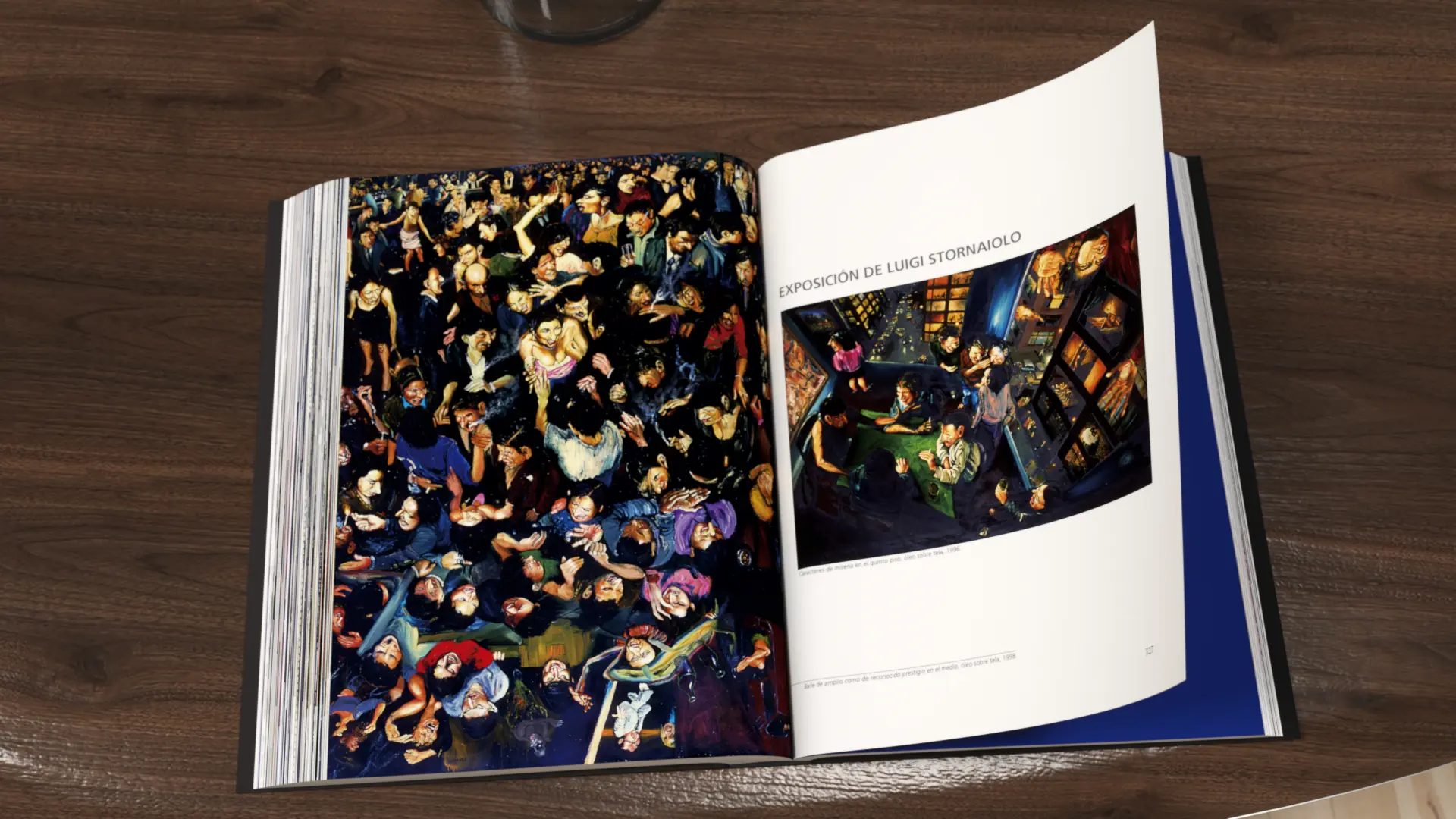
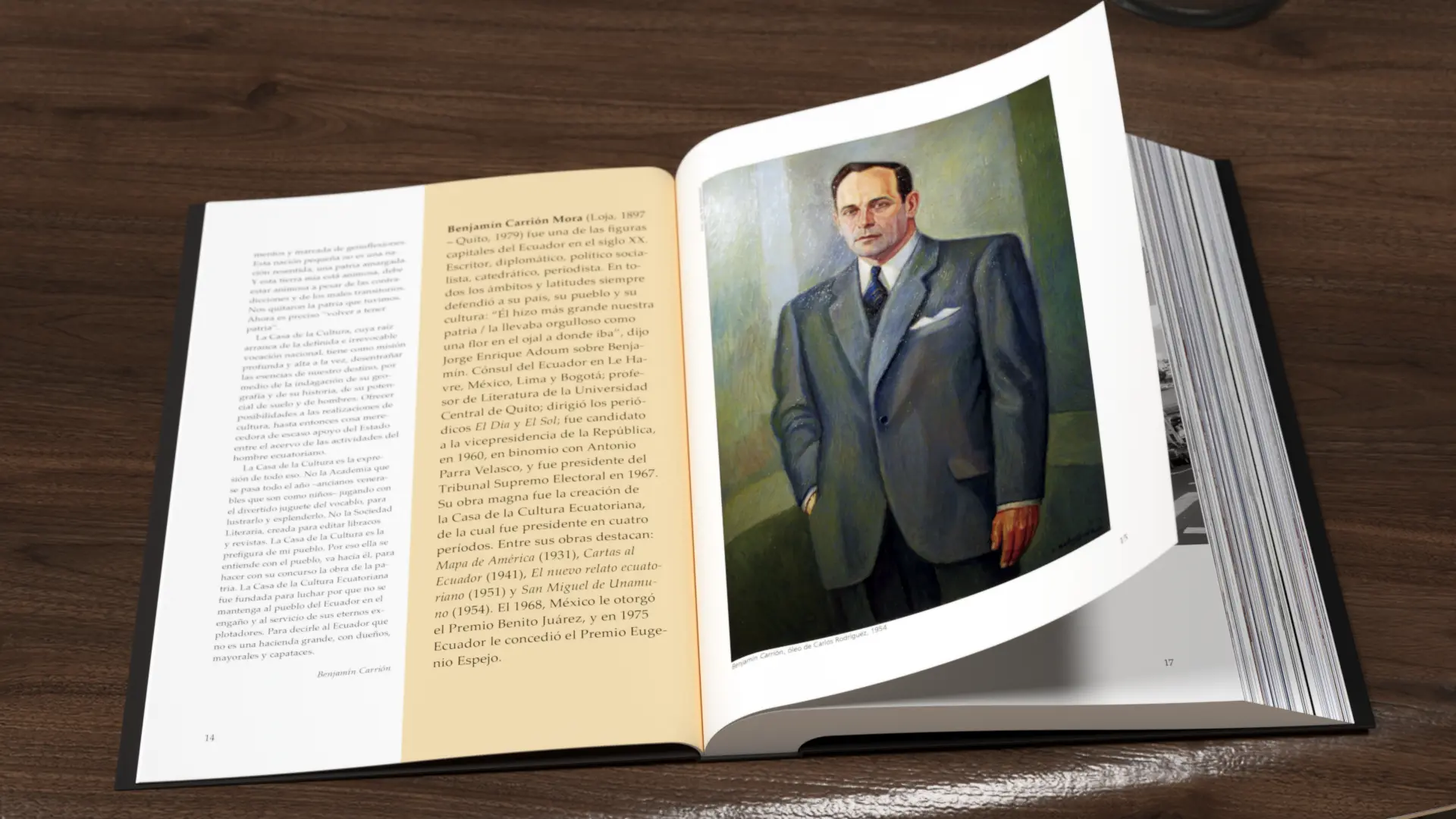
  • Substrate: Interior pages printed on 110g matte couché paper, ideal for avoiding uncomfortable reflections during reading and enhancing the depth of grises in historical photos and polychrome oil paintings.
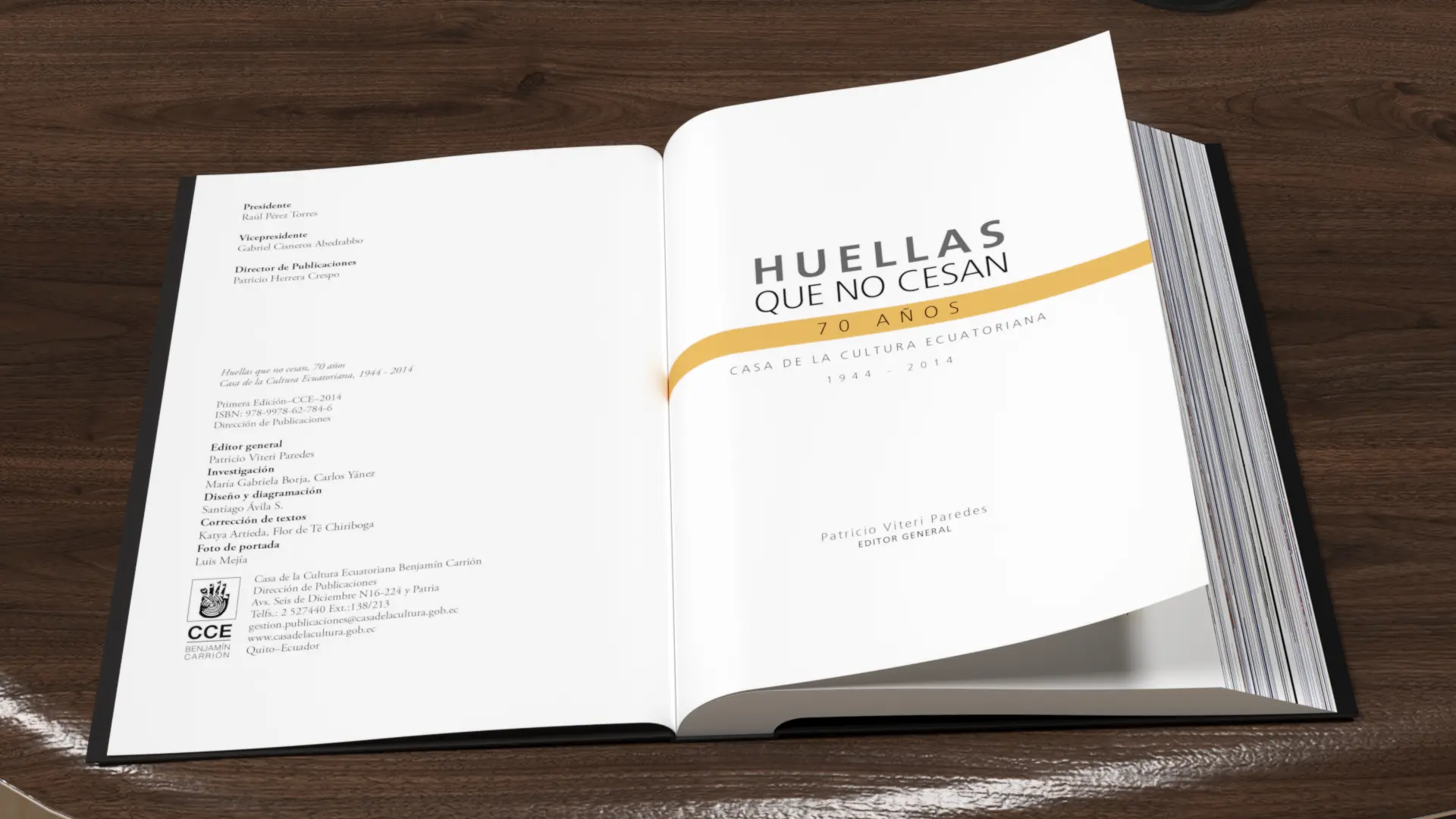
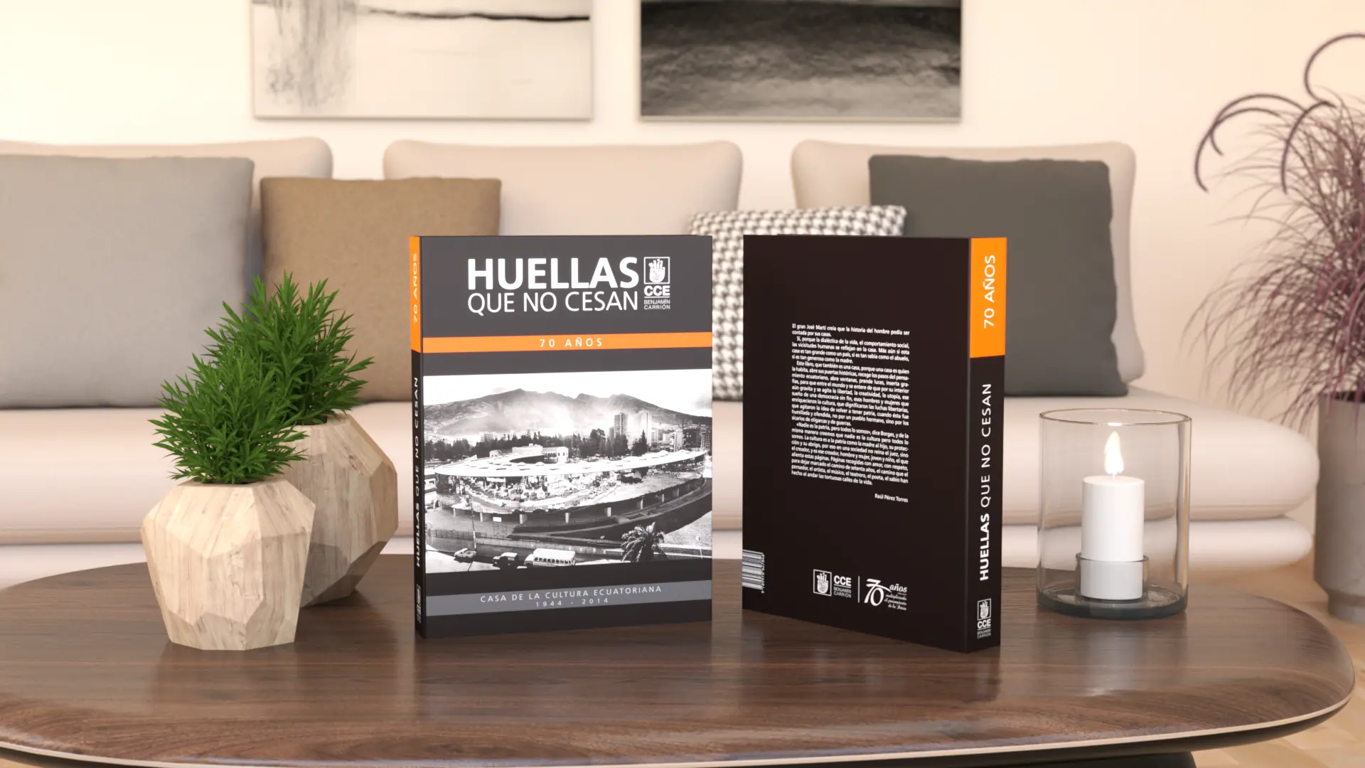
  • Cover Finishes: I designed a sober and powerful cover that combines deep black with institutional orange and gray accents, applying selective varnishing (spot UV) on key areas of the title and logo to generate a premium tactile and visual contrast upon contact with the user.

THE RESULT

The Impact: a collector's item of high heritage value

“Unceasing Footprints” established itself as one of the institution’s neatest and most graphically valuable commemorative works. The design succeeded in transforming a dense historical archive into a collector’s item of high cultural value and visual permanence. The clean microtypography hierarchy, the successful rescue of archival images, and the rigorous technical control in the choice of substrates and finishes demonstrated that strategic editorial design is capable of capturing the identity of an institution and turning history into a memorable visual legacy.
“The grid system is an attempt to order space in a logical and coherent way, allowing visual information to be transmitted with maximum clarity and technical rigor.”
— Josef Müller-Brockmann.

Our Strategic Contribution

Diagnosis & Technical Research

  • Audit of visual codes: Analysis of the brand identity in relation to market aesthetic trends and competitor visual languages.
  • Technical production mapping: On‑site survey of technological capabilities in the plant, including machinery and printing systems (flexographic, offset, and substrates).
  • Brand‑pain diagnosis: Identification of anachronisms or disconnects between the company’s industrial reality and its visual projection.
  • Action plan: Clear and feasible methodological recommendations for transforming the brand identity.

Brand Strategy & Architecture

  • Corporate concept and narrative (Brandstory): Definition of the company’s DNA and core values through a synthesis‑driven approach.
  • Creative brief development: Structuring the strategic pillars that will guide the design solution.
  • Normative identity manual: Precise vector‑based guidelines, clear control of exclusion zones, industrial typefaces, and chromatic application standards.

Packaging Design & Visual Identity

  • Logo redesign and innovation: Creation of timeless, functional graphic marks with high visual impact, fully prepared for industrial deployment.
  • Graphic design for packaging and labels: Aesthetic development focused on shelf visibility (shelf‑appeal) and the justification of premium value.
  • Prepress optimization: Technical configuration of files optimized for high‑definition flexographic printing and micrometer‑level control.

Editorial Design & Corporate Communication

  • Specialized structuring and layout: Design of corporate reports, technical product catalogs, brochures, and institutional portfolios.
  • Grids and information architecture: Systematic organization of complex content to ensure a fluid, professional, and ergonomic reading experience.
  • Transmedia consistency: Adaptation of brand codes to both printed and digital editorial environments, ensuring uniformity of the overall look & feel.

Looking to launch your project?

Fiorum
Privacy Overview

This website uses cookies so that we can provide you with the best user experience possible. Cookie information is stored in your browser and performs functions such as recognising you when you return to our website and helping our team to understand which sections of the website you find most interesting and useful.