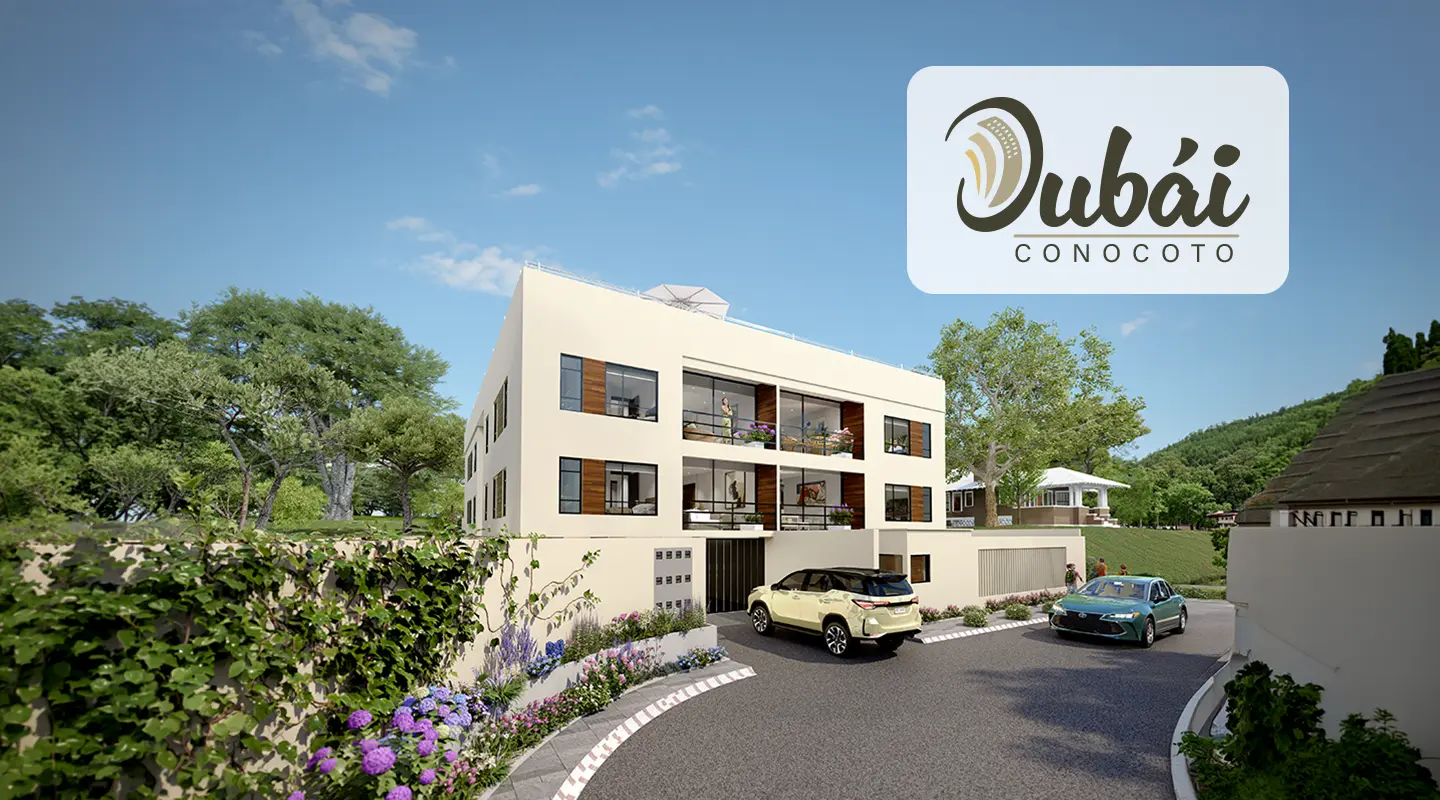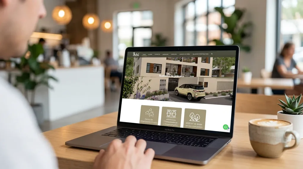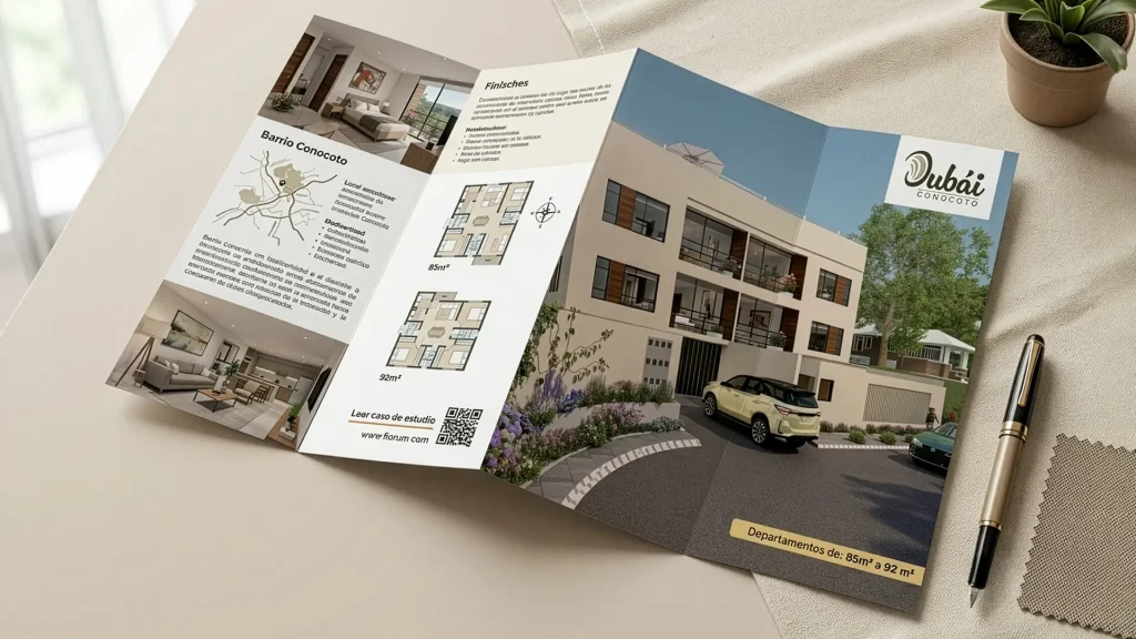
Case Study: Dubai Conocoto – Real Estate Branding and Democratization of Comfort

THE INITIAL CHALLENGE

Diagnosis: Brand Dissonance between Aspirational Naming and a Public Interest (VIP) Market

The main challenge of this project lay in a strong perception dissonance: the client selected the name “Dubái” to convey premium finishes, comfort, elevator amenities, and top-roof, but the real estate development was located in Conocoto and was targeting middle-class buyers under the VIP Public Interest Housing scheme (with a low price ceiling and state-subsidized rates).

The risk was double: if the branding was too luxurious or cold, the middle-class local buyer would feel it was outside their financial reach or pretentious; if the branding was too generic, it would fail to justify the superior amenities of the building compared to local competition. The branding challenge was to design a visual identity capable of humanizing the “Dubái” concept, grounding it in a warm, family, and accessible reality, while maintaining an aura of status, modernity, and safety.
“A brand is only worth what it means. What a brand means to its audiences is its true identity, and this translates into the value added to what the brand objectively is.”
— Joan Costa.

THE SOLUTION

Visual Strategy: Balanced Identity Design for the Middle-Class Youth Segment

The visual strategy centered on the concept of “The Urban Oasis”: positioning the building as a reference of modernity and a refuge of superior comfort within its locality.

Typographic Balance

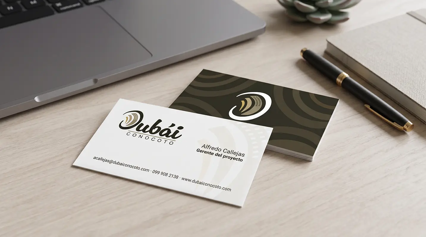
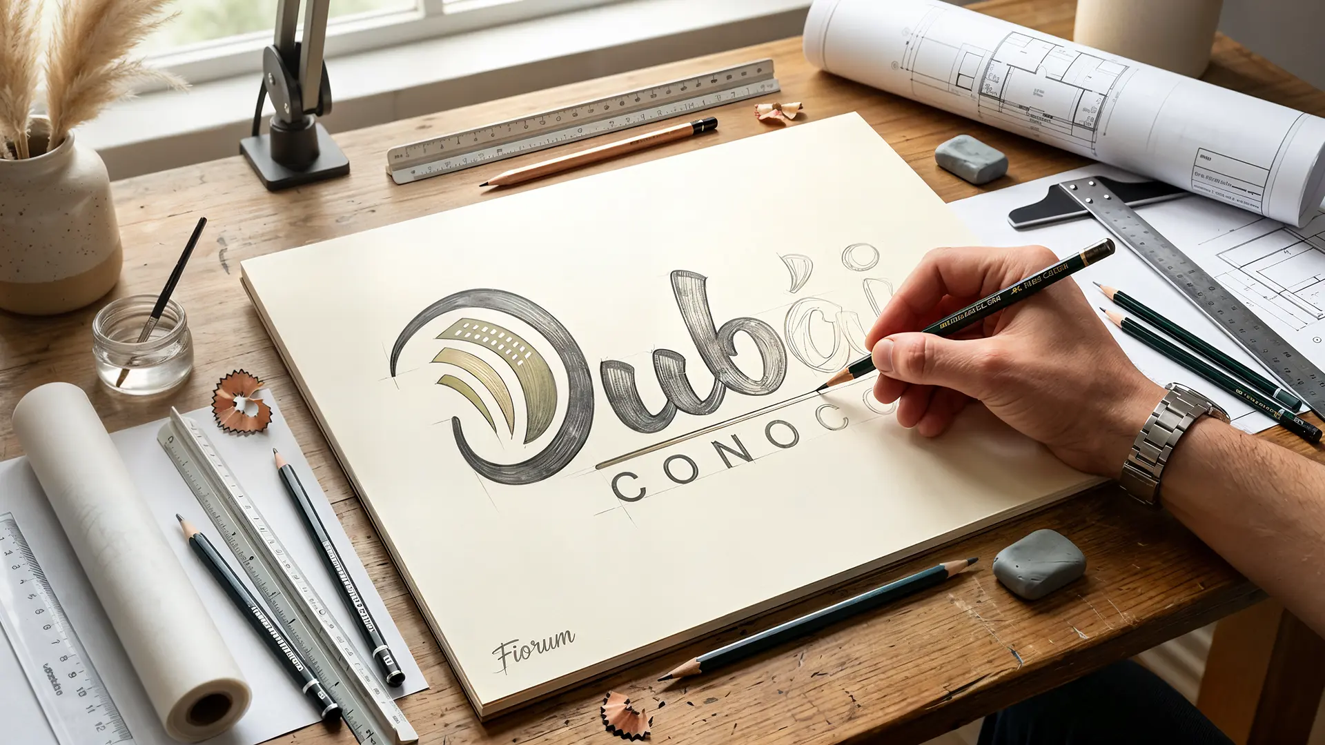
To soften the imposing load of the name “Dubái” and adapt it to a community and residential environment, a script typeface was implemented. The fluid and human strokes of the lettering bring closeness, warmth, and an organic quality, connecting the project with the private development’s green areas and reducing corporate stiffness.


Morphology and Symbolism

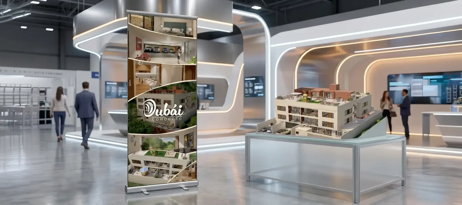
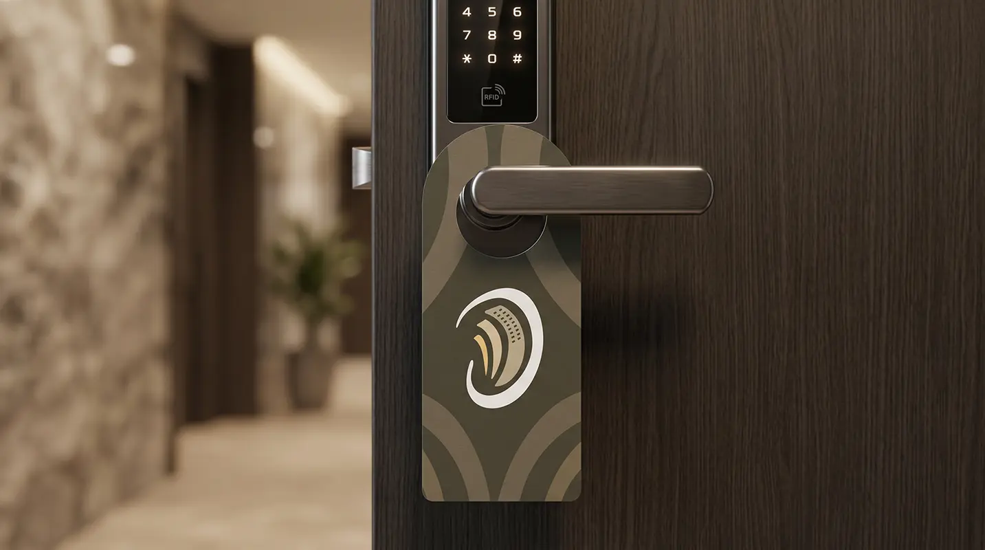
The isotype abstractly fused the silhouette of the iconic Burj Al Arab with the structure of a modern five-level residential building. The rising curved lines not only communicate the height and technical equipment of the project (such as the elevator and the top roof) but also symbolize the progress and social evolution of the buyers.


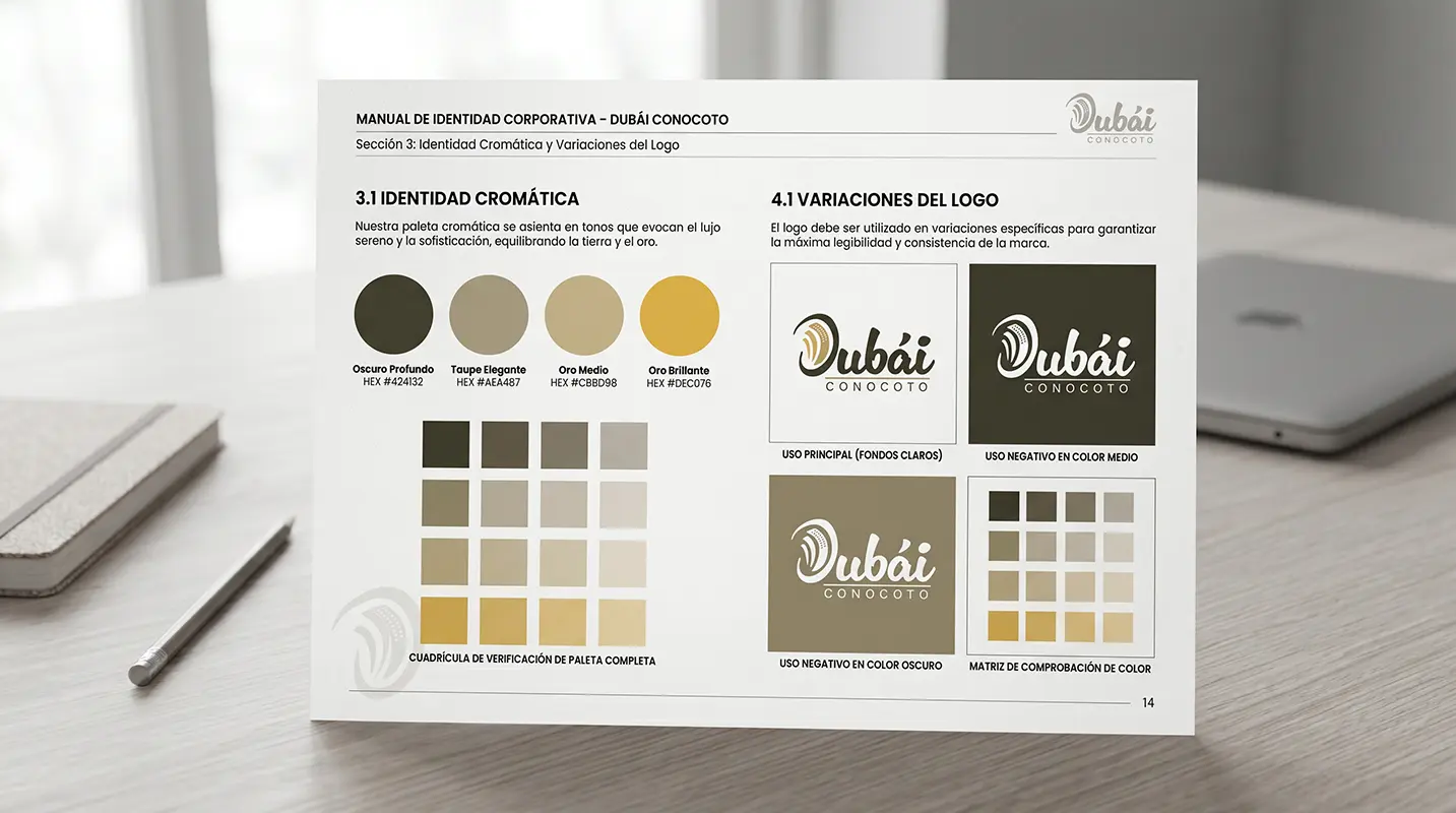
Chromatic Identity

The use of bright gold or metallic colors that would have felt artificial for the sector was avoided. Instead, a textured palette of earth tones, ochres, and olive greens was used, achieving an elegant yet sober, mature aesthetic deeply integrated into the Valley’s nature.

THE RESULT

Commercial Impact: Status Positioning and Accelerated Sales in the Sector

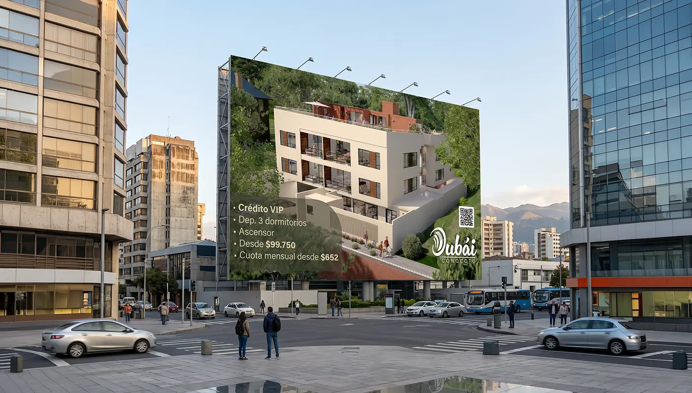
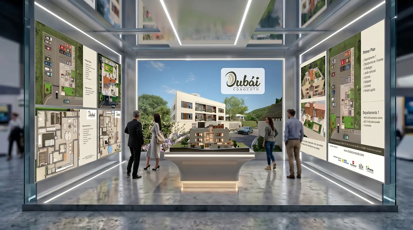
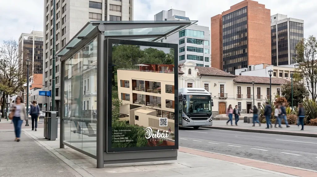
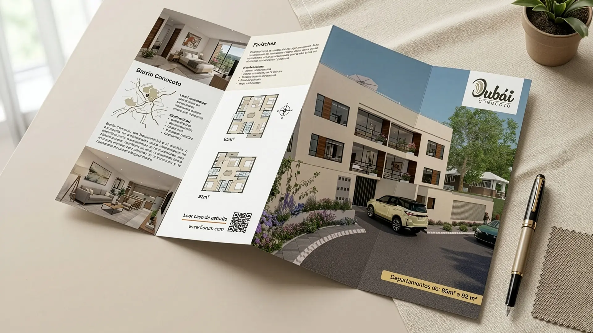
The visual identity achieved a perfect balance between the aspiration of status and the accessible reality of the market. By humanizing the “Dubái” concept through organic design, the brand became a magnet for local young professionals and emerging families in the area who wanted to “raise” their quality of life without leaving their sector. The branding transformed a 9-apartment building into a landmark of modernity for Conocoto, validating the buyers’ investment under the VIP Credit scheme and proving that good design has the power to dignify and revalue accessible housing.
“The brand is the core that integrates everything. A strong, well-valued, known, and properly managed brand is a first-rate strategic tool.”
— Joan Costa.

Our Strategic Contribution

Diagnosis & Technical Research

  • Audit of visual codes: Analysis of the brand identity in relation to market aesthetic trends and competitor visual languages.
  • Technical production mapping: On‑site survey of technological capabilities in the plant, including machinery and printing systems (flexographic, offset, and substrates).
  • Brand‑pain diagnosis: Identification of anachronisms or disconnects between the company’s industrial reality and its visual projection.
  • Action plan: Clear and feasible methodological recommendations for transforming the brand identity.

Brand Strategy & Architecture

  • Corporate concept and narrative (Brandstory): Definition of the company’s DNA and core values through a synthesis‑driven approach.
  • Creative brief development: Structuring the strategic pillars that will guide the design solution.
  • Normative identity manual: Precise vector‑based guidelines, clear control of exclusion zones, industrial typefaces, and chromatic application standards.

Packaging Design & Visual Identity

  • Logo redesign and innovation: Creation of timeless, functional graphic marks with high visual impact, fully prepared for industrial deployment.
  • Graphic design for packaging and labels: Aesthetic development focused on shelf visibility (shelf‑appeal) and the justification of premium value.
  • Prepress optimization: Technical configuration of files optimized for high‑definition flexographic printing and micrometer‑level control.

Editorial Design & Corporate Communication

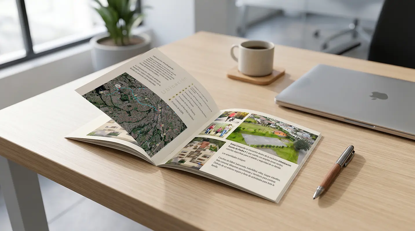
  • Specialized structuring and layout: Design of corporate reports, technical product catalogs, brochures, and institutional portfolios.
  • Grids and information architecture: Systematic organization of complex content to ensure a fluid, professional, and ergonomic reading experience.
  • Transmedia consistency: Adaptation of brand codes to both printed and digital editorial environments, ensuring uniformity of the overall look & feel.

Looking to launch your project?

Fiorum
Privacy Overview

This website uses cookies so that we can provide you with the best user experience possible. Cookie information is stored in your browser and performs functions such as recognising you when you return to our website and helping our team to understand which sections of the website you find most interesting and useful.