“To identify is to differentiate. The first condition of identity is its specificity; if a brand blends with others on the shelf or copies their codes, it abdicates its own existence.”
— Joan Costa.


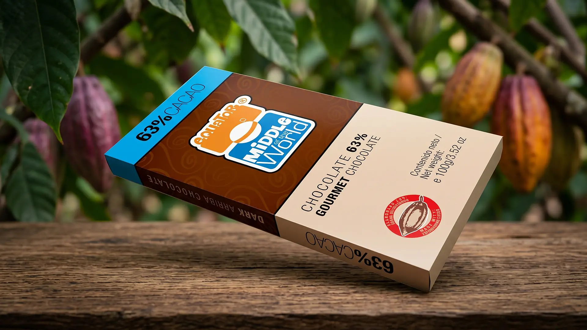
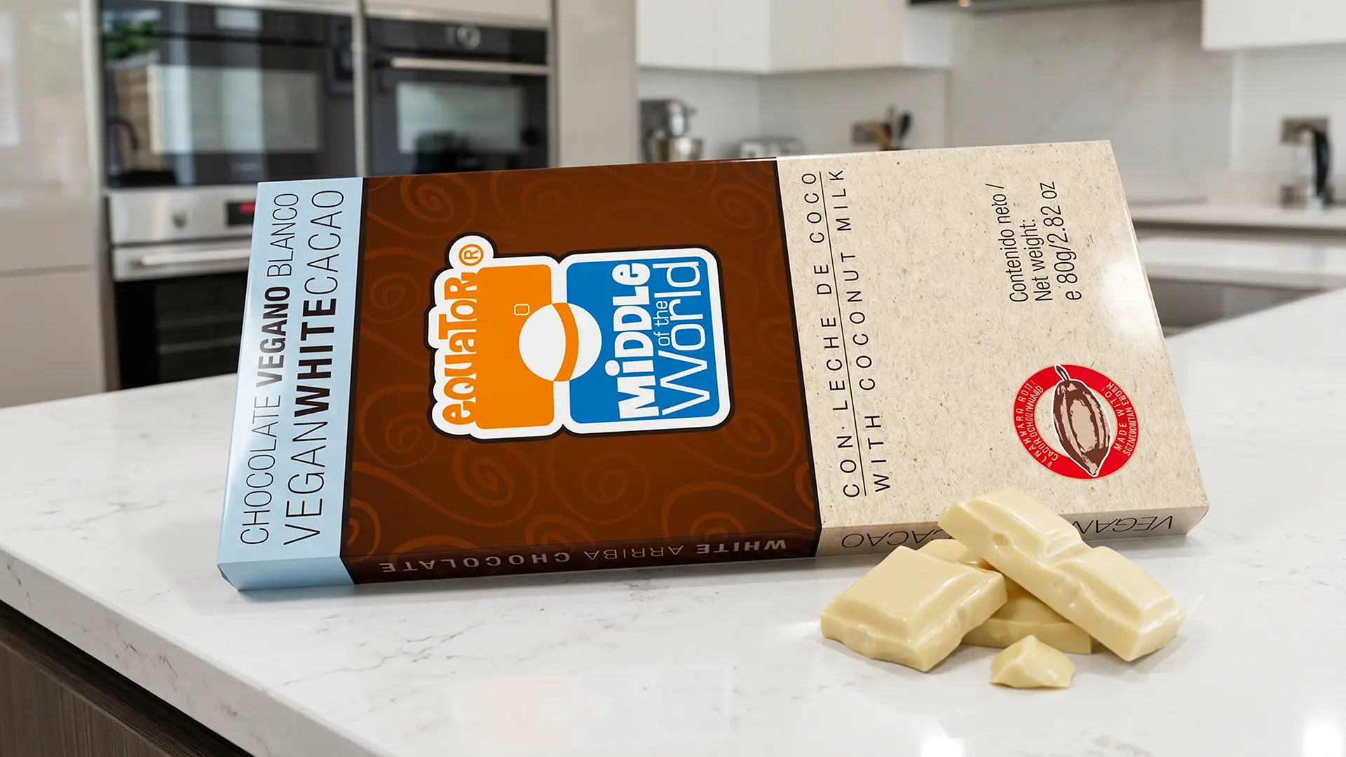
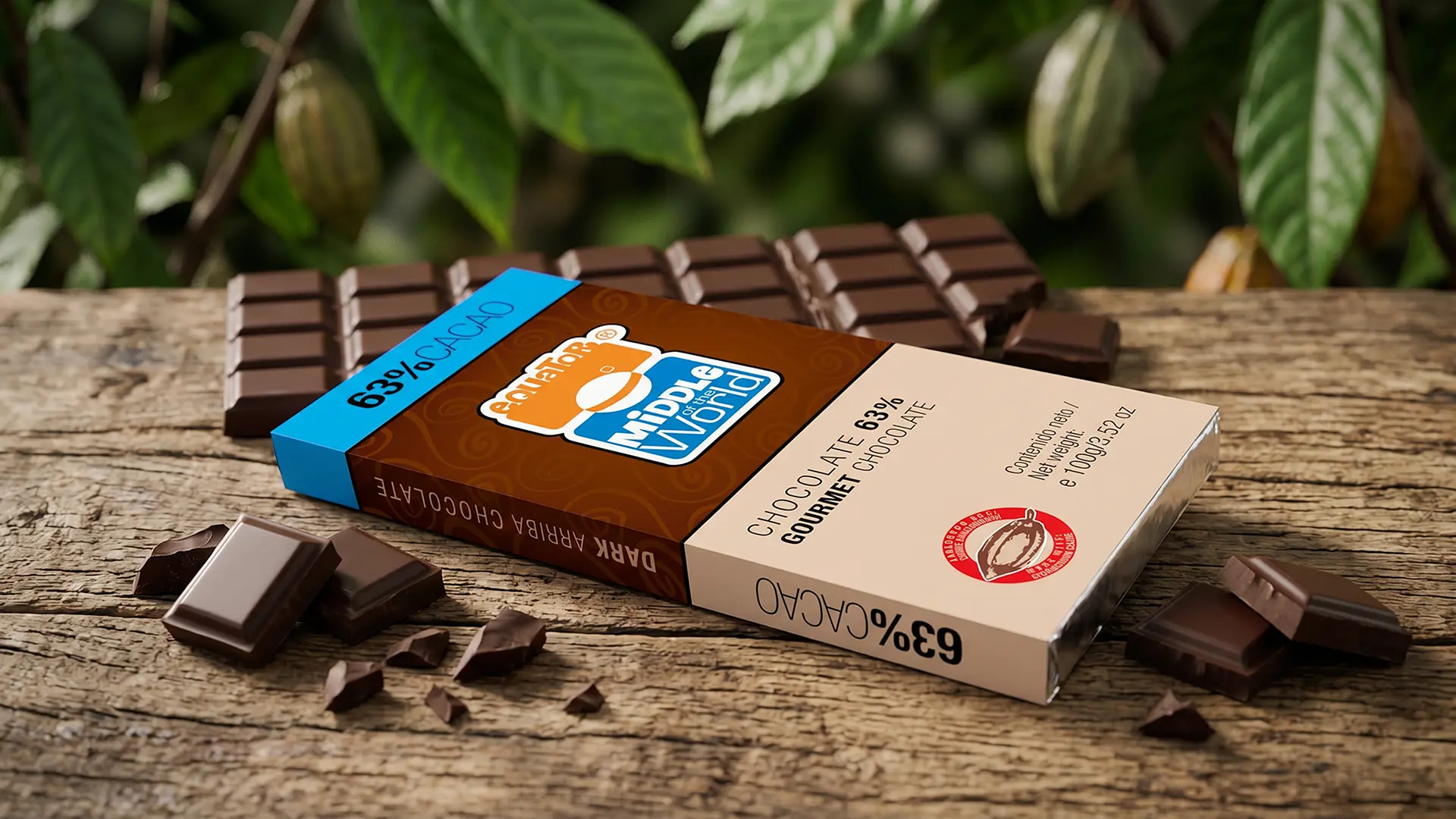
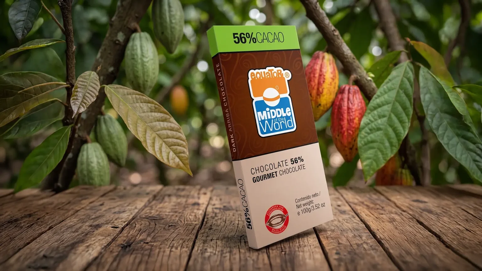
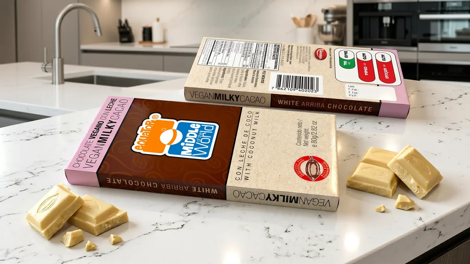
To stand out on the shelves of gourmet stores and premium supermarkets abroad, we needed a proposal that screamed origin, but from a modern and vibrant aesthetic.
“To identify is to differentiate. The first condition of identity is its specificity; if a brand blends with others on the shelf or copies their codes, it abdicates its own existence.”
— Joan Costa.
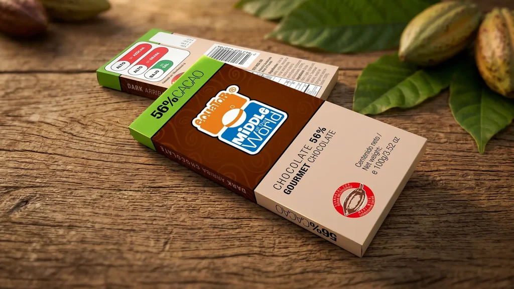
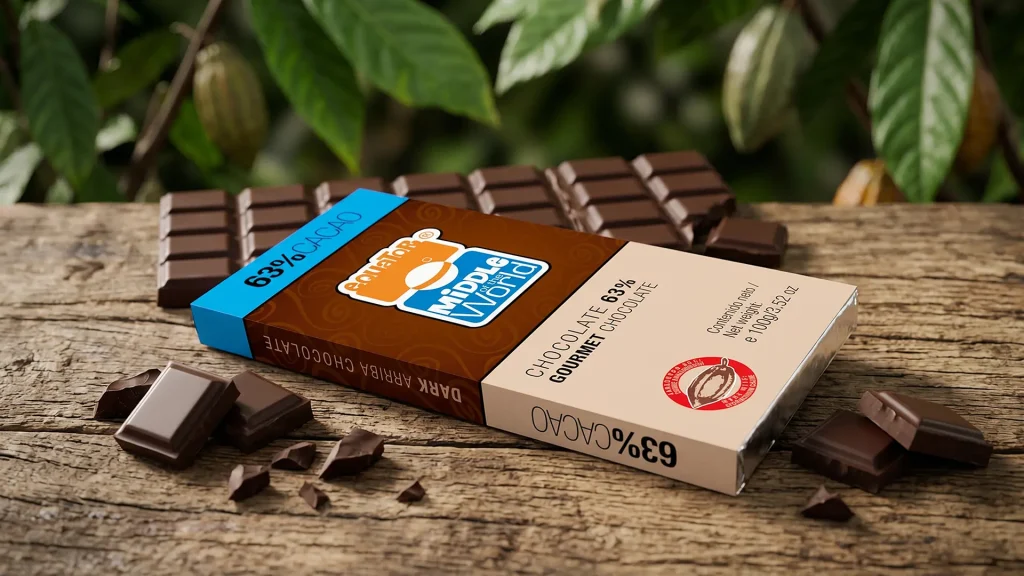
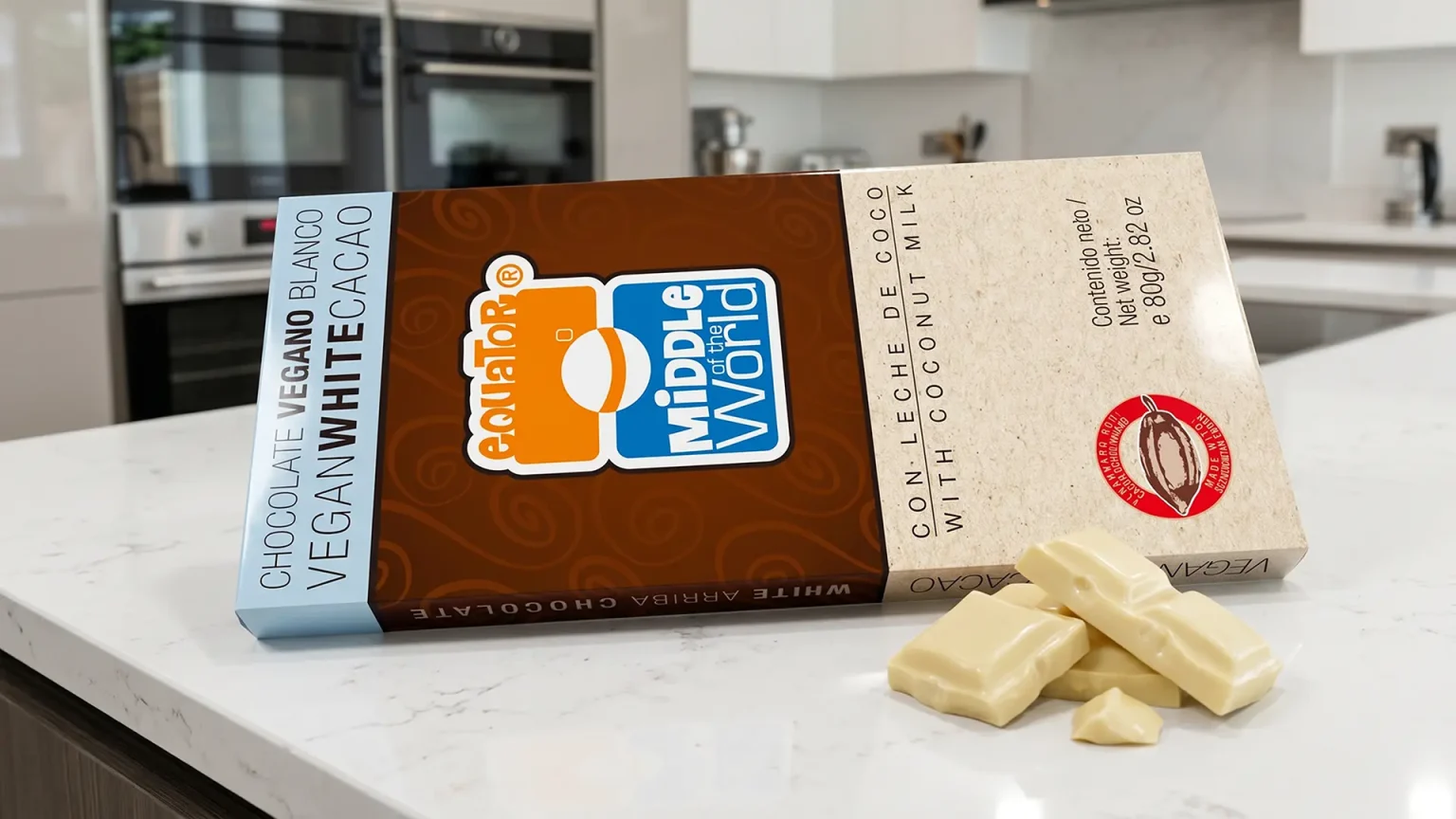
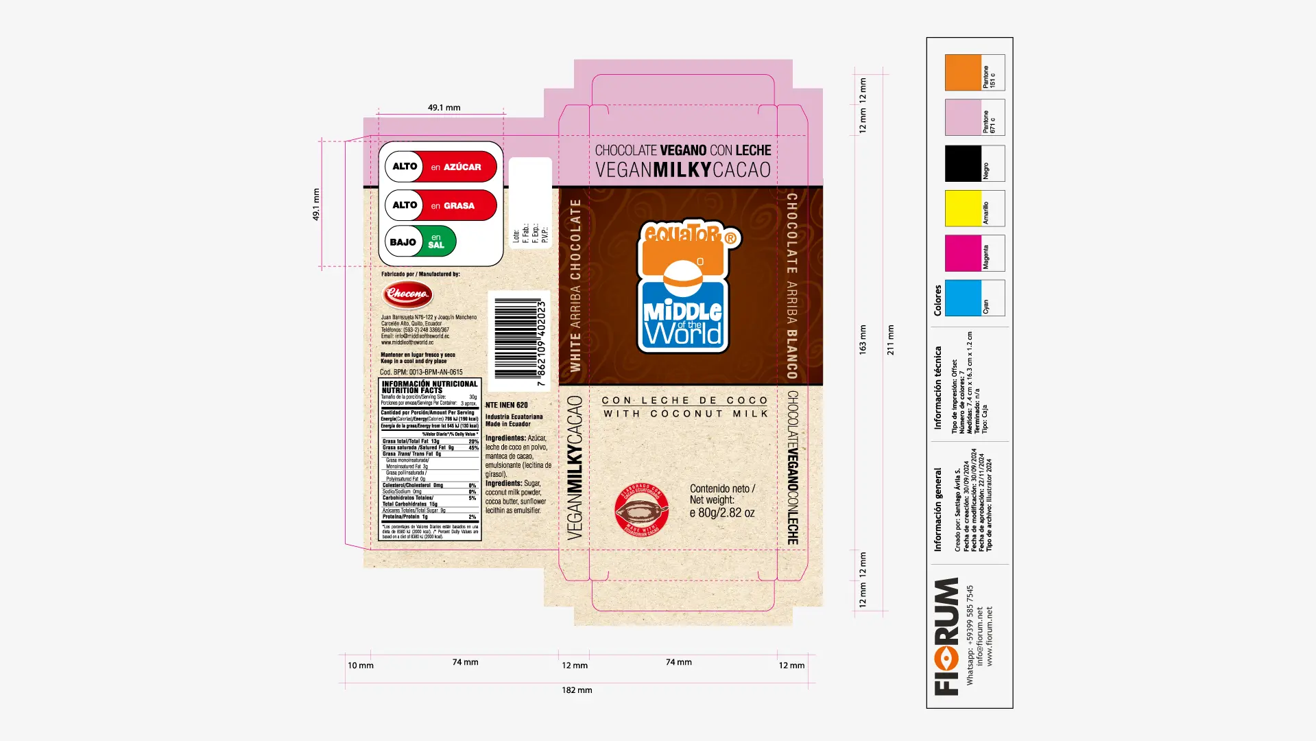
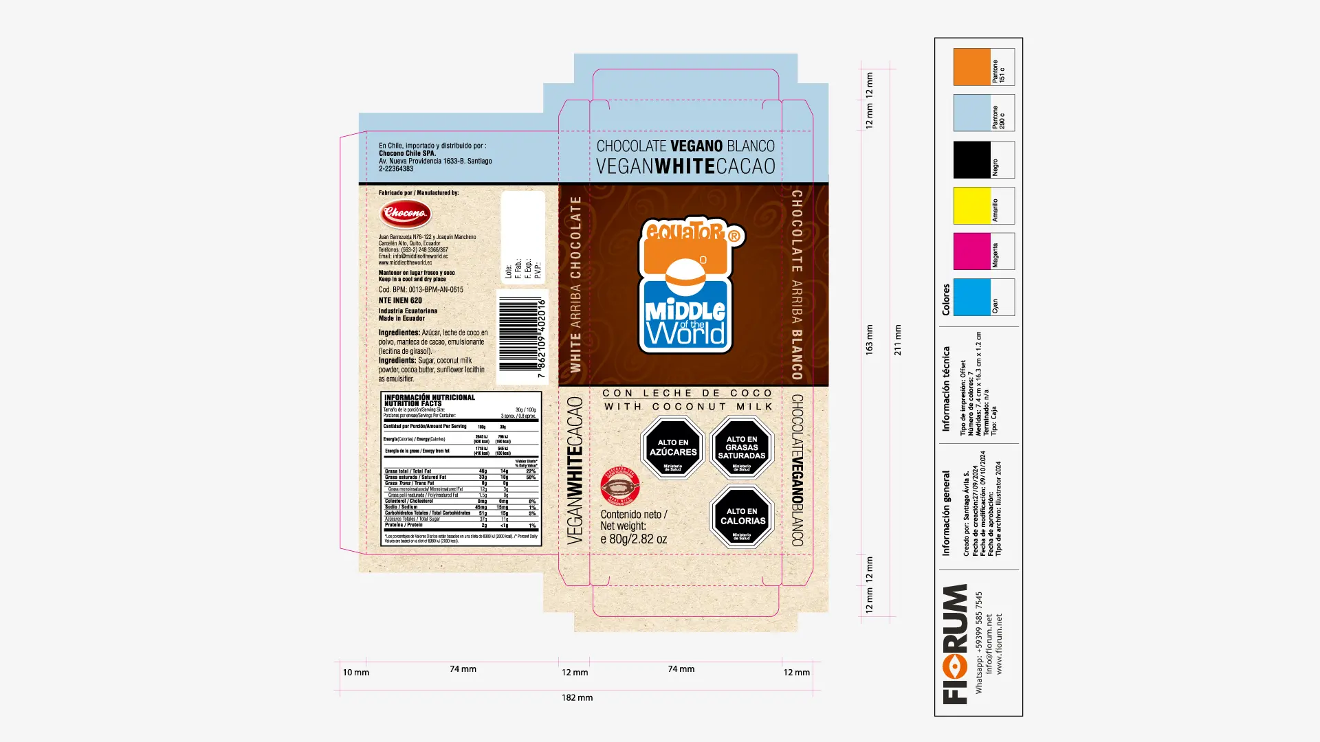
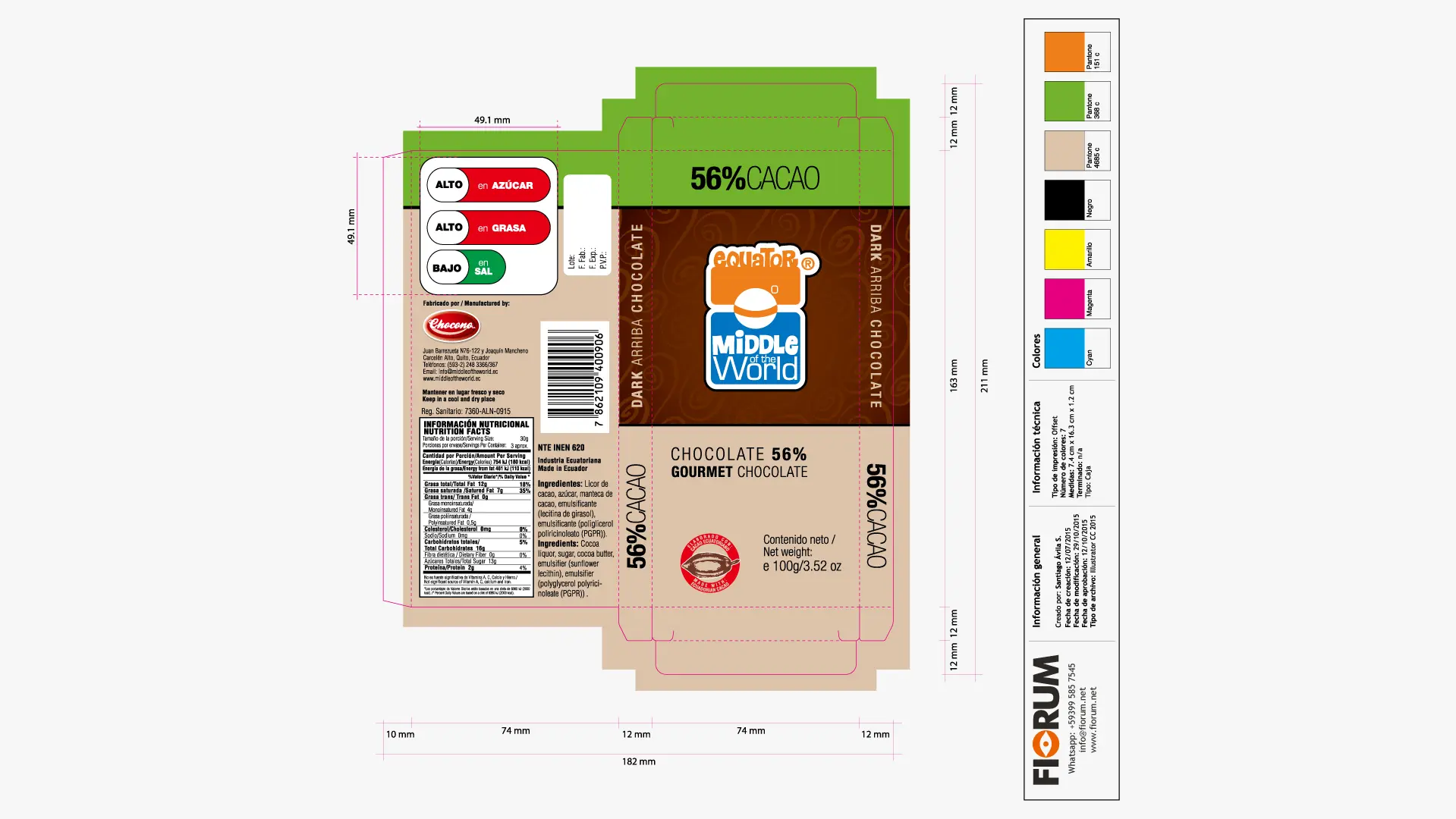
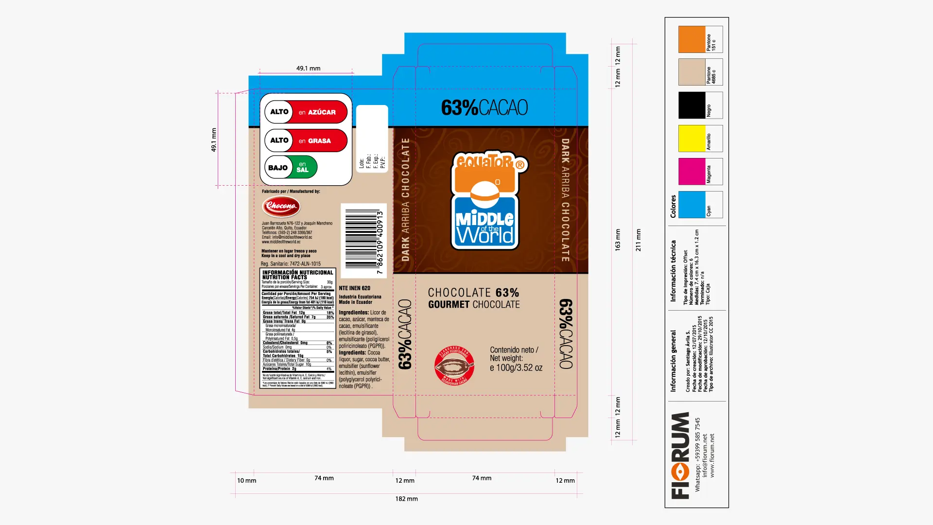
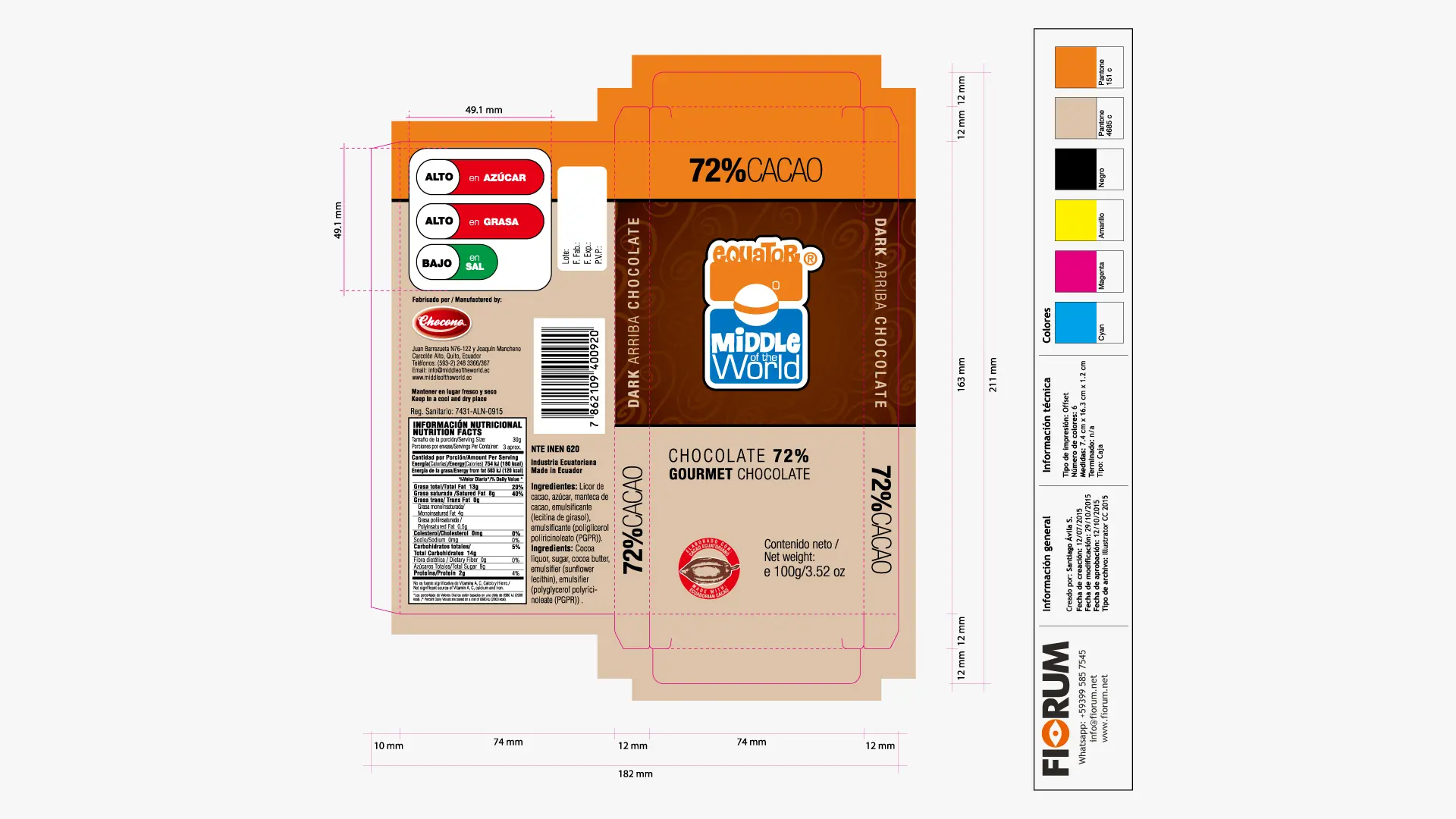
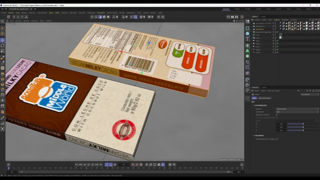
The design strategy consisted of embracing the client’s request not as a contradiction, but as an opportunity for disruption at the point of sale. We developed the concept of “Vital Luxury” through a solid packaging architecture based on geometry and color blocking.
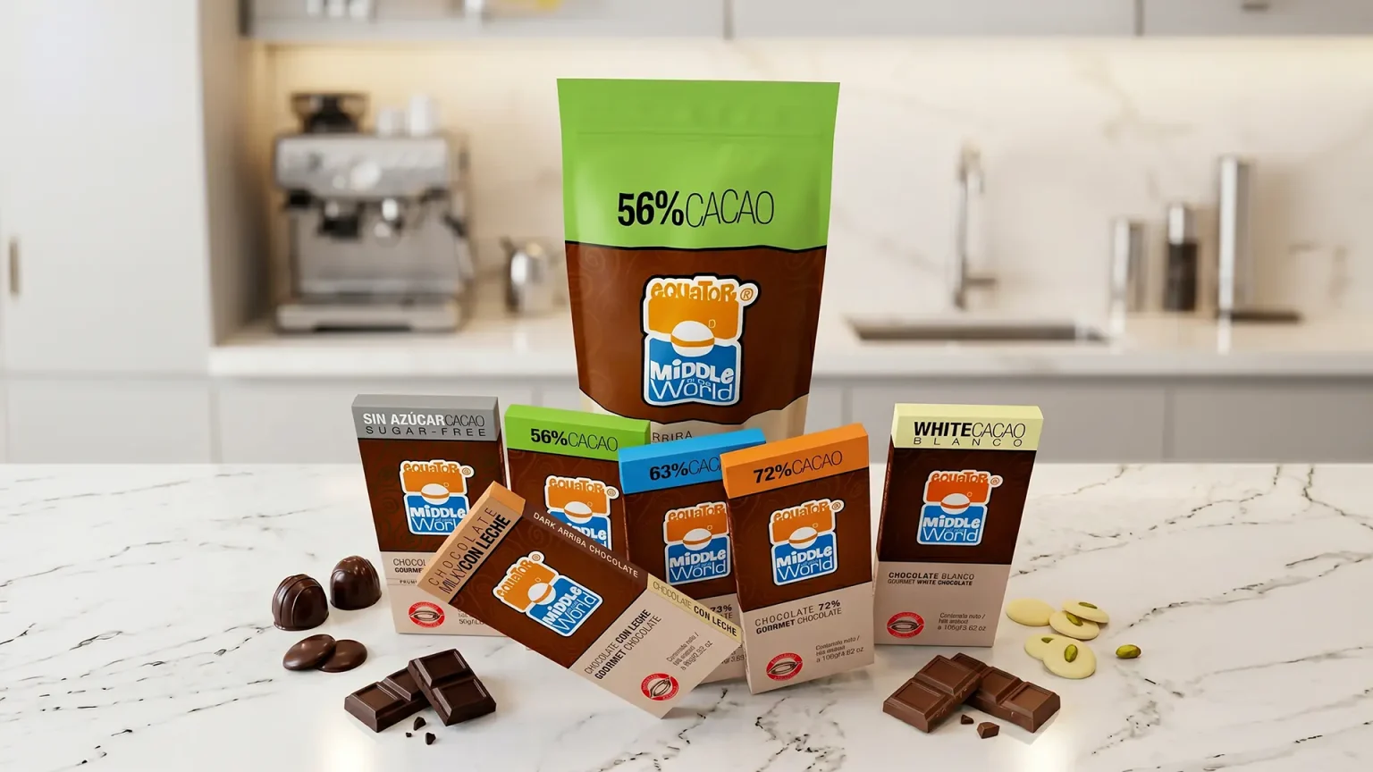
Choosing a cheerful and differentiated packaging transformed Middle of the World into an iconic visual reference on the shelves of local and international supermarkets. The consistency of the graphic system allowed the brand to be perceived not only as premium but also as accessible, friendly, and collectible.
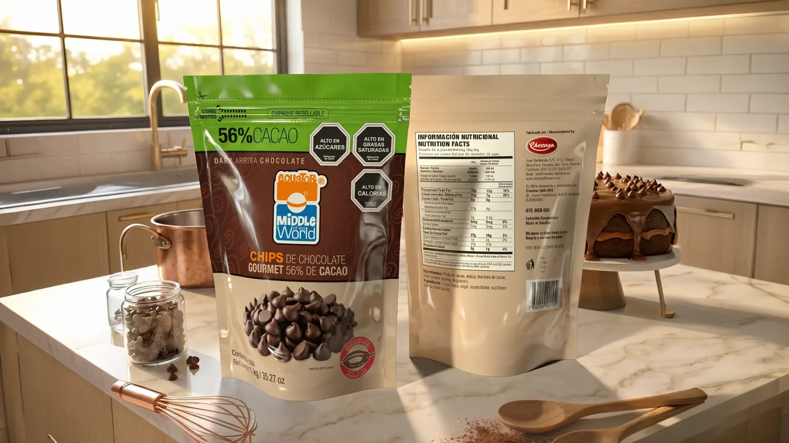
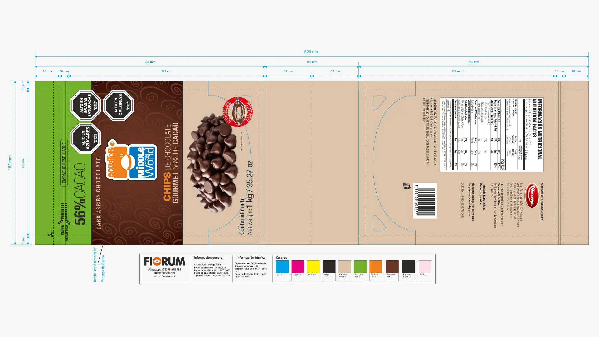
The strength and recognition of the visual identity planted in the original bars was so massive that it has allowed an organic and highly competitive line extension into the baking sector. The design proved to be perfectly scalable for new industrial formats such as 56% chocolate chips and 1kg professional blocks. By transferring the same cheerful chromatic universe to baking packaging, the brand has managed to compete directly with traditional giants in the gastronomic sector, proving that graphic authenticity is the best long-term engine for growth.

“A brand is not a static fact, but a living organism that expands. When design is strategic, the brand becomes a heritage system capable of colonizing new products and markets.”
— Joan Costa.