Case Study: Middle of the World – Visual Disruption in Premium Ecuadorian Chocolate

THE INITIAL CHALLENGE

Breaking the Paradigms of "Dark Luxury"

To stand out on the shelves of gourmet stores and premium supermarkets abroad, we needed a proposal that screamed origin, but from a modern and vibrant aesthetic.


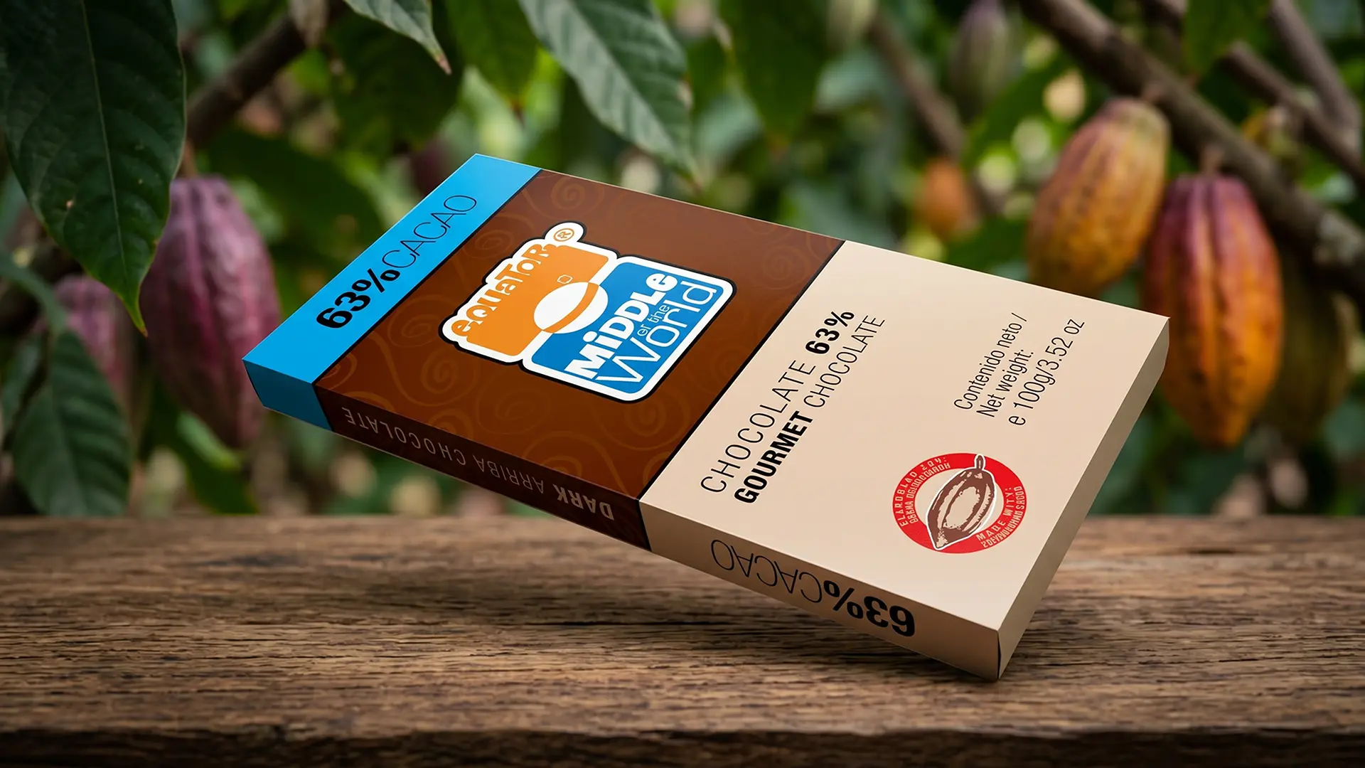
Naming and Identity Strategy: We created the brand Middle of the World Equator, an international, descriptive name with high origin value. The logo design combined a robust and cheerful typography with a central symbol that emulates the spherical division of the planet.

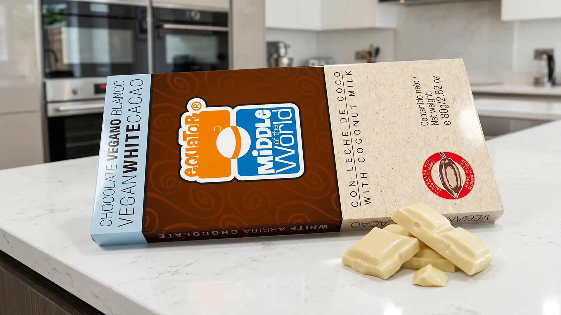
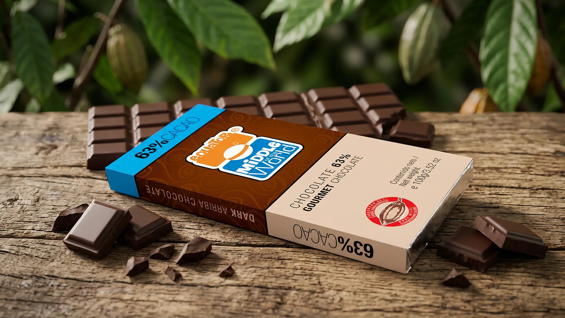
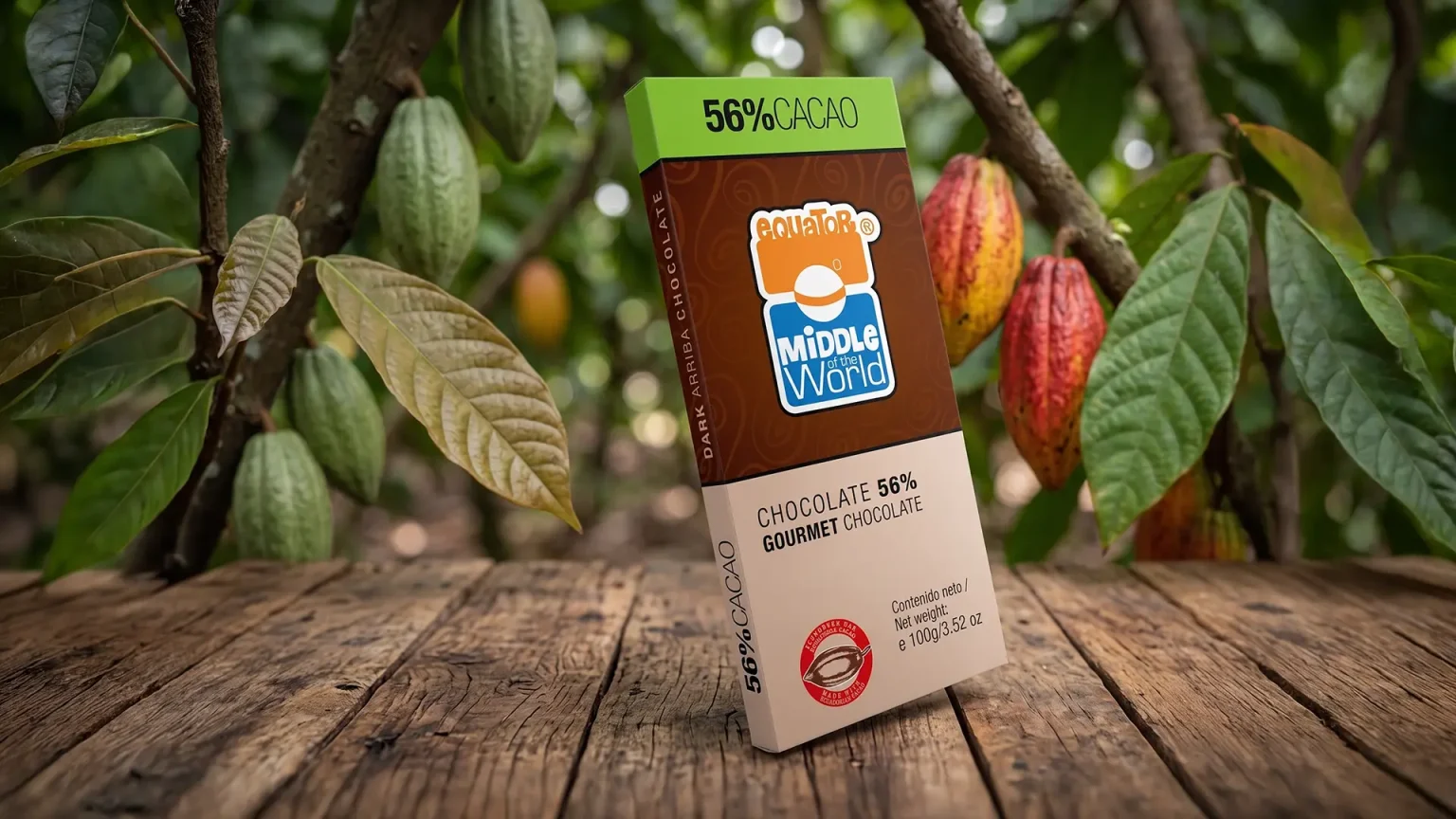
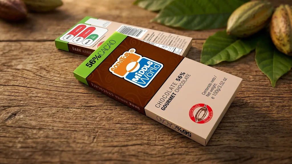
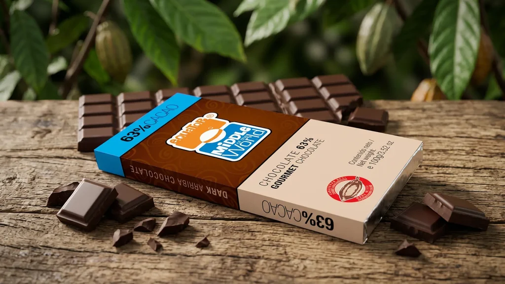
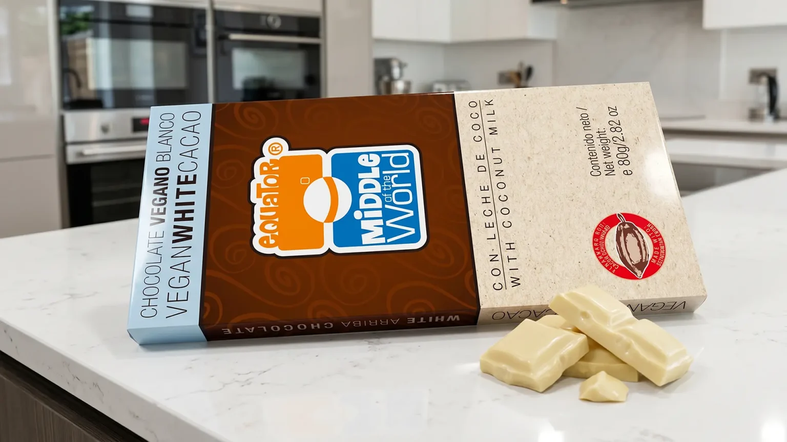
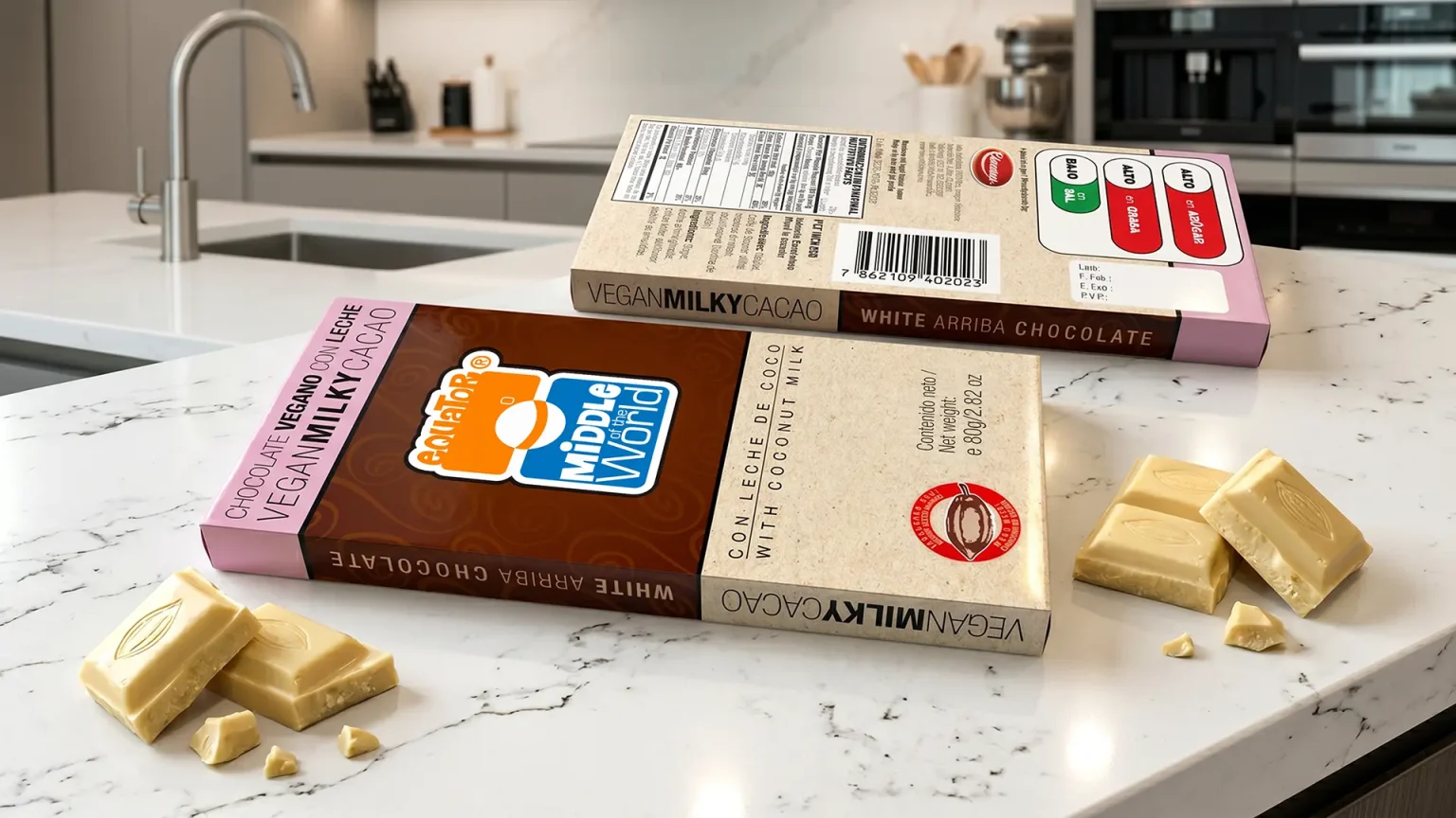
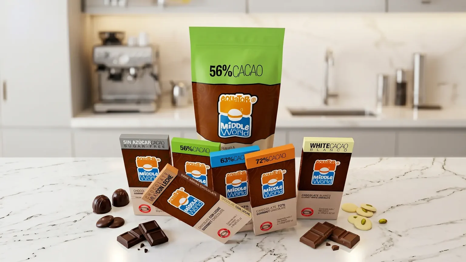
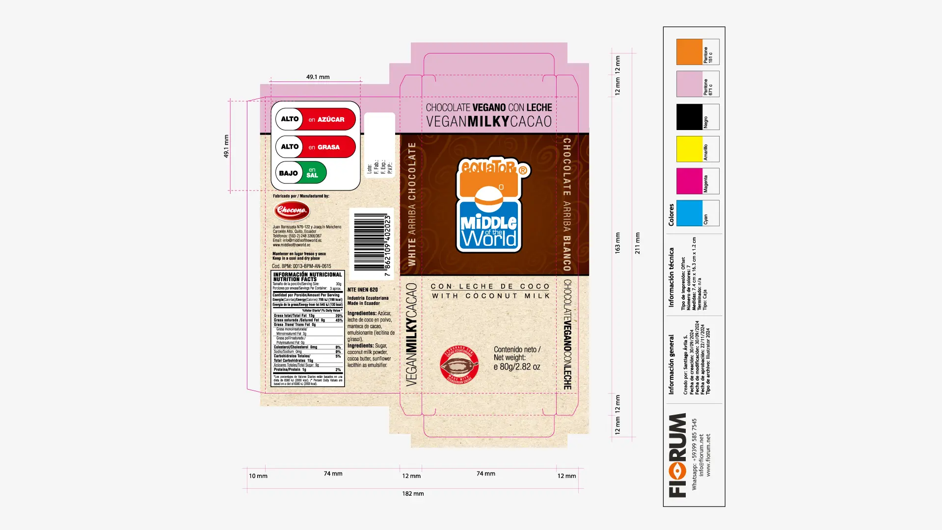
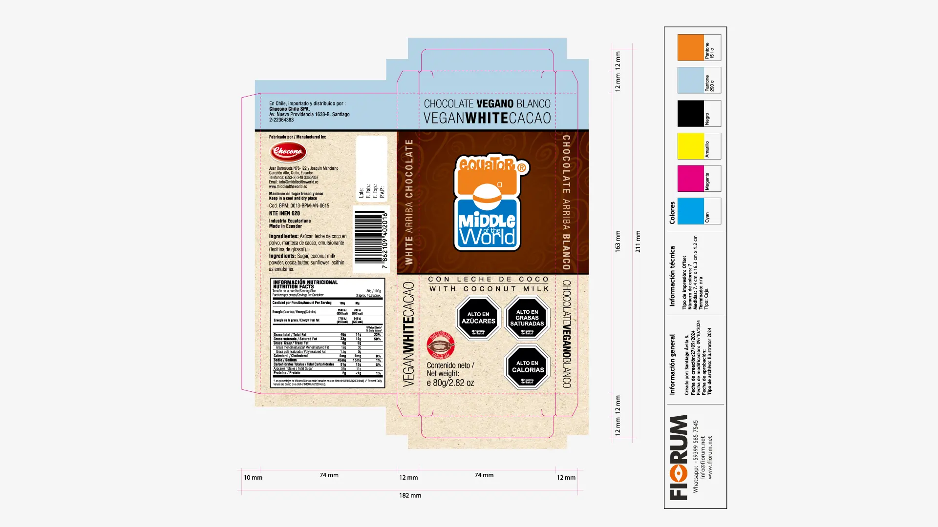
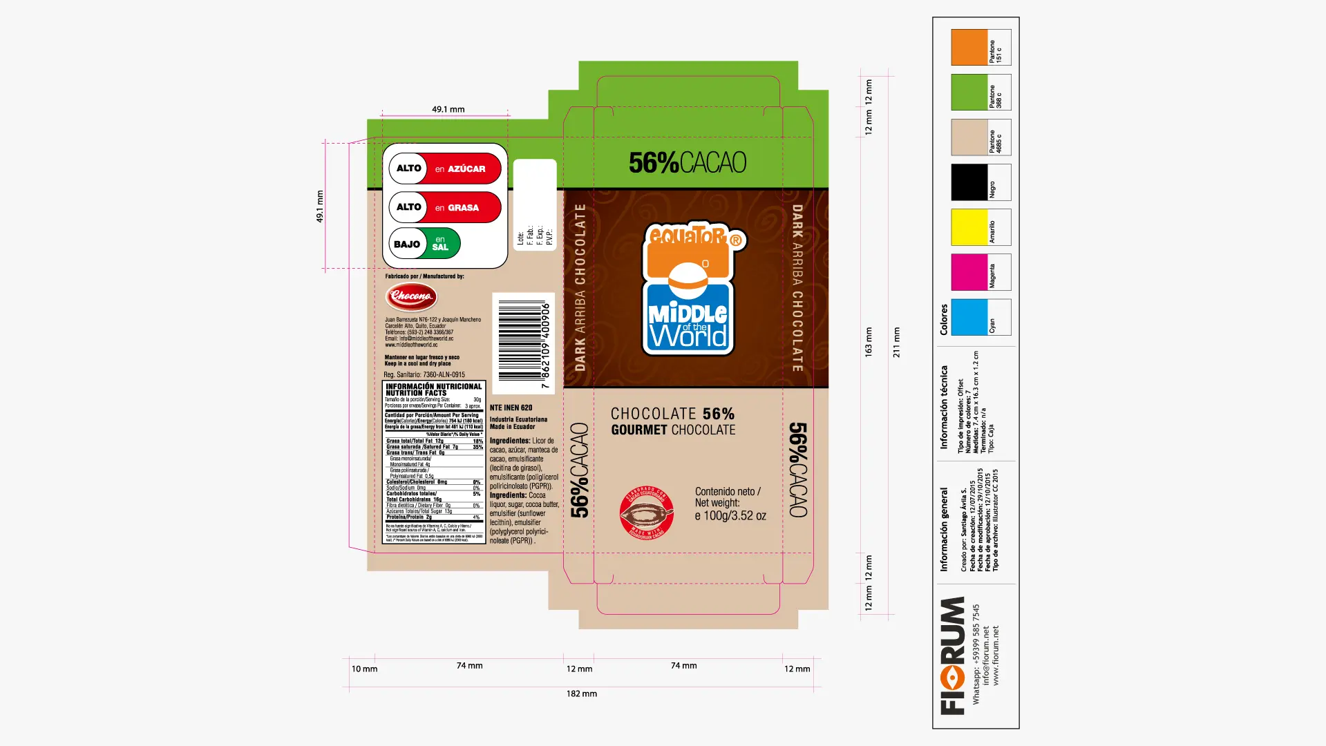
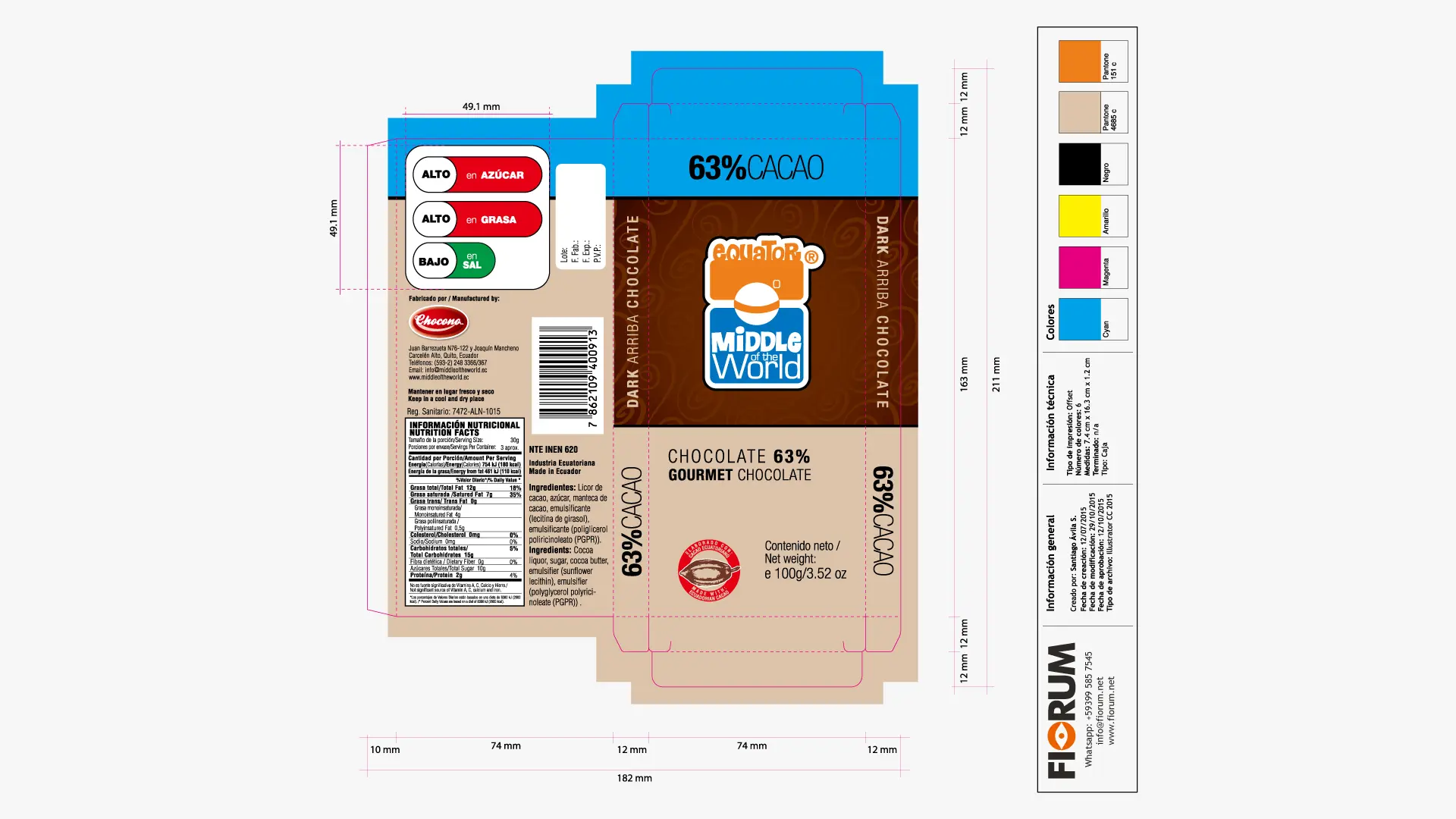
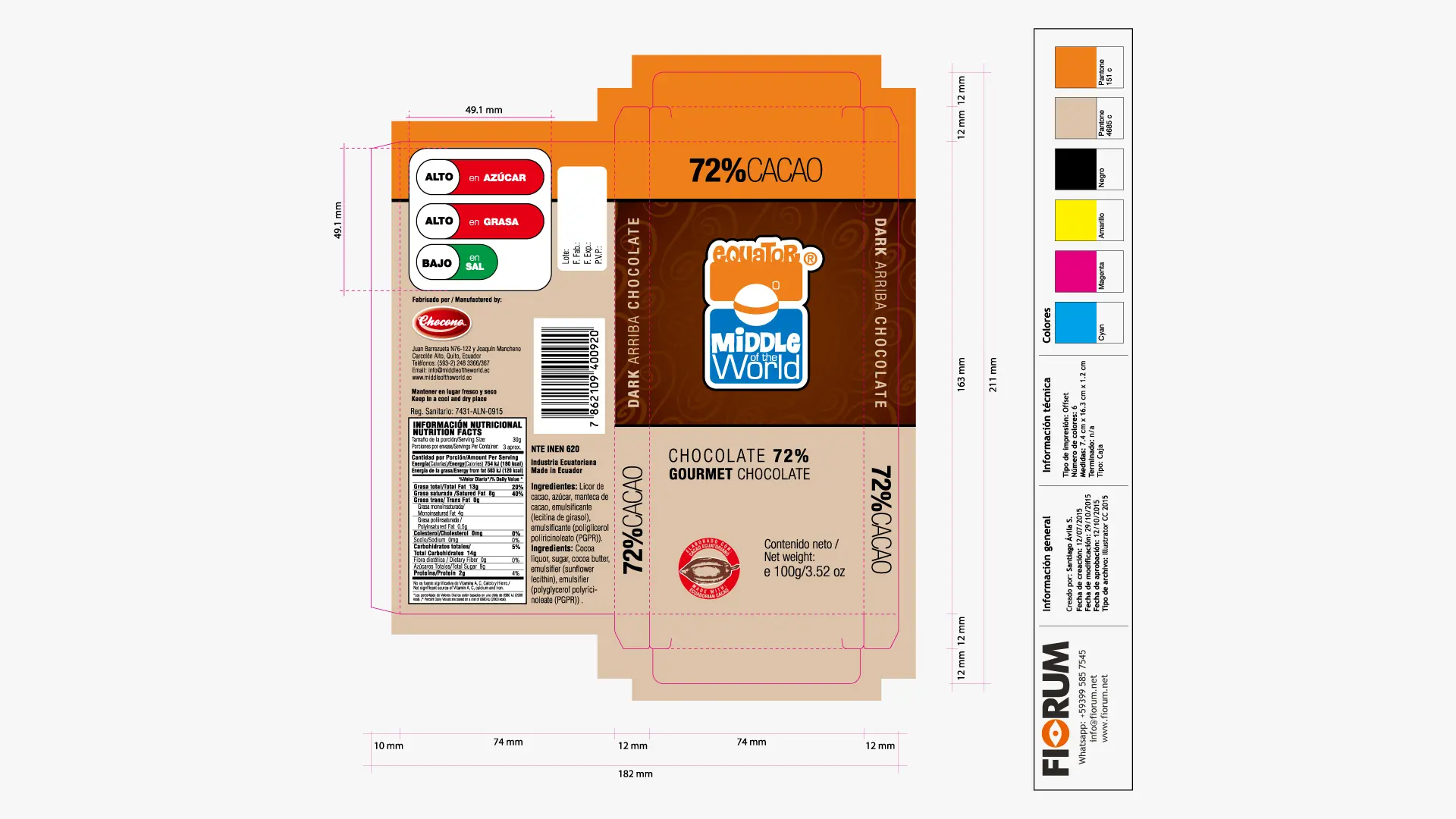
Packaging Design (Dieline and Color): As seen in the technical layout of the 100g box, we structured the packaging into three clear reading levels. A bright colored upper band (lime green in the case of the 56% cocoa) serves as a color code to differentiate purities and variations (63%, 72% Cocoa, vegan, sugar-free, white). The center maintains a textured chocolate strip that validates the richness of the product, and the base sits on a textured cream/sand tone that provides the organic, artisanal and gourmet feel indispensable for the premium market.
“To identify is to differentiate. The first condition of identity is its specificity; if a brand blends with others on the shelf or copies their codes, it abdicates its own existence.”
— Joan Costa.

THE SOLUTION

Color Blocks and Dynamic Brand Architecture

The design strategy consisted of embracing the client’s request not as a contradiction, but as an opportunity for disruption at the point of sale. We developed the concept of “Vital Luxury” through a solid packaging architecture based on geometry and color blocking.

  • Naming & Identity Strategy: We created the brand Middle of the World Equator, an international, descriptive name with high country-of-origin value. The logo design combined robust, cheerful typography with a central symbol emulating the spherical division of the planet.
  • Packaging Design (Dieline and Color): As observed in the technical layout of the 100g box, we structured the packaging into three clear reading levels. A bright colored top stripe (lime green in the case of 56% cacao) serves as a chromatic code to differentiate the purity levels and variations (63%, 72% Cacao, vegan, sugar-free, white). The center maintains a textured chocolate stripe that validates the richness of the product, and the base sits on a textured cream/sand tone that provides the organic, artisanal, and gourmet feel indispensable for the premium market.

THE RESULT

Temporal Scalability and Market Expansion

Choosing a cheerful and differentiated packaging transformed Middle of the World into an iconic visual reference on the shelves of local and international supermarkets. The consistency of the graphic system allowed the brand to be perceived not only as premium but also as accessible, friendly, and collectible.

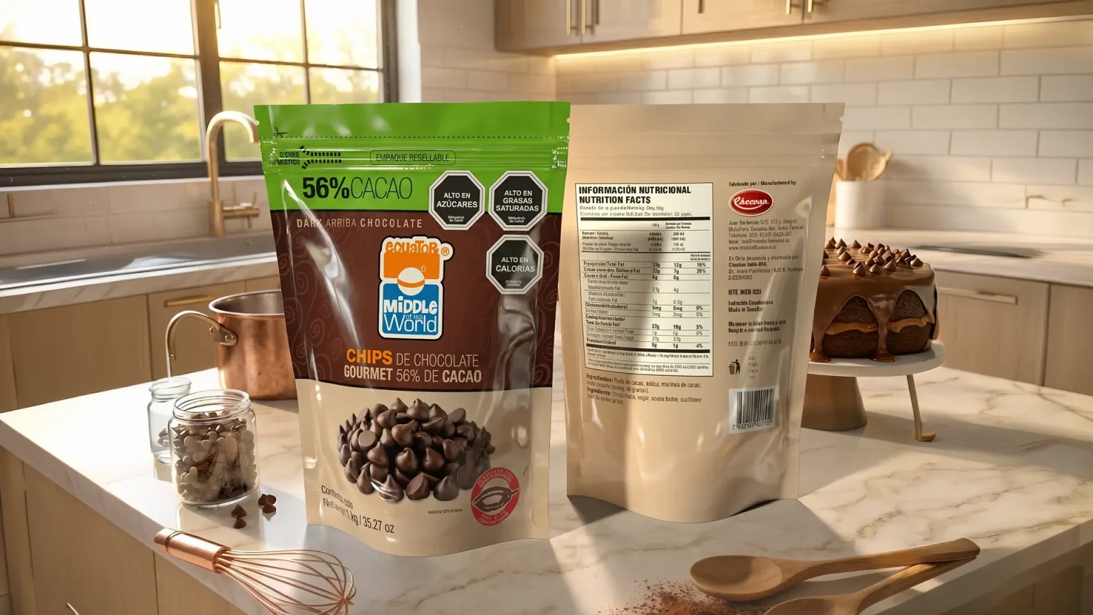
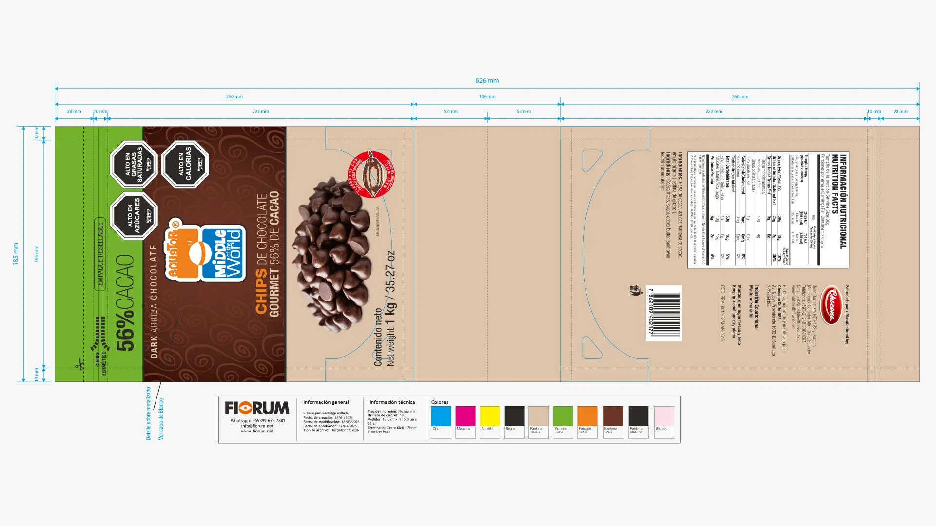
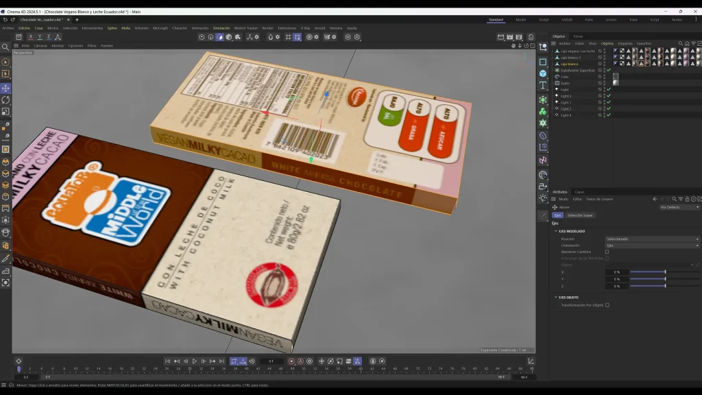
The strength and recognition of the visual identity planted in the original bars was so massive that it has allowed an organic and highly competitive line extension into the baking sector. The design proved to be perfectly scalable for new industrial formats such as 56% chocolate chips and 1kg professional blocks. By transferring the same cheerful chromatic universe to baking packaging, the brand has managed to compete directly with traditional giants in the gastronomic sector, proving that graphic authenticity is the best long-term engine for growth.

“A brand is not a static fact, but a living organism that expands. When design is strategic, the brand becomes a heritage system capable of colonizing new products and markets.”
— Joan Costa.

Our Strategic Contribution

Diagnosis & Technical Research

  • Audit of visual codes: Analysis of the brand identity in relation to market aesthetic trends and competitor visual languages.
  • Technical production mapping: On‑site survey of technological capabilities in the plant, including machinery and printing systems (flexographic, offset, and substrates).
  • Brand‑pain diagnosis: Identification of anachronisms or disconnects between the company’s industrial reality and its visual projection.
  • Action plan: Clear and feasible methodological recommendations for transforming the brand identity.

Brand Strategy & Architecture

  • Corporate concept and narrative (Brandstory): Definition of the company’s DNA and core values through a synthesis‑driven approach.
  • Creative brief development: Structuring the strategic pillars that will guide the design solution.
  • Normative identity manual: Precise vector‑based guidelines, clear control of exclusion zones, industrial typefaces, and chromatic application standards.

Packaging Design & Visual Identity

  • Logo redesign and innovation: Creation of timeless, functional graphic marks with high visual impact, fully prepared for industrial deployment.
  • Graphic design for packaging and labels: Aesthetic development focused on shelf visibility (shelf‑appeal) and the justification of premium value.
  • Prepress optimization: Technical configuration of files optimized for high‑definition flexographic printing and micrometer‑level control.

Editorial Design & Corporate Communication

  • Specialized structuring and layout: Design of corporate reports, technical product catalogs, brochures, and institutional portfolios.
  • Grids and information architecture: Systematic organization of complex content to ensure a fluid, professional, and ergonomic reading experience.
  • Transmedia consistency: Adaptation of brand codes to both printed and digital editorial environments, ensuring uniformity of the overall look & feel.

Looking to launch your project?

Fiorum
Privacy Overview

This website uses cookies so that we can provide you with the best user experience possible. Cookie information is stored in your browser and performs functions such as recognising you when you return to our website and helping our team to understand which sections of the website you find most interesting and useful.