Case Study: Enerfrut – Packaging Redesign for Premium Granola Bars

THE INITIAL CHALLENGE

From Invisibility to Top Positioning

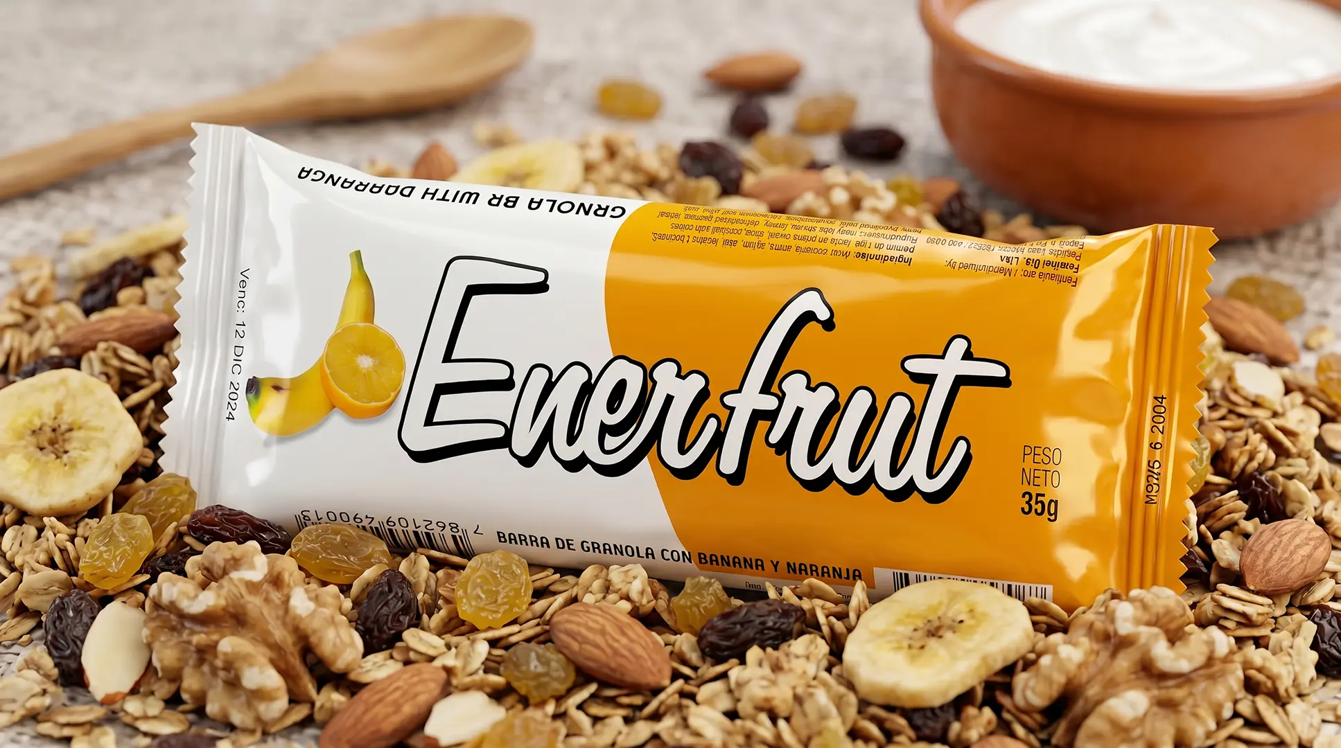
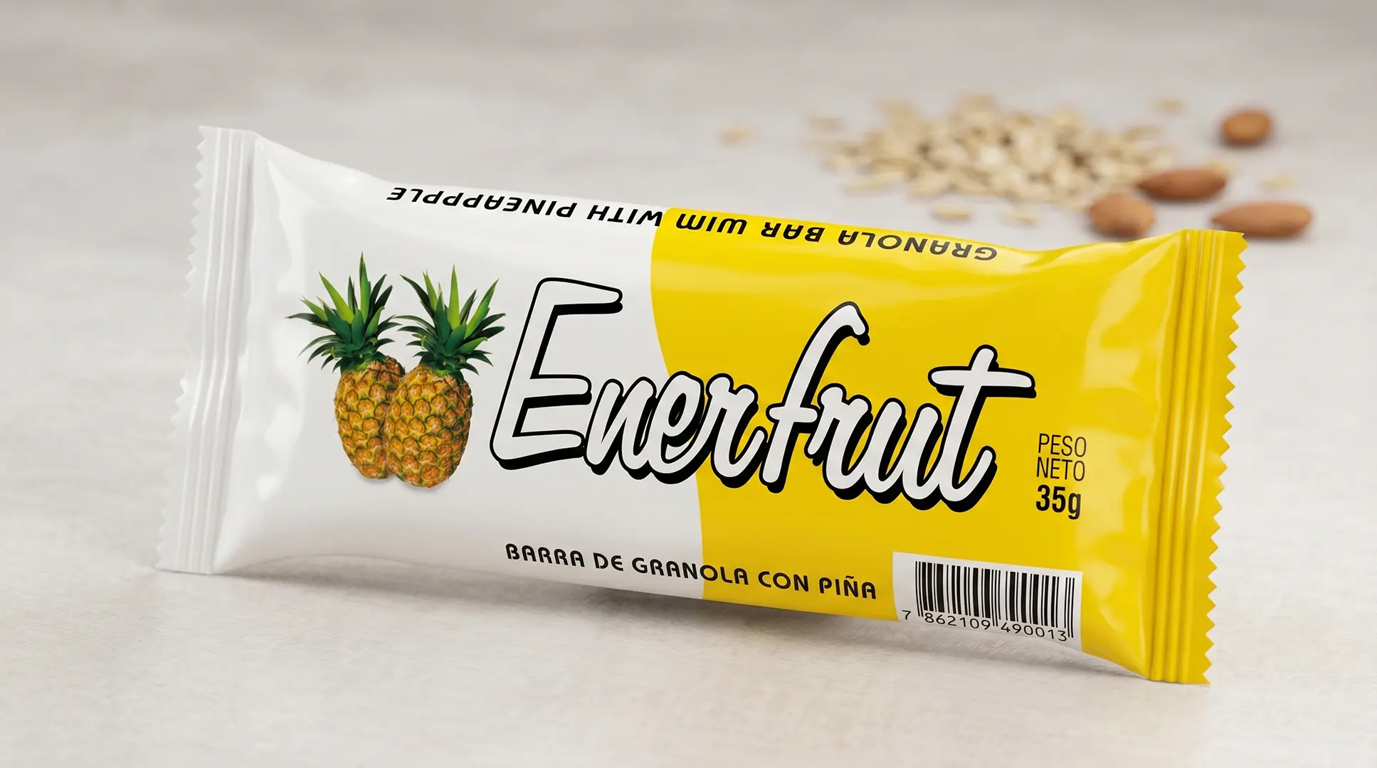
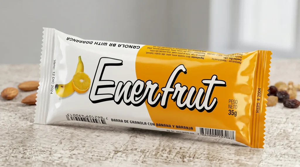
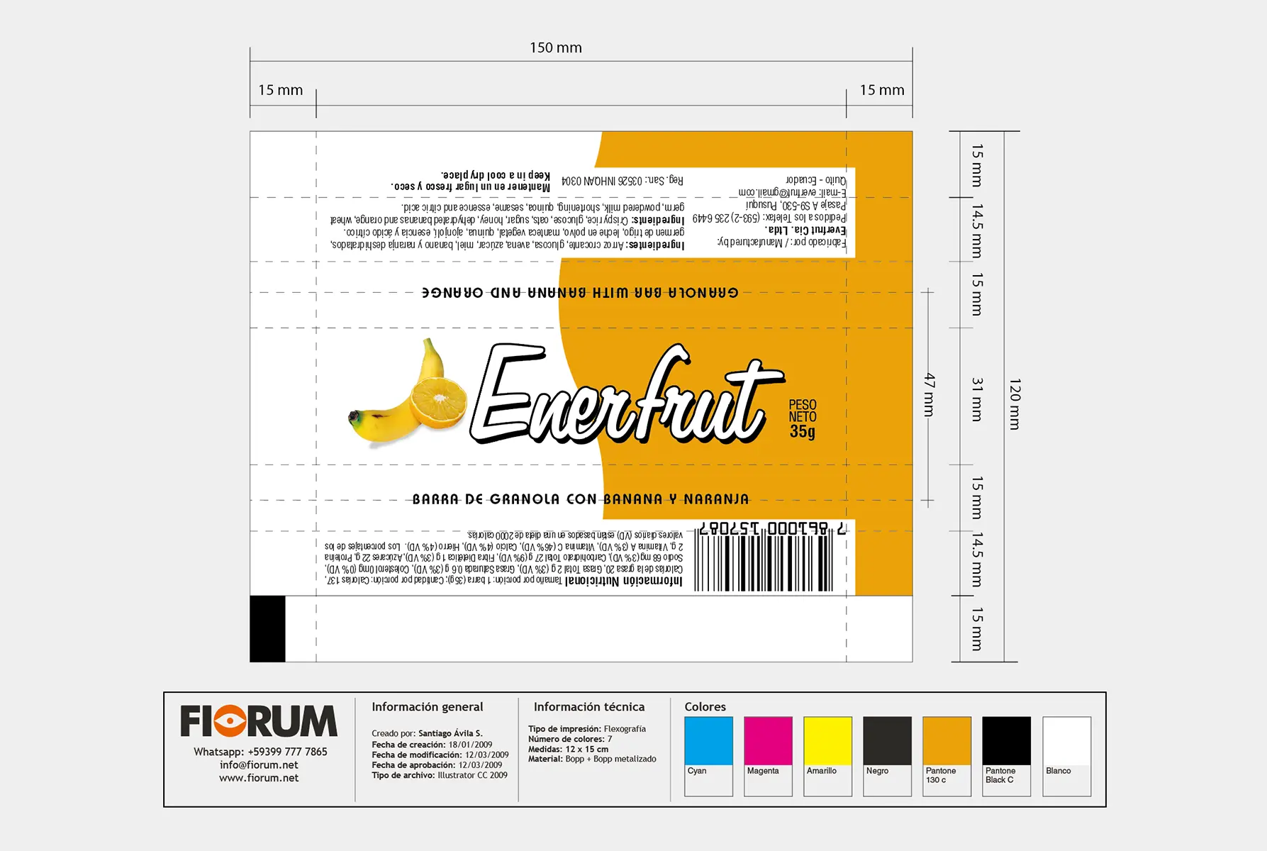
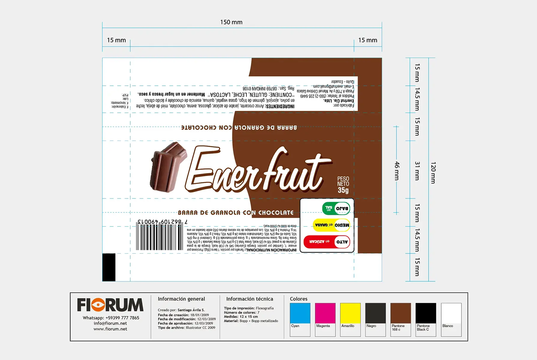
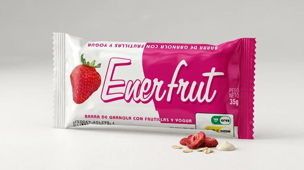
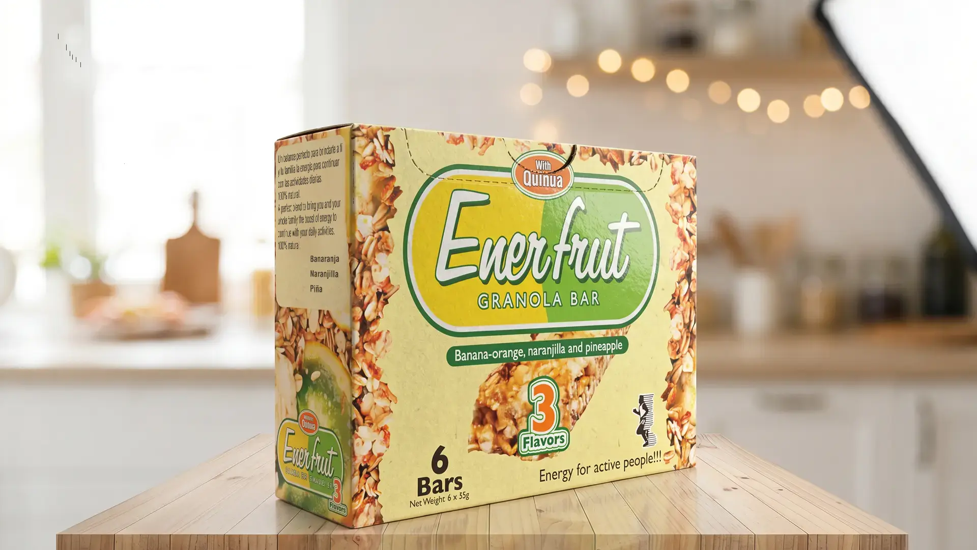
17 years ago, Enerfrut arrived with packaging that failed to communicate the richness and quality of its ingredients. The brand suffered from an excessively thin typeface that got lost on the supermarket shelf, and the overall design did not highlight the healthy benefits of its variations (Top, Fruits, Naranjilla, Strawberry with Yogurt). The strategic challenge consisted of redesigning the visual identity and packaging so that Enerfrut looked really natural and appetizing, reinforcing its value as a premium product for athletes and people with a healthy lifestyle, without losing its essence.
“Brand identity is its reality principle. Changing the design is not just changing the aesthetics, it is updating the message so that the product is understood and valued by its audience.”
— Joan Costa.

THE SOLUTION

A Visual Oasis of Ingredients and Premium Elegance

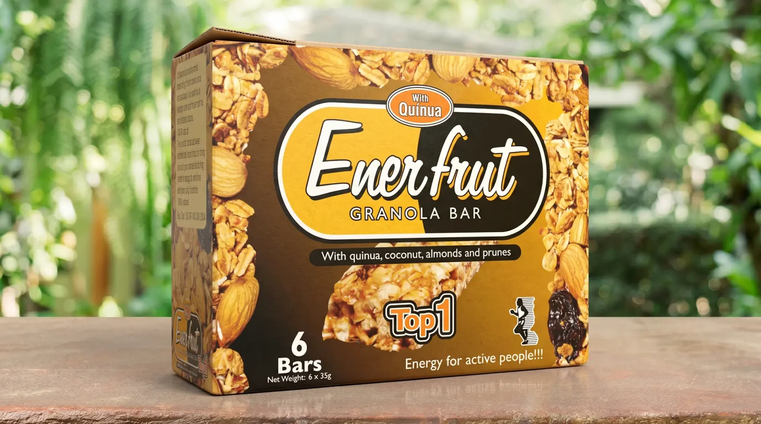
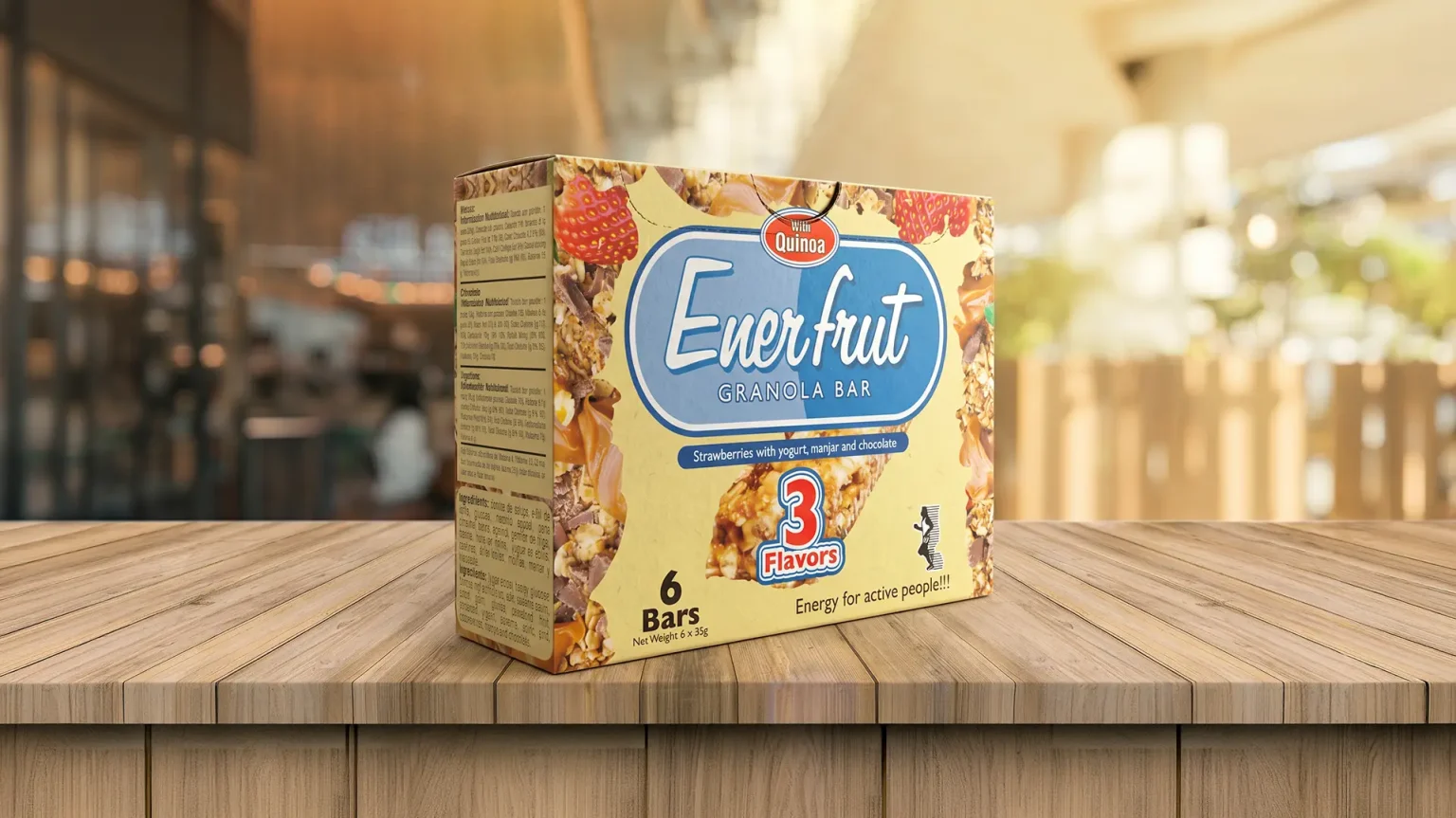
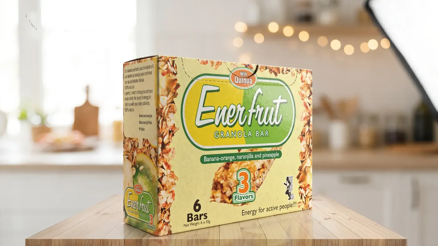
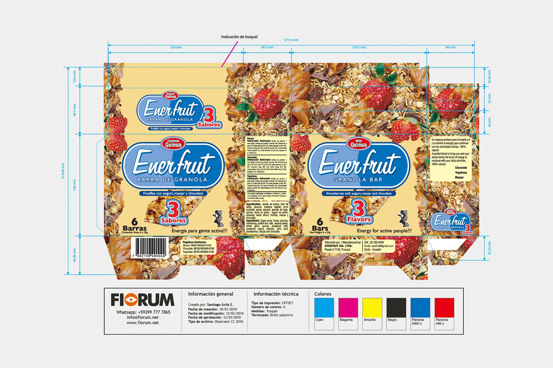
The design strategy focused on the Honesty of the Ingredient. We implemented close-up photographs of oats, quinoa, walnuts, and almonds, wrapping the box to create a tactile and visual texture that screamed “100% natural.”

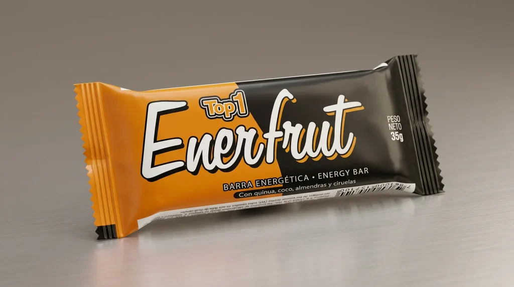
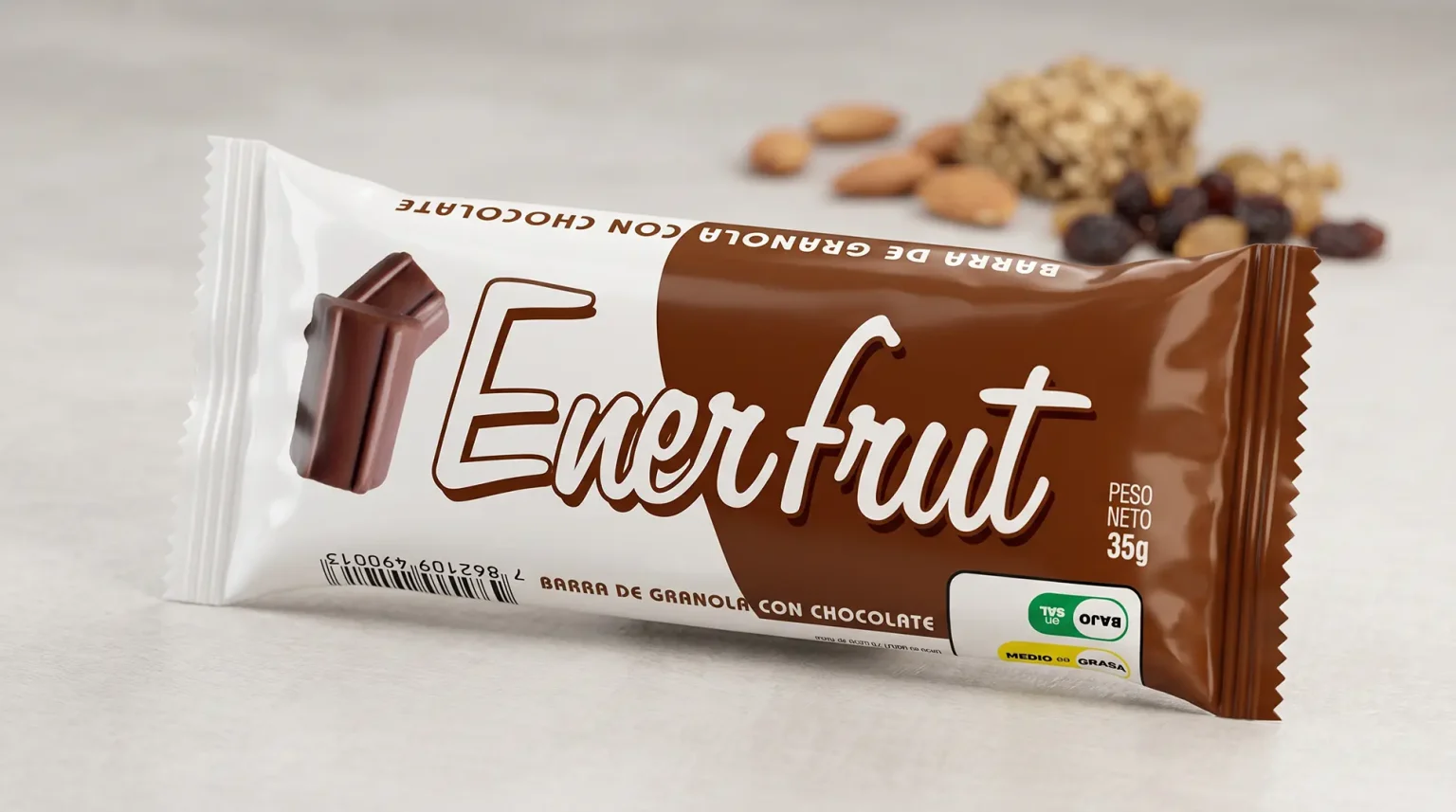
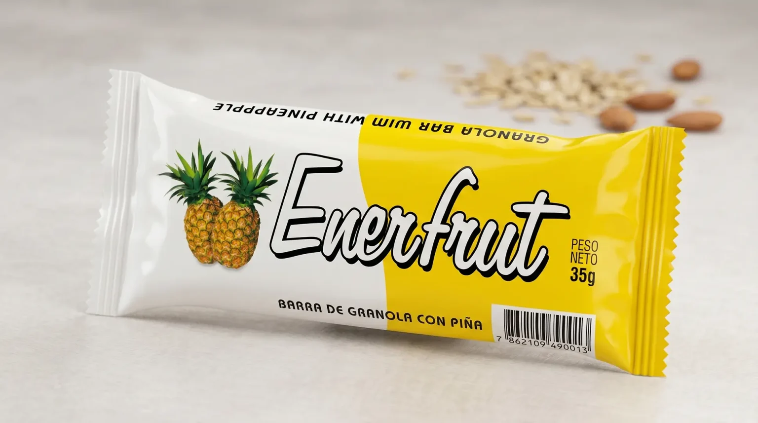
  • Brand Redesign: We transformed the light typography into a powerful brand, with body and visibility, ensuring that the name “Enerfrut” was readable even from a distance in the supermarket aisle.
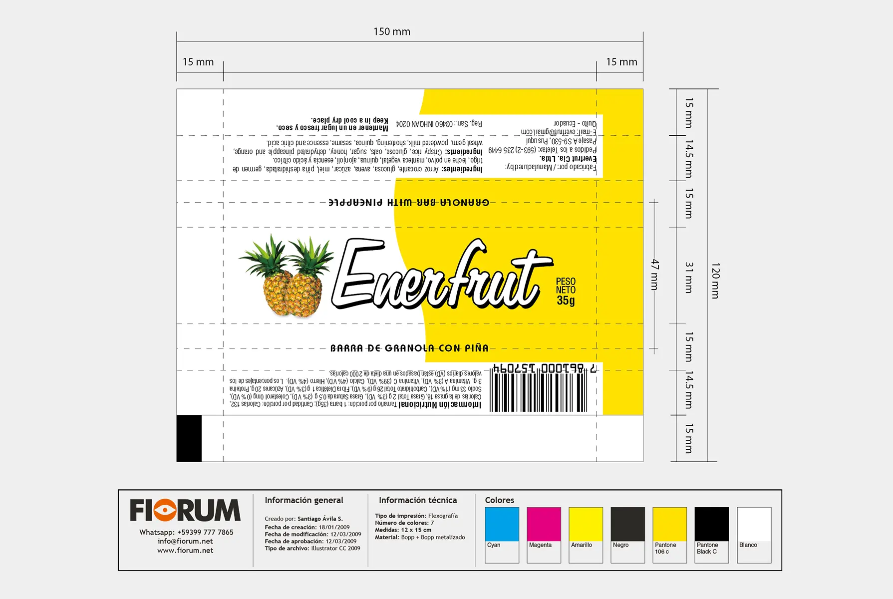
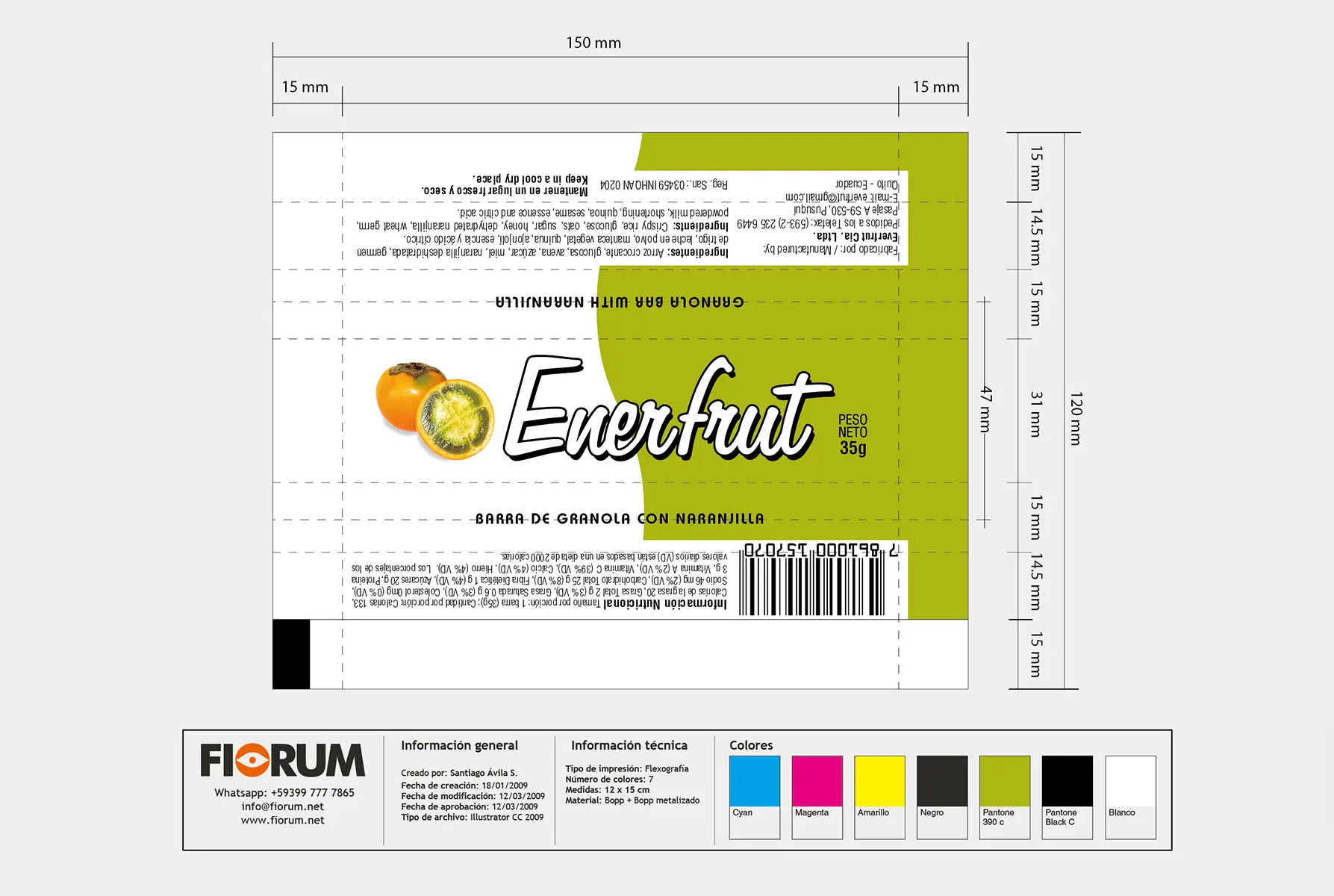
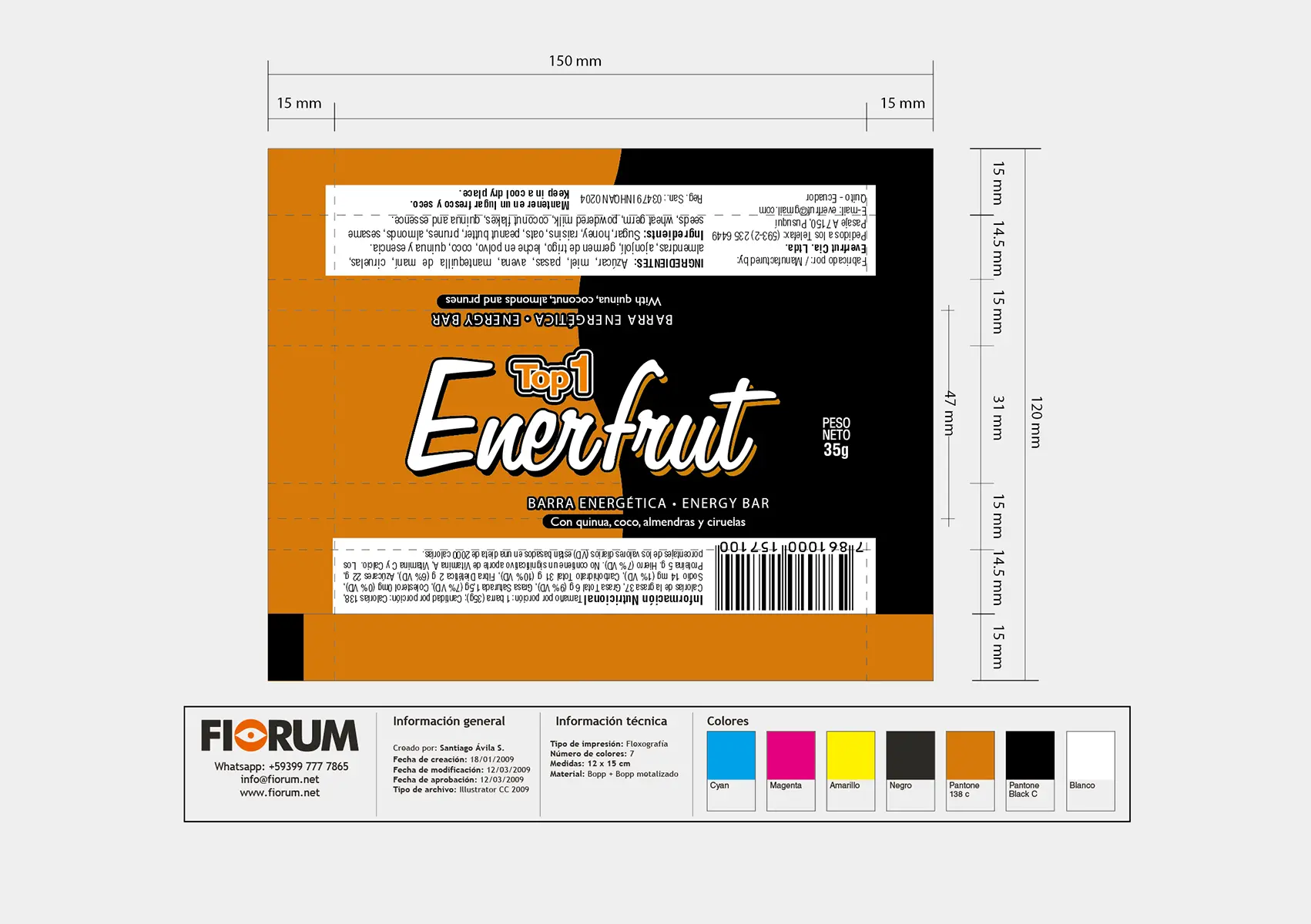
  • Strategic Chromatic Code: For the “Top” variation, we used a palette of deep black and gold yellow, instantly communicating that it was a premium and “fun” option, without losing the connection with the athletic public. For the other variations, we adapted the colors to the key fruits and ingredients (blue, green, etc.), maintaining visual coherence.

THE RESULT

A Contemporary Design That Transcends Time

The redesign was an immediate growth engine for the client. The brand achieved a solid positioning in the supermarket, standing out from the competition thanks to its contemporary, clean image and visual honesty. The success of the design has been such that, after 17 years, the brand remains intact and continues to sell actively, demonstrating that a well-executed strategic design does not expire and becomes an invaluable asset for the company.
“The graphic form of the brand must possess an unmistakable visual impact. If the brand is not read or does not stand out in its environment, it simply does not exist in the consumer’s mind.”
— Joan Costa.

Our Strategic Contribution

Diagnosis & Technical Research

  • Audit of visual codes: Analysis of the brand identity in relation to market aesthetic trends and competitor visual languages.
  • Technical production mapping: On‑site survey of technological capabilities in the plant, including machinery and printing systems (flexographic, offset, and substrates).
  • Brand‑pain diagnosis: Identification of anachronisms or disconnects between the company’s industrial reality and its visual projection.
  • Action plan: Clear and feasible methodological recommendations for transforming the brand identity.

Brand Strategy & Architecture

  • Corporate concept and narrative (Brandstory): Definition of the company’s DNA and core values through a synthesis‑driven approach.
  • Creative brief development: Structuring the strategic pillars that will guide the design solution.
  • Normative identity manual: Precise vector‑based guidelines, clear control of exclusion zones, industrial typefaces, and chromatic application standards.

Packaging Design & Visual Identity

  • Logo redesign and innovation: Creation of timeless, functional graphic marks with high visual impact, fully prepared for industrial deployment.
  • Graphic design for packaging and labels: Aesthetic development focused on shelf visibility (shelf‑appeal) and the justification of premium value.
  • Prepress optimization: Technical configuration of files optimized for high‑definition flexographic printing and micrometer‑level control.

Editorial Design & Corporate Communication

  • Specialized structuring and layout: Design of corporate reports, technical product catalogs, brochures, and institutional portfolios.
  • Grids and information architecture: Systematic organization of complex content to ensure a fluid, professional, and ergonomic reading experience.
  • Transmedia consistency: Adaptation of brand codes to both printed and digital editorial environments, ensuring uniformity of the overall look & feel.

Looking to launch your project?

Fiorum
Privacy Overview

This website uses cookies so that we can provide you with the best user experience possible. Cookie information is stored in your browser and performs functions such as recognising you when you return to our website and helping our team to understand which sections of the website you find most interesting and useful.