Geometry, Theoretical Density, and Visual Synchrony
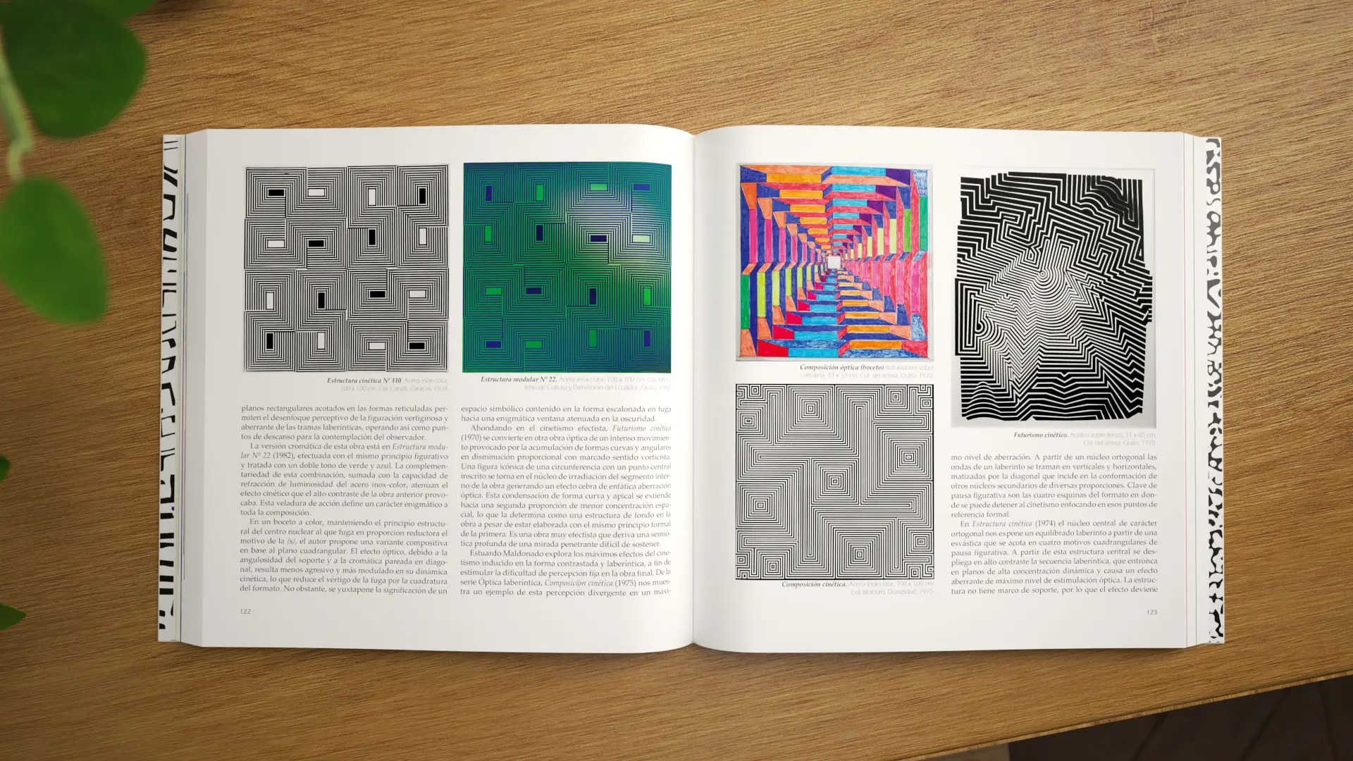
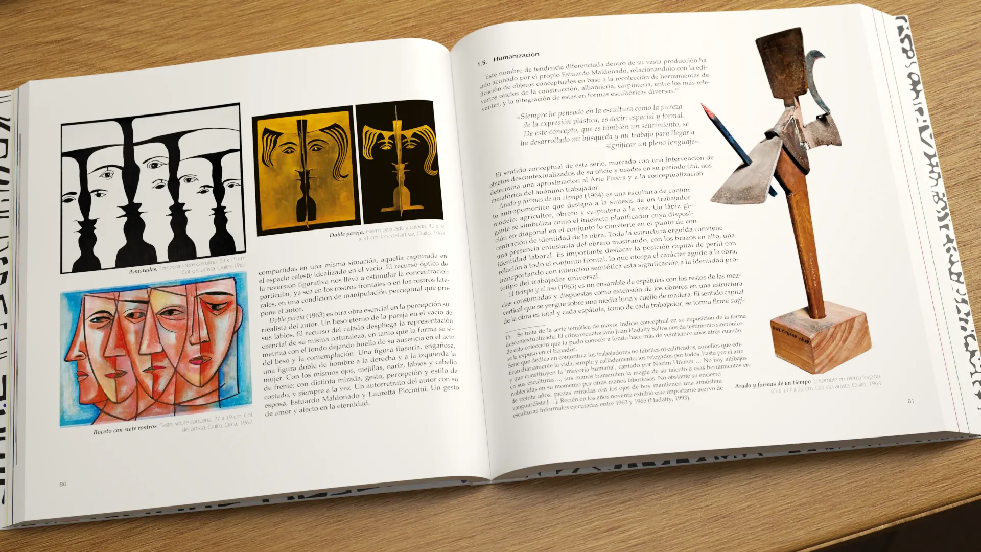
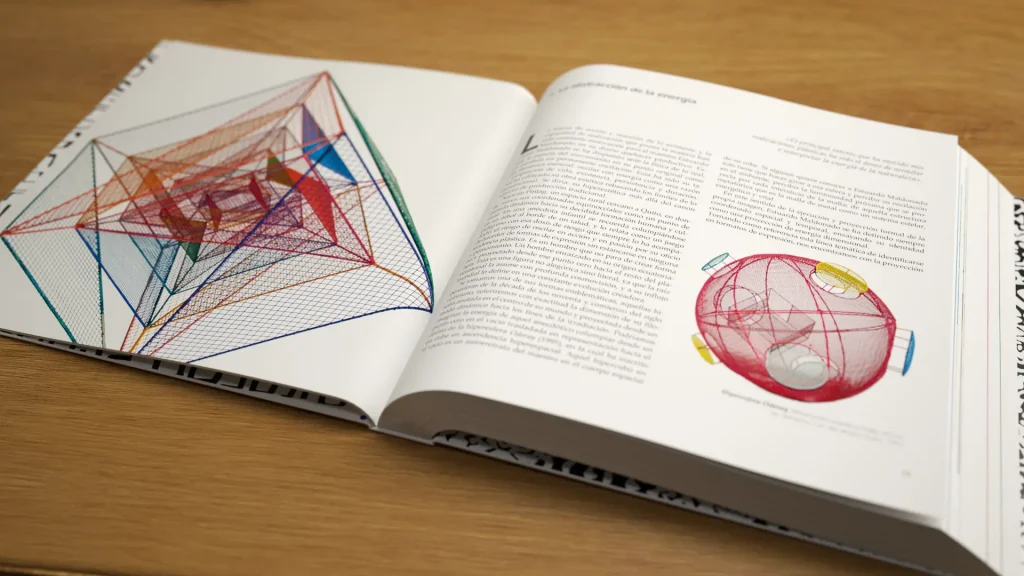
The arrival of the renowned academic Humberto Montero with his research on the master Estuardo Maldonado posed a fascinating and extremely complex scenario. Maldonado is not just a benchmark in Ecuadorian art; he is a visionary who transitioned from figurativism to Cubism, Futurism, Ancestralism, and the acclaimed Dimensionalism in stainless inox-color steel, rubbing shoulders with the historic European avant-gardes. The main editorial challenge lay in the extreme density of the analytical text. The research demanded a rigorous correspondence between the semiotic analyses and the exact placement of the artworks (drawings, sculptures, hyperspheres, and panels). Moreover, given the plastic magnitude of the pieces, many images required large-format full-bleed or double-page spreads, without breaking the reading rhythm or the coherence of the study. From the cover to the endpapers, every millimeter had to breathe the code, the spatiality, and the energy of Maldonado’s art.
“The grid is not a straitjacket, but the nervous system that sustains the tension between the theoretical word and the majesty of the image.”
— Josef Müller-Brockmann.
THE SOLUTION
Graphic Architecture of Dynamic Grid and Editorial Rhythm
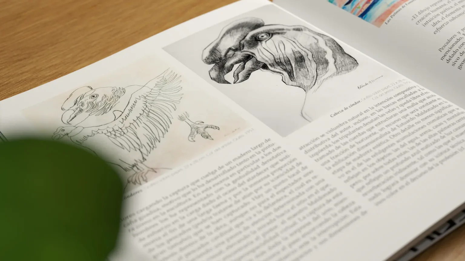
We approached the project from an information design and high-precision layout perspective. We designed a modular and flexible editorial grid that allowed us to coordinate the dense load of academic text with the vast photographic archive of the artworks.
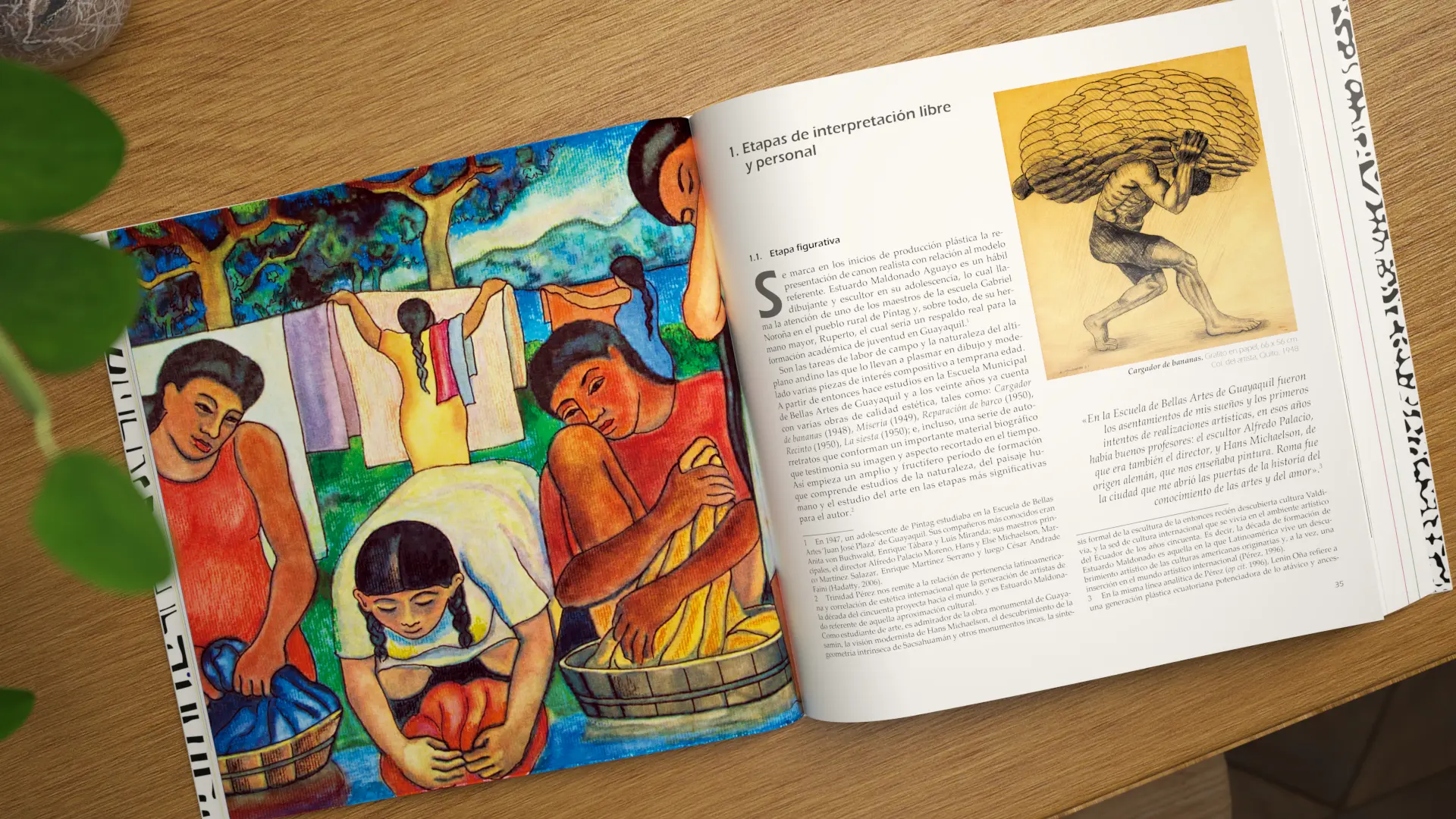
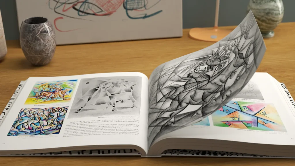
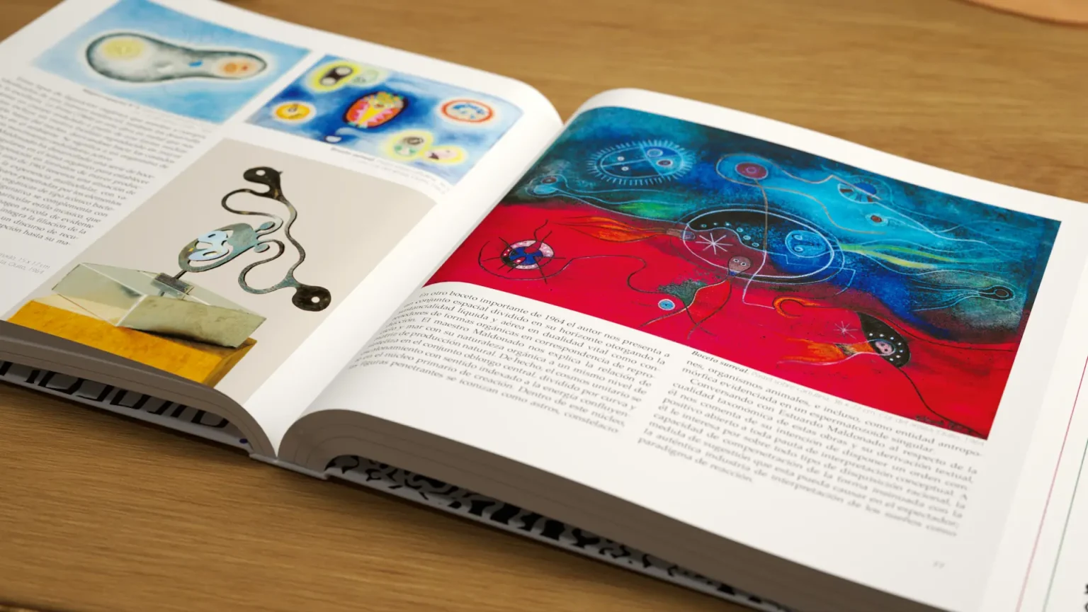
Text-Image Synchrony: We established a visual anchoring system where the theoretical analyses of Maldonado’s stages (Formation, Reflection, and Deepening) geometrically align with their visual references.
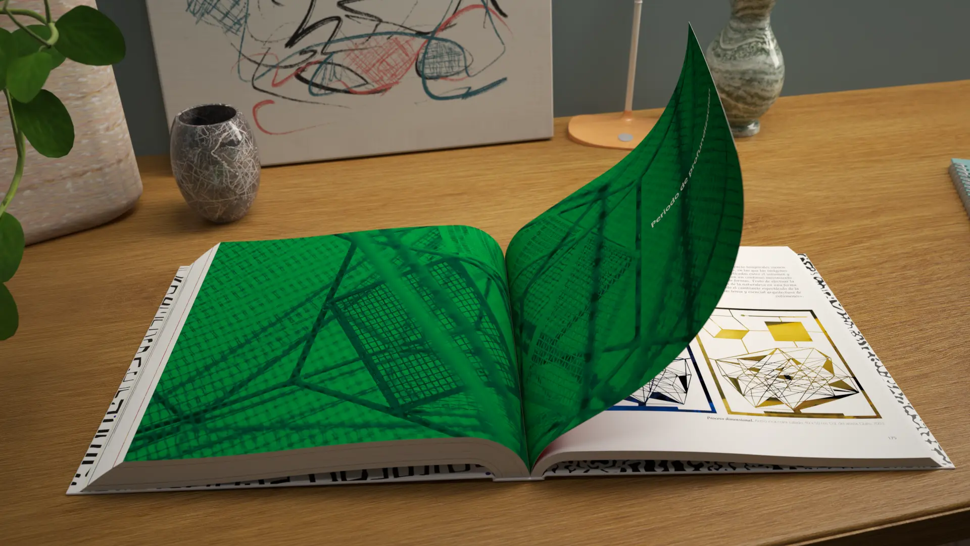
Color Treatment and Spatiality: We leveraged white space and editorial typography to give the work breathing room, allowing the radiance of the inox-color and the three-dimensionality of the meshes and sculptures to maintain their organic impact.
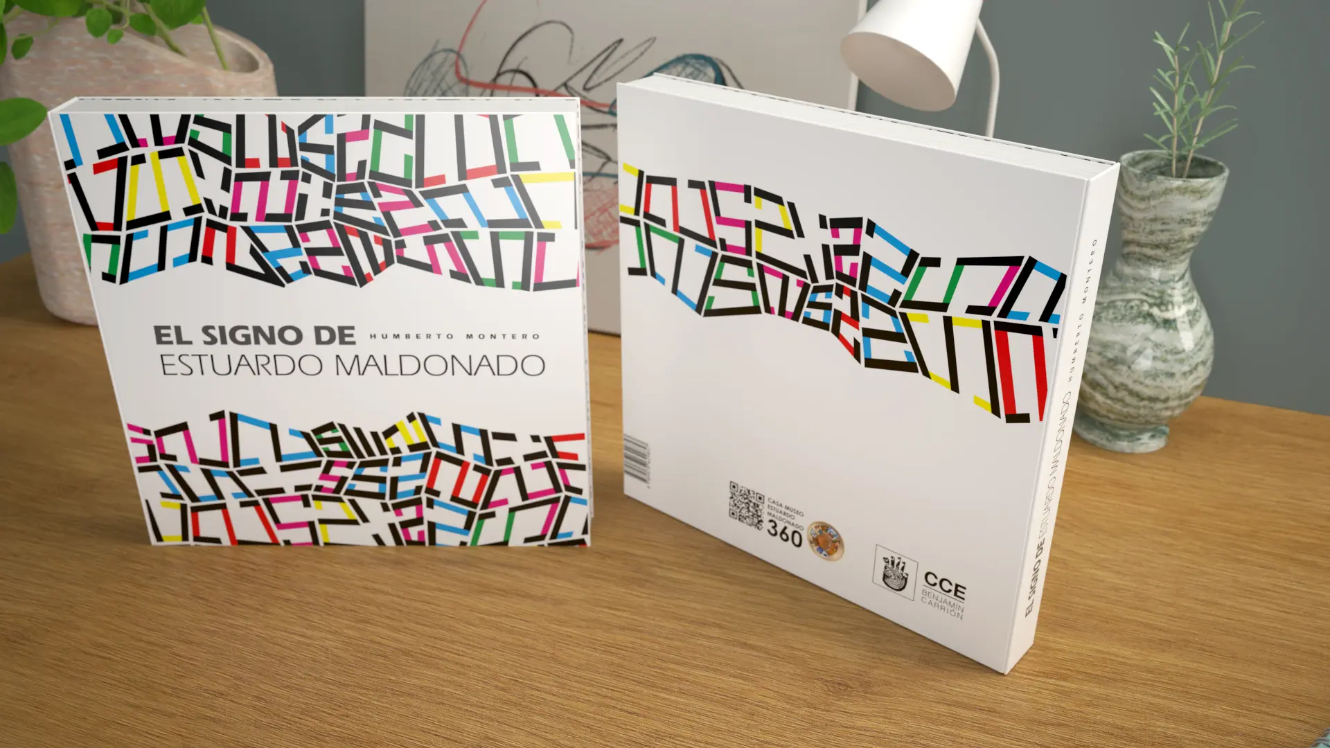
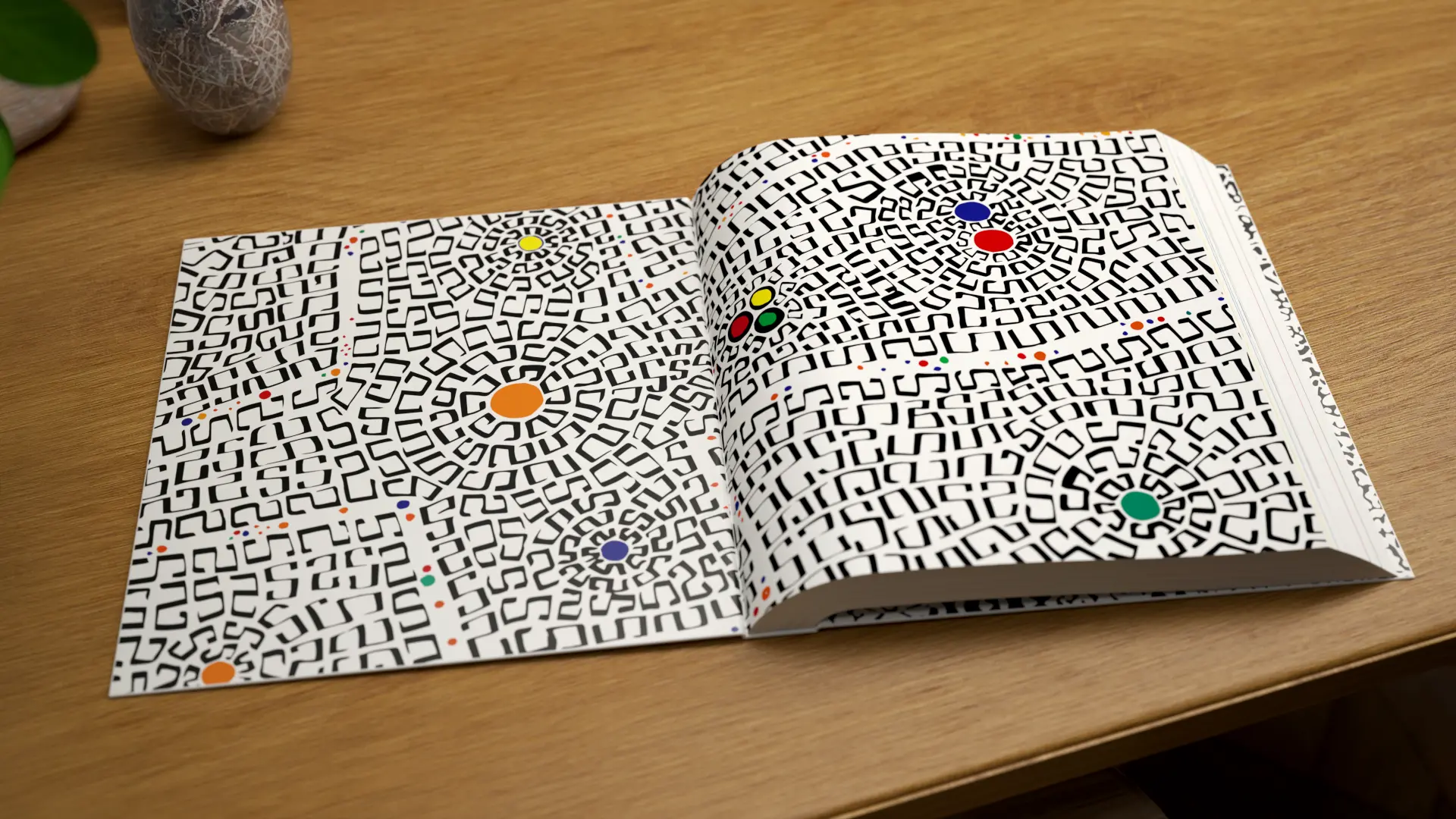
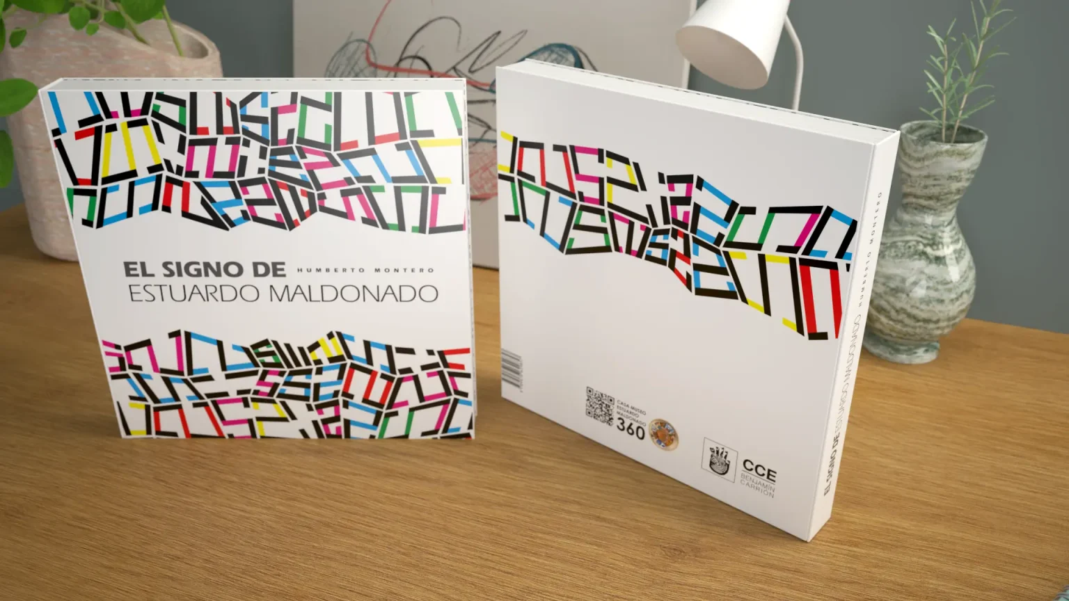
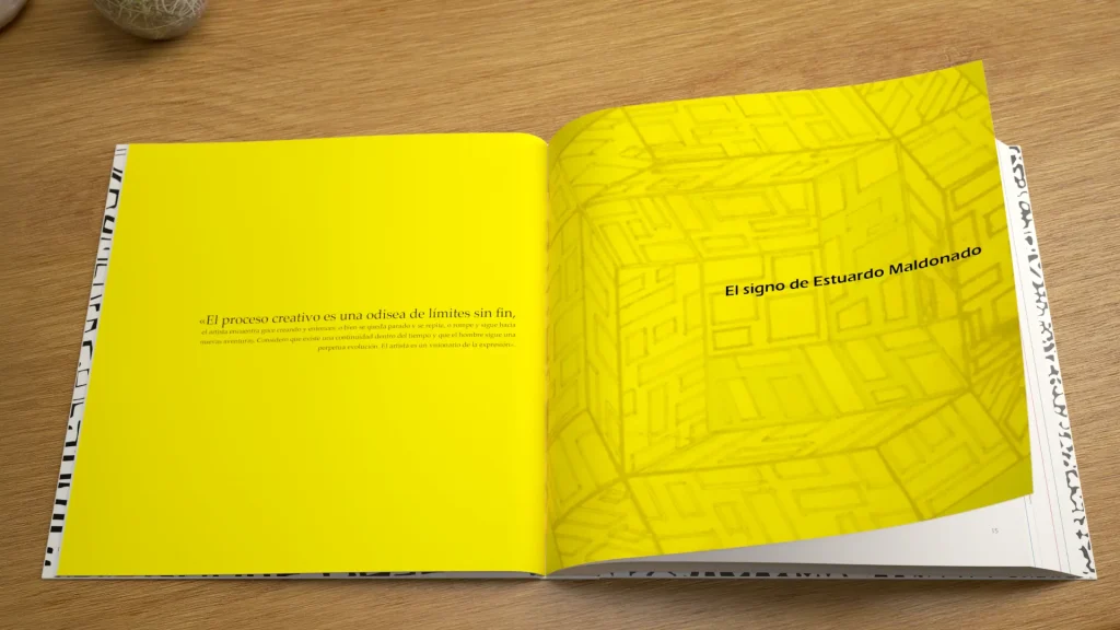
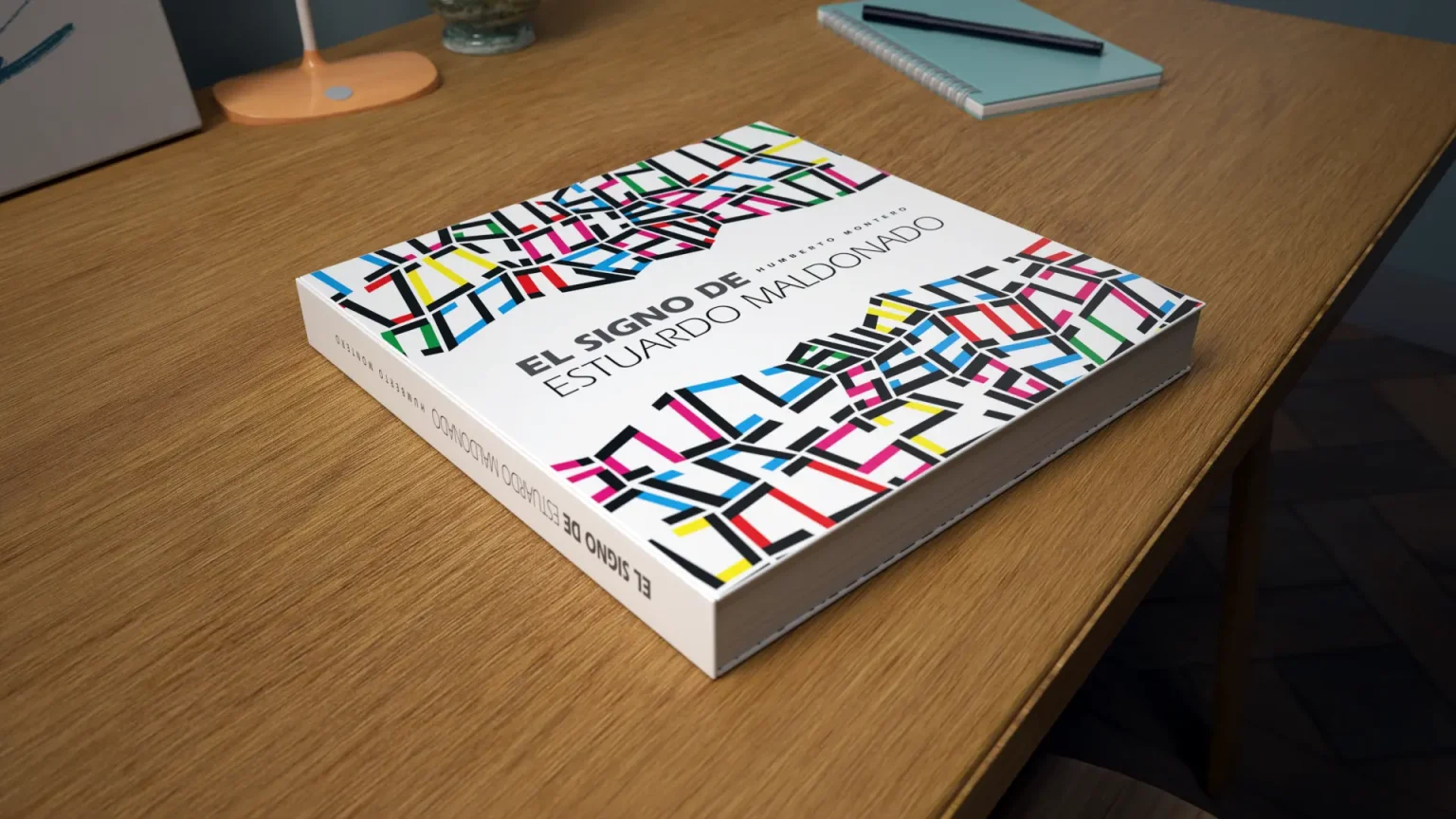
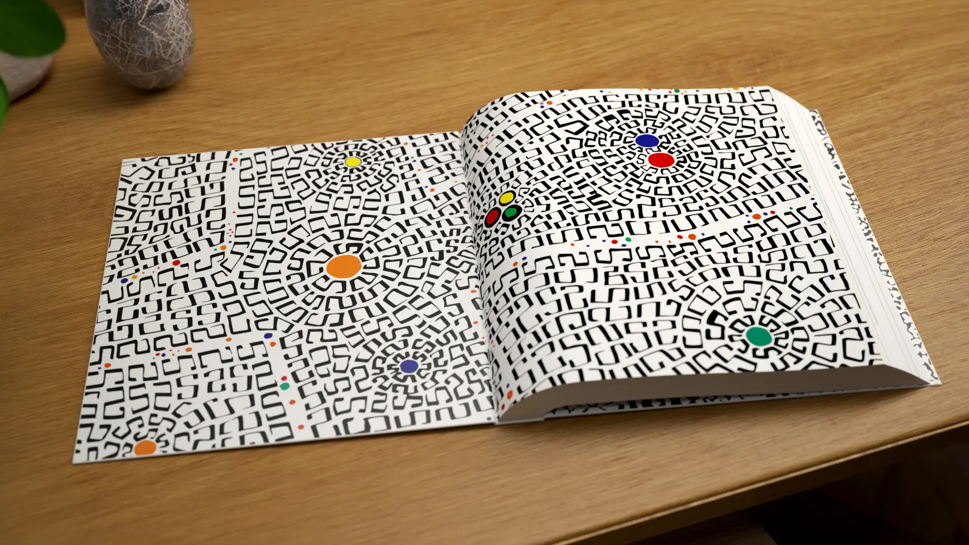
Integral Identity (Cover and Endpapers): The cover and endpapers were conceptualized as an extension of Maldonado’s own “phaneron” and the code of his /s/, preparing the reader for an immersive journey through the space-time of pre-Columbian cosmovision and international modernity.
THE RESULT
A Book-Object Worthy of a Universal Legacy
The result was a publication of academic rigor and impeccable aesthetic elegance, edited and endorsed by the Casa de la Cultura Ecuatoriana. The graphic design not only served the function of containing the text, but became an agile bridge for reading, where the technical precision of the layout artist honored the technical precision of the artist. A memorable editorial object that celebrates ancestral memory and the dimensional transcendence of Estuardo Maldonado.
“In my extensive career as a visual artist, the creative process has been an odyssey of endless limits… I present this work as a contribution to culture and to those who are training in the world of the arts.”
— Estuardo Maldonado.
Audit of visual codes:Analysis of the brand identity in relation to market aesthetic trends and competitor visual languages.
Technical production mapping:On‑site survey of technological capabilities in the plant, including machinery and printing systems (flexographic, offset, and substrates).
Brand‑pain diagnosis:Identification of anachronisms or disconnects between the company’s industrial reality and its visual projection.
Action plan:Clear and feasible methodological recommendations for transforming the brand identity.
Brand Strategy & Architecture
Corporate concept and narrative (Brandstory):Definition of the company’s DNA and core values through a synthesis‑driven approach.
Creative brief development:Structuring the strategic pillars that will guide the design solution.
Normative identity manual:Precise vector‑based guidelines, clear control of exclusion zones, industrial typefaces, and chromatic application standards.
Packaging Design & Visual Identity
Logo redesign and innovation:Creation of timeless, functional graphic marks with high visual impact, fully prepared for industrial deployment.
Graphic design for packaging and labels:Aesthetic development focused on shelf visibility (shelf‑appeal) and the justification of premium value.
Prepress optimization:Technical configuration of files optimized for high‑definition flexographic printing and micrometer‑level control.
Editorial Design & Corporate Communication
Specialized structuring and layout:Design of corporate reports, technical product catalogs, brochures, and institutional portfolios.
Grids and information architecture:Systematic organization of complex content to ensure a fluid, professional, and ergonomic reading experience.
Transmedia consistency:Adaptation of brand codes to both printed and digital editorial environments, ensuring uniformity of the overall look & feel.