

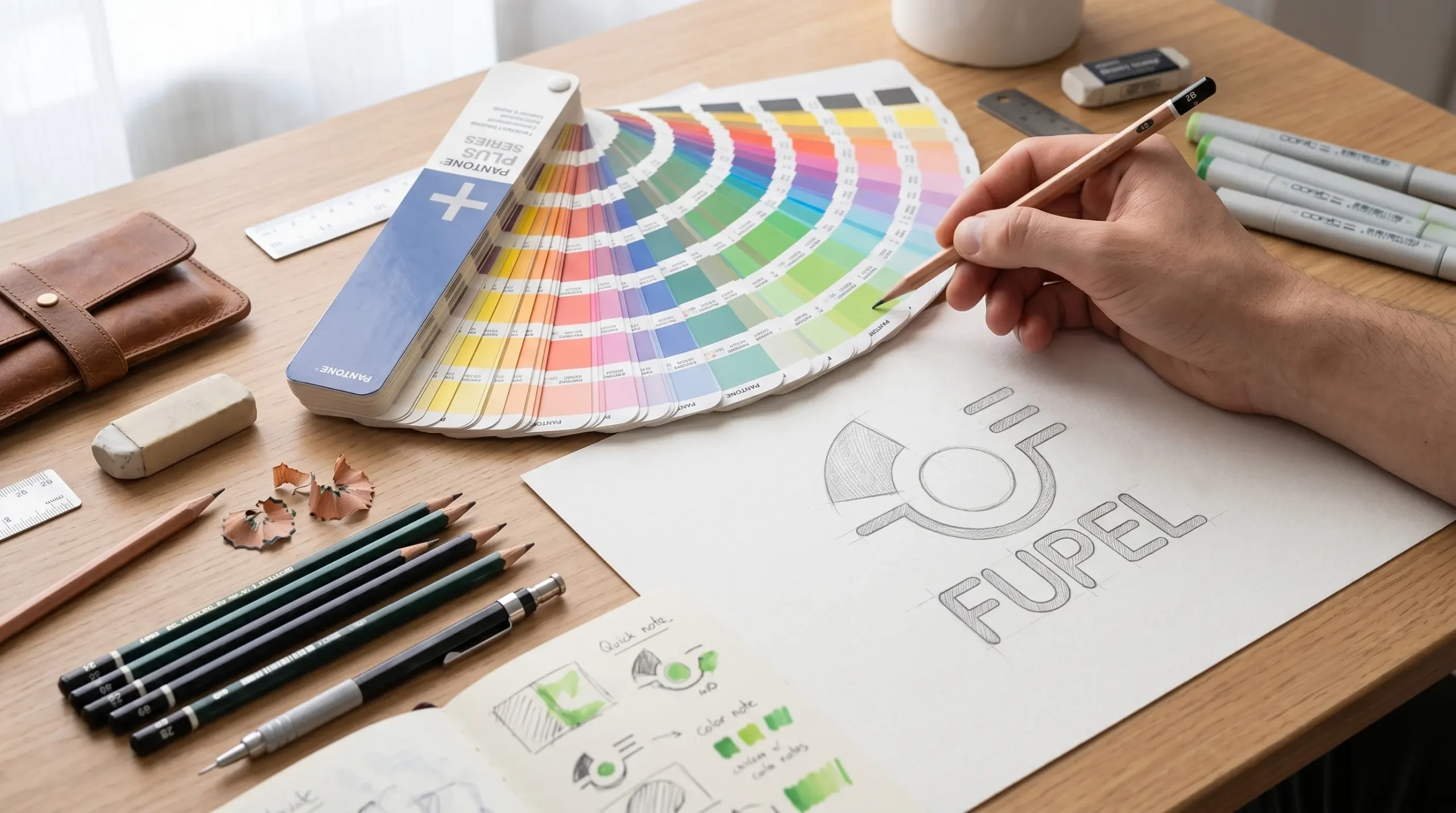
Strategic Corporate Identity Redesign Proposal – FUPEL (2001)

THE INITIAL CHALLENGE

Academic Context and Project Origin


This project was originally developed between 2000 and 2001 as a thesis proposal to obtain the professional title of Graphic Designer. The research was born from a direct immersion and a real need detected independently at FUPEL Cia. Ltda., the flexible packaging factory where I worked at that time.

The goal was to demonstrate how strategic design and simplification would set the competitive standard in the new millennium. Towards the end of the 90s (between 1998 and 1999), the company had introduced a new logo; however, as it was a process developed in parallel and internally in 2000, this redesign proposal was conceived as a cutting-edge academic exercise that remained behind the scenes, as a testimony of graphic foresight against a corporate structure that had already consolidated its recent identity change.

To support the proposal in 2001, an archaeology of the brand was carried out. Founded on May 10, 1983, the company was born under a physical premise very different from the current one: the manufacture of Paper Bags (acronym origin of the name FU-PEL). Over the years, the company executed a radical shift in its business line, abandoning cellulose to become a giant in the transformation of plastics and flexible packaging (polyethylene extrusion, and complex polypropylene and nylon structures).

Despite having state-of-the-art technology for the time —high-definition flexographic printers with 6 to 10 colors—, the company carried a severe commercial pain: its new visual identity continued to project obsolescence and a marked conceptual gap.

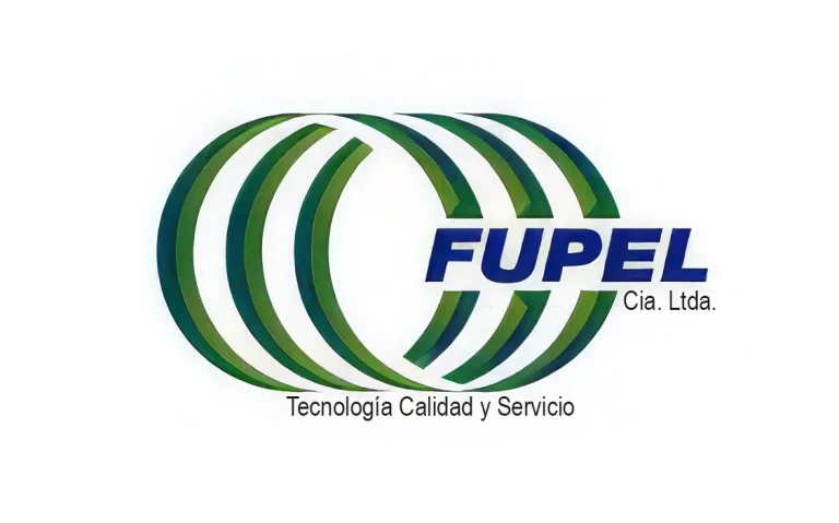
The logo implemented in the late 90s (which the company keeps active to this day) presents three critical problems analyzed in this research:

  • Structural Saturation: A system of three-dimensional concentric rings that generated visual noise, severe readability issues at scale, and an aesthetic anachronism inherited from the heavy trends of the previous decade.

  • Semiotic Confusion: The rings attempted to suggest the flexibility of plastic, but their heavy geometry transmits mechanical rigidity instead of polymeric fluidity.

  • The Cost Impact: In the face of an emerging market of smaller competitors selling at low prices, FUPEL failed to visually justify the premium value of its high technical quality. The brand did not communicate state-of-the-art technology; it communicated antiquity.
“When a corporation changes its industrial reality but keeps its brand of the past, an identity divorce occurs.”
— Joan Costa.
Logotipo actual Fupel Cia. Ltda.
Logotipo actual origen del desafío.

THE SOLUTION

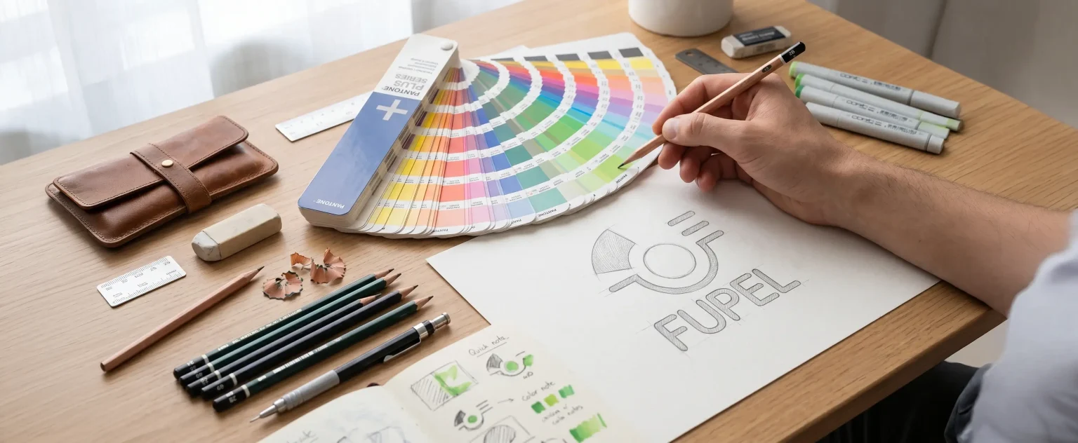
The Design Proposal (2001): Synthesis and Resignification

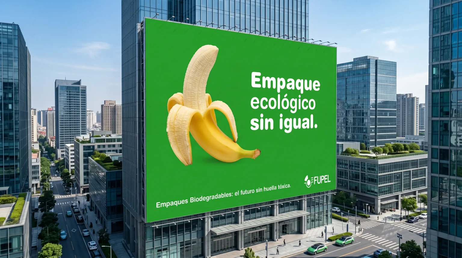
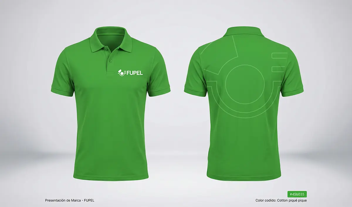
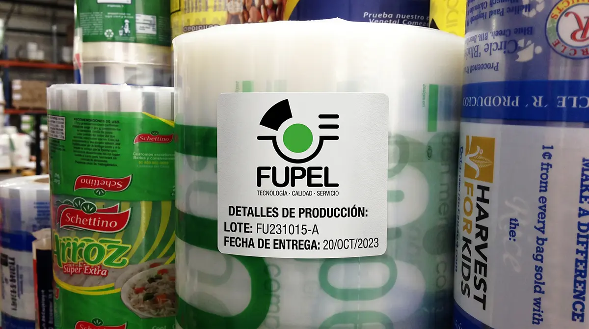
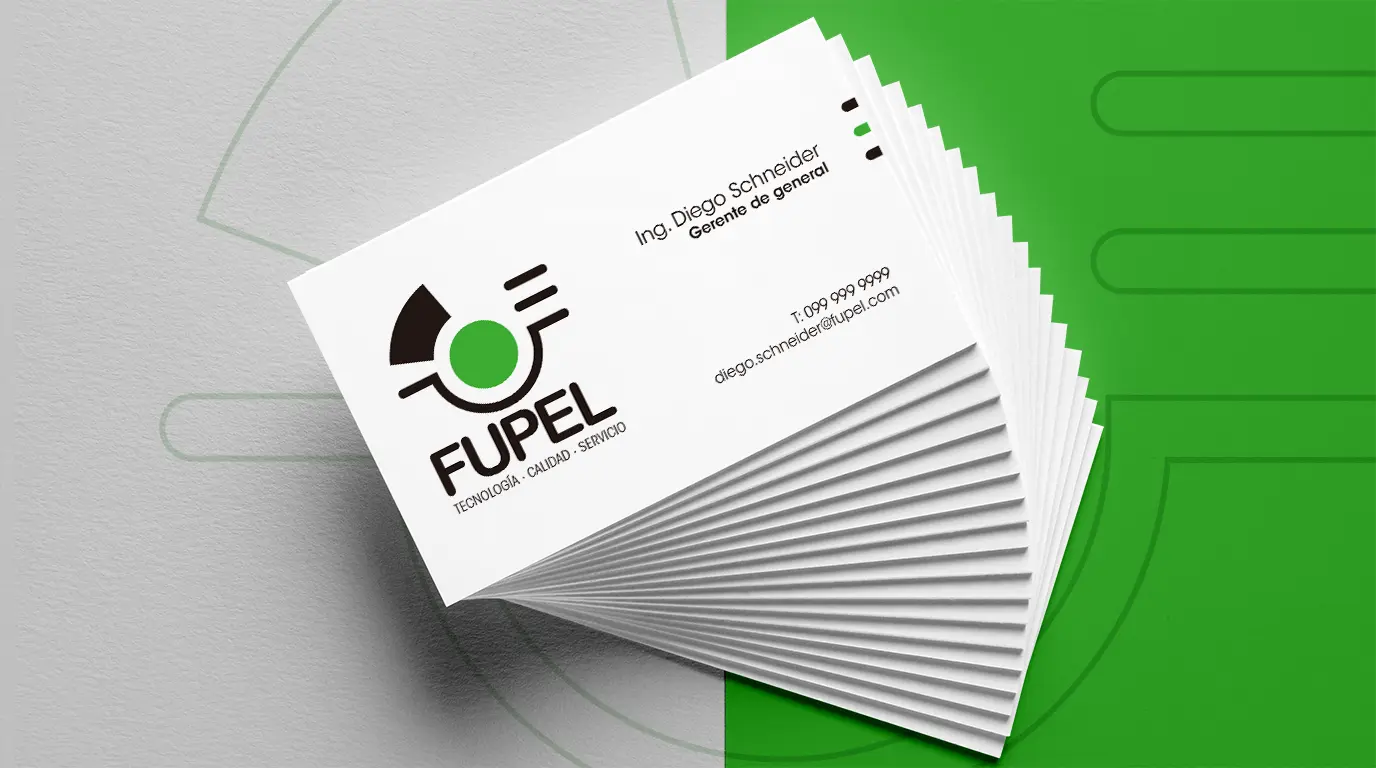
A pure geometric imagotype was introduced where the central green circle operates as a high-performance polysemic sign:
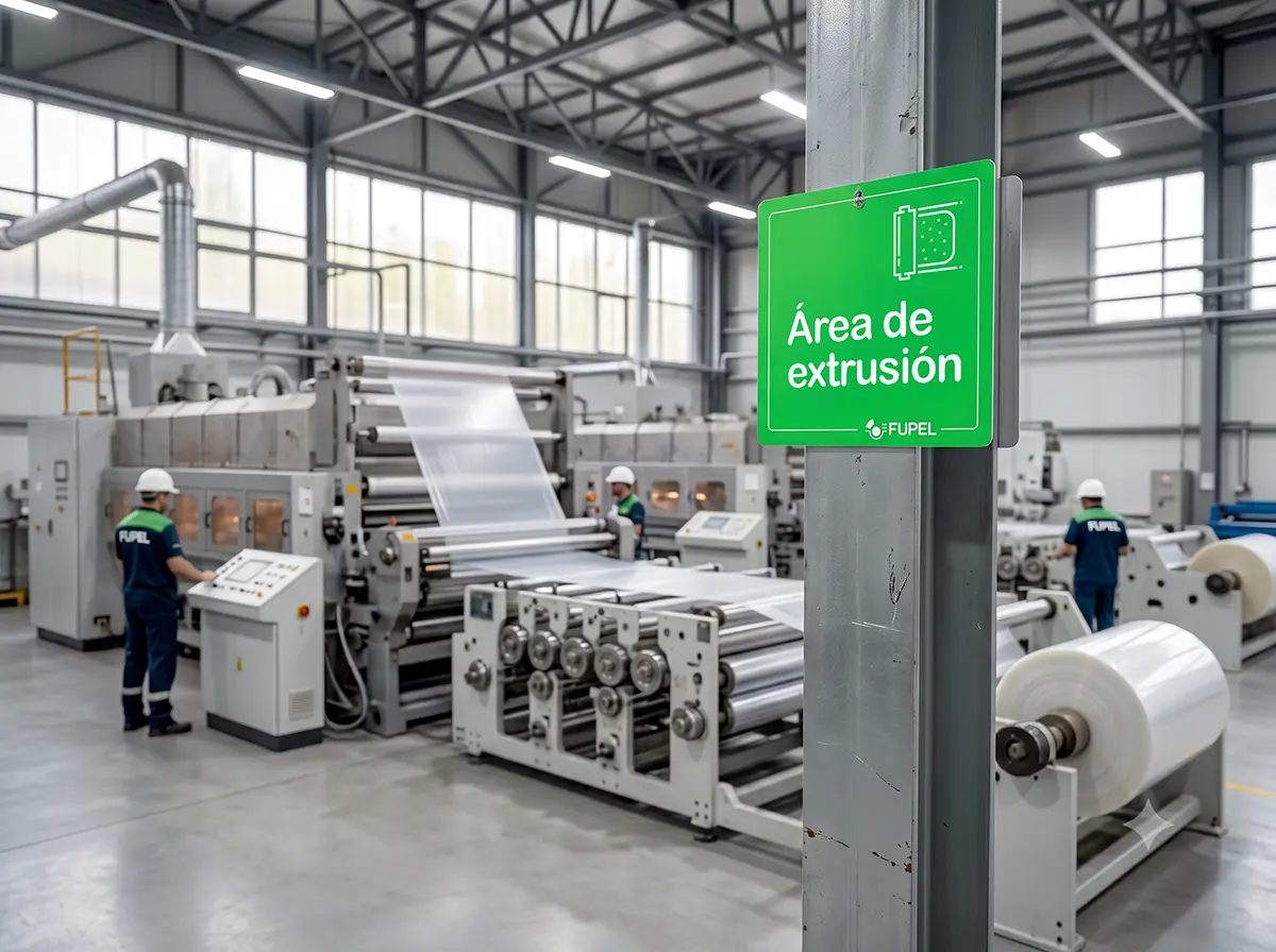
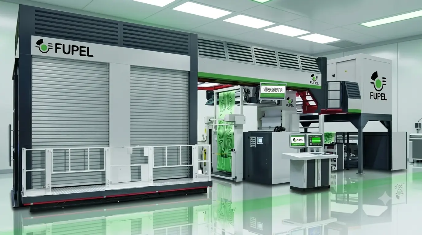
  • Machine Ergonomics: Represents perpetual motion, the rhythmic rotation of flexographic rollers, and the precision winding of polymers.
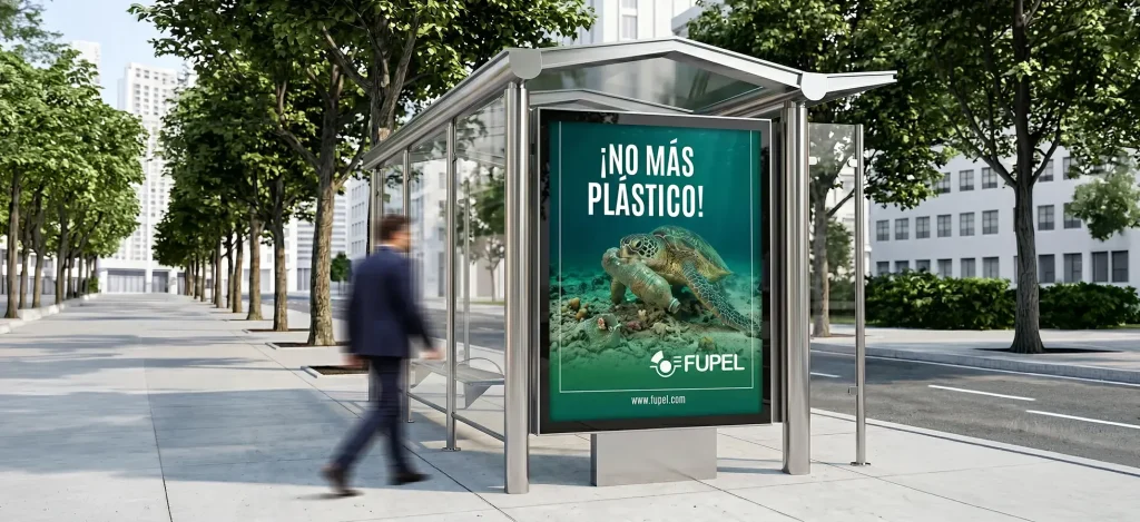
  • Historical & Ecological Reconciliation: Green subtly returns the organic freshness that paper had in the origins of 1983, but transformed into an indicator of ecological responsibility and sustainability —the great global challenge of plastic.

Typographic Solidity

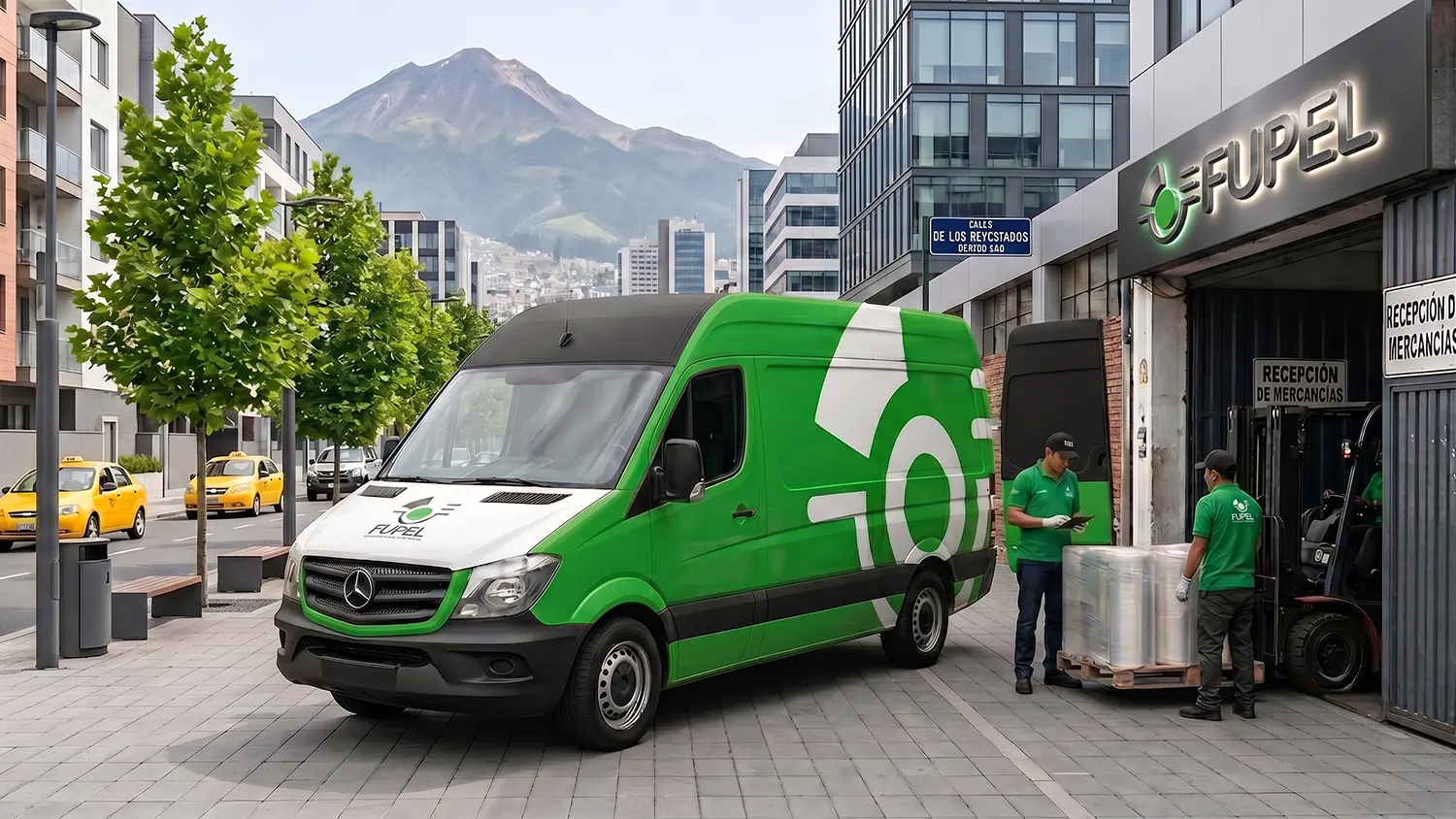
The typography was redesigned under a principle of industrial stability. Clean, stable characters without serifs that coexist symmetrically with horizontal lines simulating the continuous advance of the substrate in the printing line. A brand designed to be legible on both the body of a van and printed in a single ink on polyethylene.

THE RESULT

Conclusion and Current Perspective: A Brand Designed for the Future

Seen from a distance, this graduation project from the year 2001 was an exercise in design foresight. While the local corporate environment at the time resisted graphic abstraction, this proposal showed that simplification is not a loss of information, but a gain of power and commercial impact. The fact that FUPEL maintains the same confusing logo from the late 90s to this day confirms the initial diagnosis: the visual gap is still present. On the contrary, this proposal for change, conceived more than two decades ago, shows its timeless and robust character. Time has validated the design: a brand that was born clean for the year 2000 remains perfectly valid and modern today. It was not thought for an ephemeral trend; it was designed to last.
“Simplifying is not subtracting value, it is concentrating meaning. The future of visual identity belongs to synthesis, because what is simple is eternal.”
— Joan Costa.

Our Strategic Contribution

Diagnosis & Technical Research

  • Audit of visual codes: Analysis of the brand identity in relation to market aesthetic trends and competitor visual languages.
  • Technical production mapping: On‑site survey of technological capabilities in the plant, including machinery and printing systems (flexographic, offset, and substrates).
  • Brand‑pain diagnosis: Identification of anachronisms or disconnects between the company’s industrial reality and its visual projection.
  • Action plan: Clear and feasible methodological recommendations for transforming the brand identity.

Brand Strategy & Architecture

  • Corporate concept and narrative (Brandstory): Definition of the company’s DNA and core values through a synthesis‑driven approach.
  • Creative brief development: Structuring the strategic pillars that will guide the design solution.
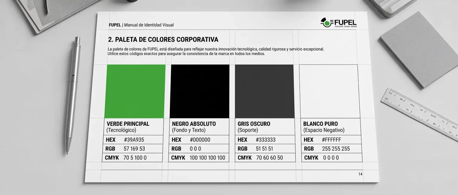
  • Normative identity manual: Precise vector‑based guidelines, clear control of exclusion zones, industrial typefaces, and chromatic application standards.

Packaging Design & Visual Identity

  • Logo redesign and innovation: Creation of timeless, functional graphic marks with high visual impact, fully prepared for industrial deployment.
  • Graphic design for packaging and labels: Aesthetic development focused on shelf visibility (shelf‑appeal) and the justification of premium value.
  • Prepress optimization: Technical configuration of files optimized for high‑definition flexographic printing and micrometer‑level control.

Editorial Design & Corporate Communication

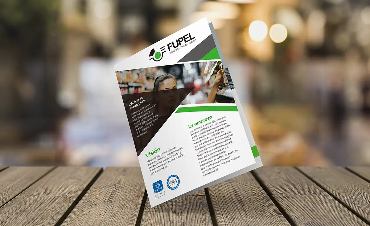
  • Specialized structuring and layout: Design of corporate reports, technical product catalogs, brochures, and institutional portfolios.
  • Grids and information architecture: Systematic organization of complex content to ensure a fluid, professional, and ergonomic reading experience.
  • Transmedia consistency: Adaptation of brand codes to both printed and digital editorial environments, ensuring uniformity of the overall look & feel.

Looking to launch your project?

Fiorum
Privacy Overview

This website uses cookies so that we can provide you with the best user experience possible. Cookie information is stored in your browser and performs functions such as recognising you when you return to our website and helping our team to understand which sections of the website you find most interesting and useful.